Try inserter with collapsable panels #6636
Conversation
|
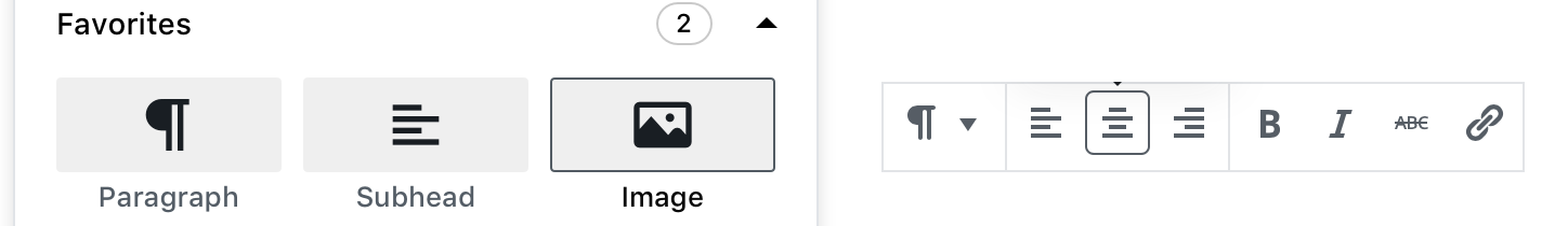
Holy cow, this is just so so so so so good. This feels like a dramatic improvement over what was there before. The border on hover feels like a good compromise between the pill icons and the original design (and means plugin developers won't need to provide a hover state, which is keeps it simple). |
|
Any thoughts on simplifying the hover? Maybe take a cue from the toolbar hover:
-- Can we make the icons bigger (while trying to keep the buttons the same size) and darker? -- Any thoughts on reducing the number of blocks we show in the "Most Used" group? Three rows fill the entire height of the popover, making it harder to notice that it scrolls (at least, on OS X).
Alternatively, we could make the height of the popover taller by default to fit three rows, and a bit of the next accordion. |
|
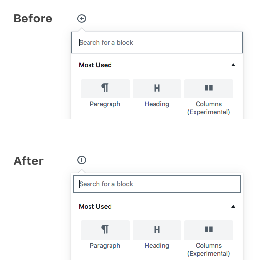
I tweaked the icons to make them bigger darker, changed the hover style and added a light box-shadow we used to use to make it more obvious that scrolling is possible. |
|
I have a few thoughts based on the PR right now. I am cautious to give a design review until we have a few things smoothed. Overall, I like it, there are however a few feelings I can't shake using this. The first is of this visually being really closed in now. There is a density to the interface that wasn't there before and I think it's not better off for that. I didn't get that feeling in the mocks as much as using it I do. It also is incredibly hard to read and connect the titles with the icons. That all said, I feel it's adjustments we need over anything drastic, which is really awesome. This all said, it's far better as a foundation than we have now, let's iterate!
Looking at above there are a few things stand out as things we need to work on:
I would agree, let's reduce the number shown in the most used section. ( [ edit ] accidentally closed because of the placing of buttons... it's so annoying. ) |

|
I made some tweaks but I can't commit them for some reason — git keeps telling me I don't have permission to commit. Here's the diff to get to the GIF above: |
 youknowriad
force-pushed
the
try/inserter-v3
branch
from
youknowriad
force-pushed
the
try/inserter-v3
branch
from
b5cfb6b
to
c37270d
Compare
|
Thanks @shaunandrews for the tweaks, I pushed the changes. |
|
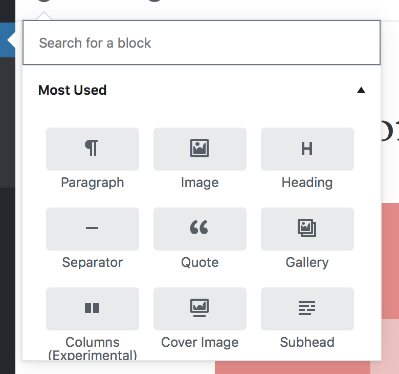
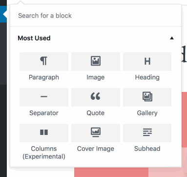
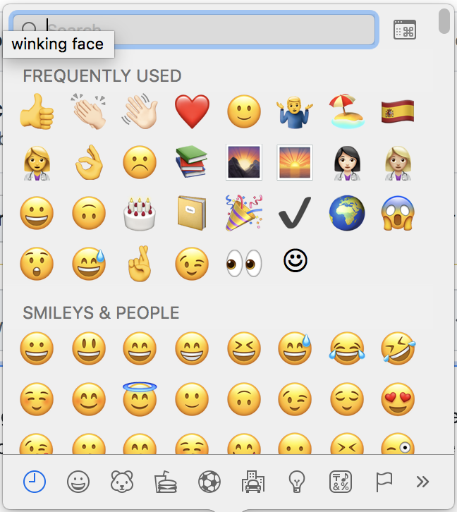
After some time using it, I think I personally I don't like the panels :(. I do like the simplification this brings, but I honestly think it adds too many clicks and scrolls to access the desired block. I'd prefer just a single list of blocks with titles to separate different sections, simple and efficient where you see all blocks with a scrollbar. I feel the tabs or panels are not necessary at all and just add visual density. Something like the emoji selector in MacOS. They do have something like tabs at the bottom where the visible section is highlighted while you scroll but I don't it's necessary for us. They have something interesting if you want a more complete UI, the button at the top right opens a bigger modal where the sections are more organized. I feel it's a good addition for advanced filtering if needed but not something mandatory or that we should try to bake into the small inserter popover. So yes, maybe instead of having one popover with a lot of information there, we could instead build a simple list on the inserter with a button to open a richer UI to navigate the blocks. (the richer UI is optional) Simple popover:
More advanced modal:
|

|
Whilst it is an extra click I think there is merit in this format. I have to be honest @youknowriad, I think having 2 formats as the emoji picker is adding complication, that said I'd need to see a design to be sure. It works for emoji's because of their nature and I am not sure block selecting and emoji picking is the same mindset. At the root perhaps it is 'picking' but there's a few more levels of process going on with expressing in emoji and adding content. I also have concerns over usability in a giant list. What we have now I think could have some iterating. I actually think the 'fixed' bottom accordions could be worth exploring again. As we hide them below in the list it's causing a short cut to be lost. I realise the scaling of this is limiting but maybe having a larger library isn't the worst thing. The new hovering I don't see in the latest branch, but that could be because we have failing tests maybe? Looking at the gif @shaunandrews provides I absolutely love it and feel it really meets all the concerns I had previously. This all said, I feel we've come a long way so far and what we have I wouldn't be at all unhappy with adding in as is. Why? Well, right now I feel this is better than what we currently have. Absolutely we should polish this, but we already have such a better block picking experience in this version. |
|
Agreed with @karmatosed, 100%. I think this is a dramatic improvement on the UX. There are definitely further improvements possible, but this is such a fantastic step in the right direction. A few small riffs on this: I think when you hover, the elements kind of blend together because they overlap and the grey runs into each other. A second box-shadow — essentially a fake white border — might help give some separation between elements on hover:
// Tweak at inserter/style.css, line 116
box-shadow: 0 1px 0 $light-gray-300, 0 0 0 2px white;
Also, it's slightly nit-picky and probably just me (I know it's been this way for a while), but the outline on the search input cutting off the arrow feels kinda clunky to me. What if the outline is positioned inside a bit?
This is |

|
I think this can work! I think if we go this route, we should default to a taller inserter, obviously keeping the viewport in mind. I also think the icon inside the gray swatch should be darker to increase contrast. Right now the shadow is applied to the entire link. I can't find where @shaunandrews's original hover mockup is — but seems like we should have both a thicker drop shadow (the block scales up, so it implies a fair bit of elevation), but also be mindful of what that shadow applies to. Right now it looks like the gray swatch is the "card", and the text floats in the air, right until you over it and realize the white space below the text is also part of the card. We want to make sure to treat the "materials" right, when we're using shadows here. |
|
@chrisvanpatten I implemented some of your changes:
Screenshot:
|

|
I also just added a quick change to add per-block class names in the item list, following the same pattern as the class names that wrap blocks in the editor. This allows much simpler branding/customisation of the blocks: e.g. produces:
|

|
Noting here for drive-by reviewers that @youknowriad intends to fix these tests some time on Monday. I'm not yet fully up to speed in Gutenberg-land. Or Javascript in general. |
|
Really great to see the insights and thinking here.
I agree. I think we have space and should use it a little. Not too tall but taller :) @gravityrail thanks for diving into work here and look forward to giving your PR a test. |
youknowriad
force-pushed
the
try/inserter-v3
branch
from
f838d07
to
b4d0205
Compare
|
Fix the unit tests and applied some tweaks. What's remaining here? |
|
This is looking good to me. @shaunandrews @karmatosed @jasmussen I think the "shared" panel should be at the bottom. And can we add the icon we use for shared blocks to the panel to make the visual association? The hover still has blurry shadows instead of simpler borders: https://user-images.githubusercontent.com/191598/39887780-0ef59d82-5461-11e8-9640-467d4202bc28.gif |
|
Also, what do you think of not treating the first group as a named category and making them always visible? |
|
I will add the simpler borders @mtias |
|
Made the icons darker, simplified the border (though I'm unclear what the "right" hover effect is here...) and made the columns wider. I also changed the |
|
Ditched zoom for now, was hard to get it to look right and not touch/overlap button focus border etc
|

|
@chrisvanpatten we tried that but it caused issues with overlapping the bottom border of the accordion button. |
 mtias
added
the
[Feature] Inserter
mtias
added
the
[Feature] Inserter
|
I am actually glad zoom isn't added, I have worries about that as a pattern being brought into this interface. I got a lot of conflicts trying to view this PR, can anyone else replicate. |
 youknowriad
force-pushed
the
try/inserter-v3
branch
from
youknowriad
force-pushed
the
try/inserter-v3
branch
from
408a66a
to
af3a0a2
Compare
|
Thanks all for your work on this one |
related #6168