react-datepicker is not accessible #1311
Comments
 afercia
added
[Focus] Accessibility (a11y)
afercia
added
[Focus] Accessibility (a11y)
|
Also to mention: AM/PM: not all countries in the world use them. |
|
AM/PM would definitely get a lot of pushback and require a localized UI for alternate date/time formats. I don't have a great solution for datepickers - they are truly difficult to make predictable. One solution I've favored is to allow manual string entry of dates and times, so that the datepicker is an optional UI; but even as an optional UI I would need it to be accessible; I'd just be less concerned about the complexity of the interaction patterns from the keyboard. |
|
Is there any use of date pickers elsewhere in the admin (I've assumed not), or an audit of available solutions and their accessibility? In another of my own projects, I've integrated Flatpickr with React successfully, and know it is at least keyboard operable and opens in response to receiving focus, but on a cursory glance lacks some labeling. Another option is to create a homegrown solution built with accessibility in mind. |
|
I can't recall running across a datepicker anywhere. The jQuery datepicker is something that's in the set of scripts bundled with WordPress by default, but I'm not aware of a core usage of it. I'm not sure of the current state of accessibility in that script, but it wasn't satisfactory when I last assessed it. That was over 2 years ago, however. I've used Pickadate myself, but it's lacking any stable project maintainer at the moment, so probably not viable. Here's the only information I know about accessible date pickers. |
|
The jQuery UI datepicker was recently properly localized, see https://core.trac.wordpress.org/changeset/37908. RTL support is also a concern. I'm not aware of any core usage, best persons to ask to: @ocean90 and @swissspidy |
It's only activated depending on the time format defined in the general settings |
|
The jQuery UI datepicker is currently not used in core. It‘s only localized for plugins using it. |
|
Related discussions on core Trac: Add jQuery UI's datepicker() where applicable Use JS Calendar control for date picking Edit published date of post - inputs with no labels Also to consider: "Now" button for current date in update post published date and time Publish Date DatePicker |
afercia
added
the
[Priority] High
|
Marking with the high priority label to indicate it's an a11y priority. At the very least, there should be an alternative way to enter a date using only a keyboard. |
|
Couple options to consider:
|
Maybe it's accessible, but it's announcing me the wrong month and days 😬 Maybe it's just a configuration issue. Hopefully. Not the best start, though.
I've run just a very quick, preliminar, test. I've navigated to a previous month (also, notice the color contrast on previous months is far from being accessible) but the wrong month/days are announced also on the initial view:
|


|
@afercia I'm curious if either if these datepickers would qualify as accessible:
|
|
@jwold The latter of those two appears to be the browser-default https://developer.mozilla.org/en-US/docs/Web/HTML/Element/input/date |
|
Sorry for the very late reply. The Whatsock Date Picker one, after an initial test, seems to work pretty well with keyboard and screen readers. |
|
Thanks for the followup! Glad to hear that about the Whatsock Data Picker. |
|
Even for those just using a mouse it's not clear how to actually get out of the date picker. What is the action that makes it disappear after successfully picking a date: Is it the date? No. Is it the time? No. Is it the pm/am? No. The only action that makes the date picker disappear and let's me continue with my work, is clicking outside the datepicker. |
|
+1 for the idea of not forcing people to use a date picker. Even if it were possible to find one that is accessible, it's a bit of an overhead for sighted keyboard users, and screen reader users. Can we not use something similar to the publish date in the existing edit pages - a dropdown, plus text boxes, or something similar. Interacting with that would be a lot easier. |
This may be subjective. I've personally found the classic editor's date inputs to be cumbersome to use contrasted with other date pickers I've used (web or otherwise). |
|
How about making it an either/or option? So that people can use a date picker if they want to, but don't have to. |
Seems to fall against the "Decisions, not Options" mantra. It hasn't been raised but not addressed as of yet: How does |
|
I've pushed the changes I've made — and to quote the ARIA description box regarding keyboard navigation:
Ergo, the user now needs to hold down shift to navigate within the calendar, as navigating horizontally would break the expected behaviour of input boxes. Pressing up and down directly navigates within the time picker instead now (which is a new feature that was a bit tricky to implement). The changeset is at aldavigdis/react-datepicker@768dcea, but do expect me to do a force push a couple of times today as there are some broken tests and typoes — and I haven't run eslint yet. |
|
So, I'm keeping the PgUp/PgDn and End/Home functionality, sans the shift key. It could be replaced with more complex modifier key combinations, but I guess people with less than four arms/tentales may be at a disatvantage there. |
* Improving keyboard navigation. Now works with time picker too.
* Shorthand weekday names are now displayed as `abbr` tags, with full names as title.
* Using a colour with higher contrast for month navigation.
* Adding a WAI-ARIA compatible description.
* The text field now has `aria-live="polite"`, which should update screenreader users as soon as the value changes.
* The date picker popper now has the `aria-hidden` tag, making it invisible to screenreaders and assistive technologies, in order to make navigation more straightforward.

Detailed discussion at WordPress/gutenberg#1311
|
@aldavigdis thanks very much for diving into this, very appreciated. Worth considering the date picker used in Gutenberg is set up as the "inline version" example, see https://reactdatepicker.com/#example-36 that means there's no input field. Even if we change the configuration to add the input field, then the keydown event (which is attached to the input field...) would kick in producing the conflicts you mentioned above. Allowing the left and right arrow keys to operate normally is a first step but then we should also allow other native, standard, key strokes that normally work within input fields, like home and end (e.g. Cmd + left/right on a mac), partial selection (e.g. Shift+Alt+left/right on a mac) etc. I guess that would be a bit complicated, as the root issue here is Regardless, even if we're successful in improving a bit keyboard interaction, there are many other accessibility issues, especially when assistive technologies come into play. For example, the keydown event works with screen readers on Windows because, as soon as they encounter the input field, they switch to "forms mode" and stop intercepting key strokes. However, the calendar semantics is far from ideal and basically nothing useful is announced to screen reader users. Similar problems would be faced by speech recognition software users as well, as some UI controls are completely unlabelled. Even if the controls were labelled, their name should be visually apparent in some way to allow users to properly voice a command. Overall, Some screenshots after testing on Windows, with both the NVDA and JAWS screen readers:
I'd still tend to think the best option to make the publish date UI usable by everyone would be using a simple input field with a suggested date format (the format should change based on the user locale). This input field should be completely separated by the one used by Besides the a11y issues, I've noticed a couple of functional issues, /Cc @mtias @aduth etc. 🙂
Please let me know if I should open separate issues.
|


This is something I want to tackle in Gutenberg itself. Thanks a lot for bringing this to my attention, as this will be the next step in solving this ticket. One solution may be to simply trigger the visibility of an actual
I decided to utilise shift as a modifier key for navigating the calendar. This includes the functionality of
I added relevant WAI-ARIA tags and I do hope that will solve some of the issues you are describing here. This includes As my approach to polyfills is to move them away from the screenreader users and to allow for form elements to be filled manually, I have also added
I added content to those buttons, which can be set using the
In the current version of React-Datepicker, the time is displayed using a list on the right-hand side of the calendar. My approach here is to allow users to tab out of the text field and into the next one. Keyboard navigation will also work with the time selector, so it may cover the issue.
I have attempted to fix this by creating A fundamental (and a really annoying) problem with React-Datepicker is the fact that the calendars are not treated as tabular data. The date pickers I've worked on in the past have generally used Regardless, as the date picker is no longer visible to screen readers in the current PR, this may be redunant. I still want to explore the option to make the visibility optional, but this requires snaking through a chain of React components. I may add this to a separate PR to React-Datepicker.
Sounds like something that should be added as a separate issue ticket. Perhaps reffering this ticket would be a good idea too, so I could work on it after this one (given the capacity of course). Furthermore, I know there was some dicussion about this on Slack, but unfortunatly, I wasn't there, with the reason being I need to migrate to a new WordPress.org user before joining there again, so I can keep a consitent username and apperiance on all communication channels. |
|
I'll dive into the Gutenberg codebase by tomorrow. Will also install a proper screenreader on a Windows partition to explore more things. |
|
@aldavigdis thanks so much.
Maybe I'm missing something but if we hide the whole date picker from assistive technologies then why to use aria-live on the input field? Ideally the input field should behave in a native way, its value would be read out when tabbing into it (content gets selected automatically ) or when typing, character by character.
Yep, I've seen the list on the right, however in Gutenberg the time fields are implemented differently:
Yeah... there's no programmatic relationship between days and numbers, however as you said this may be pointless if we hide the whole calendar from assistive technologies. Thanks again, looking forward to see the improvements. |

I like to hope this is just the beginning of further improvement of the library. My contract is expiring really soon and after I realised converting the calendars to being laid out as tables would be the most appropriate way of making the date picker itself "sustainable", I also realised it would be a very time consuming process as well. I'll be examining the implementation in Gutenberg more closely today and once I've finally made a pull request on here, I would like to bring my attention to the HTML semantics of React-Datepicker insha'Allah. |
|
Replying to @aldavigdis. Whilst using the tag with title on the day names to indicate an abbreviation should be a good answer, the reality is that screen reader support for is patchy. I did a (less than) scientific survey for this blog post: https://openinclusion.com/blog/presenting-abbreviations-acronyms-for-screen-reader-users/ You also talk about the desirability of having each month marked up as a table. I think that's right, but having elements as column headers is going a bit extra. We'd need to test how that worked... |
|
My comment rendered slightly less easy to understand by HTML being stripped out - apologies. The missing word is abbr - both times. |
|
I am honestly starting to think that implementing drop-down menus instead of an athetiscally pleasing date picker is the best way to get this right. |
|
@aldavigdis said:
Perhaps I'm biased after accessibility auditing so many sites, and seeing people trying to use them, but I'm having problems with seeing date pickers as pleasing in any way. Seriously though, having 3 dropdowns or text boxes for date, and 2 for time is going to be a lot easier a) to implement and b) to use for many people. The current editor defaults to publish immediately, and only shows dropdowns and text boxes if I wish to edit that. Then the values default to 'now'. There's an OK button which then 'fixes' the publish date/time. Can we not use the same model in Gutenberg? |
|
We are on the same page here @grahamarmfield.
You are absolutely correct here. Having dug very deep into this, I am getting to the conclusion that date pickers, while perhaps asthetically pleasing are not very useful, unless they provide additional functionality. The WAI working group has even removed any references to date pickers from their current version of the WAI-ARIA Best Practices document. Unfortunatly, a lot of other information I have gathered uses the outdated version as a primary reference. While date pickers may provide visual cues, I can conclude they should only be used as a seccondary option, after proper forms and input fields.
This is what I have concluded too. Having input fields with proper labels, just as in the classic WordPress editor should be good enough.
My mistake was to assume the main issue was with how the date picker widget itslef operated internally. In other words, assuming that the main issue was with the React-Datepicker library, but not how it was implemented in Gutenberg and Calypso. In essence, what I'd like to do is to use form fields by default. I am okay with displaying a date picker along with that as a visual indicator, but keeping it outside of the screenreader context and tab index. What I have done with React-Datepicker is really only a stop-gap measure. I did a write-up on this, which is available as a blog post at https://aldavigdis.wordpress.com/2018/06/24/we-need-to-talk-about-the-accessibility-of-date-pickers/. I will see if I can keep on working on this into this week. But it also means I need to ballance this with some contract work. |
|
Dear all — a pull request has been submitted based on this issue ticket: #7621 |
|
Oh, the new date-picker is much more accessible. I'm closing this as we aren't using |
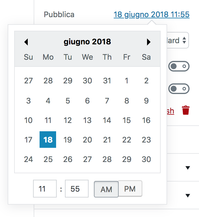
Looks like
react-datepicker, currently used for the "publish" date, has several accessibility issues.Just to mention a few:
day-15I was also able to break it completely just editing the hour/mins fields using a keyboard:
I'd strongly recommend that every external component/library included in Gutenberg should be picked up taking into consideration also its accessibility support.
Not sure
react-datepickercan be easily patched and made decently accessible. It would likely require a lot of work. Not sure if other, more accessible, react date-pickers exist. Not sure if using a date-picker is a good idea in the first place 🙁 Date pickers are always tricky.One option could be considering a completely different UI, without a date-picker. Happy to evaluate other, more accessible, tools if any, but I'm afraid
react-datepickerin its current state doesn't meet the quality standards we'd like to see in WordPress and it's a blocker for accessibility./cc @jasmussen and @joedolson (as he's an expert about calendars)
The text was updated successfully, but these errors were encountered: