Skip to content
New issue

Have a question about this project? Sign up for a free GitHub account to open an issue and contact its maintainers and the community.

By clicking “Sign up for GitHub”, you agree to our terms of service and privacy statement. We’ll occasionally send you account related emails.

Already on GitHub? Sign in to your account

Support drawing of cplot() effects for factors with more than two levels #46

Closed
leeper opened this issue Nov 3, 2016 · 6 comments
Closed

Comments

@leeper
Copy link
Owner

leeper commented Nov 3, 2016

Currently, an error is issued when trying to display the conditional effect(s) of a factor variable that has more than two levels in cplot():

> cplot(lm(y~x*fac,data=df), "x", "fac", what = "effect")
Error in cplot.lm(lm(y ~ x * fac, data = df), "x", "fac", what = "effect") : 
  Displaying on a factor variable with > 2 levels is not currently supported!

This could be fixed to display effect of each level/transition for the factor. margins() already does this fine, but it's a matter of figuring out how to draw it and return the data it appropriately.

@leeper leeper added this to the CRAN Release milestone Nov 3, 2016
@cschwem2er
Copy link

Hi,
first of all thank you so much for finally bringing margins to R. After seeing cplot() in the description and your example in this issue, I'm still not sure whether it is already possible to predict margins of a categorical across another continuous variable like so:
http://www.stata.com/stata14/i/mplot2.png
Will this be possible?

@leeper
Copy link
Owner Author

leeper commented Nov 10, 2016

@methodds Not currently. What package do you use to for multinomial or ordered response variables? Is it with MASS::polr()? If so, this should be feasible but it is not currently supported (cplot() currently only has methods for "lm", "glm", and "loess" models).

@cschwem2er
Copy link

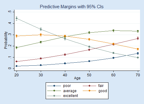
I'm not sure whether you perhaps misunderstood what I'm looking for. The different lines in the plot above refer to categories of an explanatory variable. The dependent variable still reflects probabilities from a logit model.

@leeper
Copy link
Owner Author

leeper commented Nov 10, 2016

@methodds Ah, sorry. I thought the graph was predicted probabilities for a multiple outcome regression (ordered/multinomial logit) model.

If you just want to show predictions, that's currently possible. It just requires running cplot() for every level of the factor, like this (specifying draw = "add" for subsequent plots), so that a new predicted probability line is added for each separate factor level:

library("datasets")
library("stats")
library("margins")
iris$long <- rbinom(nrow(iris), 1, 0.6)
x <- glm(long ~ Sepal.Width*Species, data = iris)
cplot(x, x = "Sepal.Width", data = iris[iris$Species == "setosa", ], ylim = c(0,1), col = "red", se.fill = NA, xlim = c(0,5))
cplot(x, x = "Sepal.Width", data = iris[iris$Species == "versicolor", ], draw = "add", col = "blue", se.fill = NA)
cplot(x, x = "Sepal.Width", data = iris[iris$Species == "virginica", ], draw = "add", col = "green", se.fill = NA)

It's not ideal, but should get you to what you need.

@cschwem2er
Copy link

just what I needed! thanks for the example :)

@leeper
Copy link
Owner Author

leeper commented Nov 13, 2016

I've added this example to the documentation. I'm going to close this for now; may revisit later.

@leeper leeper closed this as completed Nov 13, 2016
This issue was closed.
Sign up for free to join this conversation on GitHub. Already have an account? Sign in to comment
Projects
None yet
Development

No branches or pull requests

2 participants