


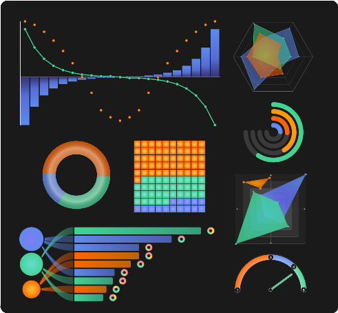
A user-empowering data visualization Vue components library for eloquent data storytelling.
Available components
- VueUiAgePyramid
- VueUiCandlestick
- VueUiChestnut
- VueUiDonutEvolution
- VueUiDonut
- VueUiDumbbell
- VueUiFlow
- VueUiGalaxy
- VueUiGauge
- VueUiHeatmap
- VueUiMolecule
- VueUiMoodRadar
- VueUiNestedDonuts
- VueUiOnion
- VueUiParallelCoordinatePlot
- VueUiQuadrant
- VueUiQuickChart
- VueUiRadar
- VueUiRelationCircle
- VueUiRings
- VueUiScatter
- VueUiStripPlot
- VueUiThermometer
- VueUiTiremarks
- VueUiTreemap
- VueUiVerticalBar
- VueUiWaffle
- VueUiWheel
- VueUiWordCloud
- VueUiXyCanvas
- VueUiXy
- VueUiAccordion
- VueUiAnnotator
- VueUiCursor
- VueUiDashboard
- VueUiDigits
- VueUiIcon
- VueUiKpi
- VueUiMiniLoader
- VueUiScreenshot
- VueUiSkeleton
- VueUiTimer
npm i vue-data-ui
You can declare components globally in your main.js:
import { createApp } from "vue";
import App from "./App.vue";
// Include the css;
import "vue-data-ui/style.css";

// You can declare Vue Data UI components globally
import { VueUiRadar } from "vue-data-ui";

const app = createApp(App);

app.component("VueUiRadar", VueUiRadar);
app.mount("#app");
Or you can import just what you need in your files:
<script setup>import {(VueUiRadar, VueUiXy)} from "vue-data-ui";</script>Since v.2.0.38, you can also use the "VueDataUi" universal component, just specifying which component you are using. You can of course use the slots provided, if the target component has them.
<script setup>
import { ref } from "vue";
import { VueDataUi } from "vue-data-ui";
// Include the css;
import "vue-data-ui/style.css";

const config = ref({...});
const dataset = ref([...]);

</script>

<template>

  <VueDataUi
    component="VueUiXy"
    :config="config"
    :dataset="dataset"
  />

</template>Types are available in the 'vue-data-ui.d.ts' file under the types directory of the package.
This repo contains a boilerplate implementation of the vue-data-ui package in Nuxt
Charts with tooltips have a config option to customize tooltip contents:
customFormat: ({ seriesIndex, datapoint, series, config }) => {
  return `<div>${ ... }</div>`;
}Most Vue Data UI chart components include a #svg slot you can use to introduce customized svg elements (shapes, text, etc).
<VueUiXy :dataset="dataset" :config="config">
  <template #svg="{ svg }">
    <foreignObject x="100" y="0" height="100" width="150">
      <div>This is a custom caption</div>
    </foreignObject>
  </template>
</VueUiXy>
The svg slot also works when using the VueDataUi universal component, if the component it wraps supports it.
All charts expose a #legend slot except for:
- VueUiFlow
- VueUiHeatmap
- VueUiRelationCircle
- VueUiSparkHistogram
- VueUiSparkStackbar
- VueUiSparkbar
- VueUiSparkgauge
- VueUiSparkline
- VueUiThermometer
- VueUiTiremarks
- VueUiWheel
- VueUiDumbbell
- VueUiTimer
The legend slot also works when using the VueDataUi universal component, if the component it wraps supports it. It is recommended to set the show legend config attribute to false, to hide the default legend.
<VueUiDonut :config="config" :dataset="dataset">
  <template #legend="{ legend }">
    <div v-for="item in legend">{{ legend.name }}</div>
  </template>
</VueUiDonut>Since v.2.0.57, it is possible to further customize tooltip contents with #tooltip-before and #tooltip-after slots. It is that easy to include an image, another chart or any other content into your tooltips. It's an alternative to the config option tooltip.customFormat, in case richer tooltip content is needed.
Both slots expose the following object:
{
  datapoint,
  seriesIndex,
  series,
  config,
}
The following charts bear these slots:
- VueUiAgePyramid
- VueUiCandlestick
- VueUiDonut
- VueUiGalaxy
- VueUiHeatmap
- VueUiMolecule
- VueUiNestedDonuts
- VueUiOnion
- VueUiQuadrant
- VueUiQuickChart
- VueUiParallelCoordinatePlot
- VueUiRadar
- VueUiRings
- VueUiScatter
- VueUiTreemap
- VueUiVerticalBar
- VueUiXy *
- VueUiwaffle
- VueUiXyCanvas
* VueUiXy slots specifically expose the following additional attributes:
{
  ...,
  bars,
  lines,
  plots
}
<VueUiDonut :config="config" :dataset="dataset">
  <template #tooltip-before={ datapoint, seriesIndex, dataset, config }">
    <div>
      This content shows first
    </div>
  </template>
  <template #tooltip-after={ datapoint, seriesIndex, dataset, config }">
    <div>
      This content shows last
    </div>
  </template>
</VueUiDonut>
The #tooltip-before & #tooltip-after slots also works when using the VueDataUi universal component, if the component it wraps supports them.
Available for the following components:
- VueUiQuickChart (for line & bar types only)
- VueUiXy
- VueUiDonutEvolution
- VueUiCandlestick
The config option zoom.useResetSlot must be set to true to use the slot.
<VueUiXy :config="config" :dataset="dataset">
  <template #reset-action="{ reset }">
    <button @click="reset()">RESET ZOOM</button>
  </template>
</VueUiXy>If for some reason you can't access the documentation website and need to get the default config object for a component:
import { getVueDataUiConfig } from "vue-data-ui";

const defaultConfigXy = getVueDataUiConfig("vue_ui_xy");All charts are set by default without a theme, and use the default color palette.
3 themes are available for all charts:
- zen
- hack
- concrete
Any color provided in dataset props will override the colors used by the theme for datapoints.
To use a theme, set the theme attribute of the config prop, for example:
const donutConfig = ref({
  theme: 'zen',
  ...
})Type definitions are available in the vue-data-ui.d.ts file in the dist/types directory.
| Name | dataset type | config type | emits / exposed methods | slots | custom tooltip | themes |
|---|---|---|---|---|---|---|
VueDataUi |
(depends on component) | (depends on component) | (depends on component) | (depends on component) | (depends on component) | (depends on component) |
From the dataset you pass into the props, this component will produce the most adapted chart (either a line, bar or donut chart)
| Name | dataset type | config type | emits / exposed methods | slots | custom tooltip | themes |
|---|---|---|---|---|---|---|
VueUiQuickChart |
VueUiQuickChartDataset |
VueUiQuickChartConfig |
@selectDatapoint, @selectLegend, generatePdf, generateImage, toggleTooltip |
#legend, #tooltip-before, #tooltip-after, #reset-action |
✅ | ✅ |
| Name | dataset type | config type | emits / exposed methods | slots | custom tooltip | themes |
|---|---|---|---|---|---|---|
VueUiSparkline |
VueUiSparklineDatasetItem[] |
VueUiSparklineConfig |
@selectDatapoint |
#svg, #before |
❌ | ✅ |
VueUiSparkbar |
VueUiSparkbarDatasetItem[] |
VueUiSparkbarConfig |
@selectDatapoint |
#data-label, #title |
❌ | ✅ |
VueUiSparkStackbar |
VueUiSparkStackbarDatasetItem[] |
VueUiSparkStackbarConfig |
@selectDatapoint |
❌ | ❌ | ✅ |
VueUiSparkHistogram |
VueUiSparkHistogramDatasetItem[] |
VueUiSparkHistogramConfig |
@selectDatapoint |
❌ | ❌ | ✅ |
VueUiSparkGauge |
VueUiSparkGaugeDataset |
VueUiSparkGaugeConfig |
❌ | ❌ | ❌ | ✅ |
VueUiSparkTrend |
number[] |
VueUiSparkTrendConfig |
❌ | ❌ | ❌ | ✅ |
| Name | dataset type | config type | emits / exposed methods | slots | custom tooltip | themes |
|---|---|---|---|---|---|---|
VueUiAgePyramid |
Array<Array<string / number>> |
VueUiSparklineConfig |
generatePdf, generateImage, generateCsv, toggleTable, toggleTooltip |
#svg, #legend, #tooltip-before, #tooltip-after |
✅ | ✅ |
VueUiCandlestick |
Array<Array<string / number>> |
VueUiCandlestickConfig |
generatePdf, generateImage, generateCsv, toggleTable, toggleTooltip |
#svg, #legend, #tooltip-before, #tooltip-after, #reset-action |
✅ | ✅ |
VueUiChestnut |
VueUiChestnutDatasetRoot[] |
VueUiChestnutConfig |
@selectRoot, @selectBranch, @selectNut, getData, generatePdf, generateCsv, generateImage, toggleTable |
#svg, #legend |
❌ | ✅ |
VueUiDonut |
VueUiDonutDatasetItem[] |
VueUiDonutConfig |
@selectDatapoint, @selectLegend, getData, generatePdf, generateCsv, generateImage, toggleTable, toggleLabels, toggleTooltip |
#svg, #legend, #dataLabel, #tooltip-before, #tooltip-after, #plot-comment |
✅ | ✅ |
VueUiDonutEvolution |
VueUiDonutEvolutionDatasetItem[] |
VueUiDonutEvolutionConfig |
@selectLegend, getData, generatePdf, generateCsv, generateImage, toggleTable |
#svg, #legend, #reset-action |
❌ | ✅ |
VueUiDumbbell |
VueUiDumbbellDataset[] |
VueUiDumbbellConfig |
getData, generatePdf, generateCsv, generateImage, toggleTable |
#svg, #legend, |
❌ | ✅ |
VueUiFlow |
VueUiFlowDatasetItem[] |
VueUiFlowConfig |
getData, generatePdf, generateCsv, generateImage, toggleTable |
#svg, |
❌ | ✅ |
VueUiGalaxy |
VueUiGalaxyDatasetItem[] |
VueUiGalaxyConfig |
@selectDatapoint, @selectLegend, getData, generatePdf, generateCsv, generateImage, toggleTable, toggleTooltip |
#svg, #legend,#tooltip-before, #tooltip-after |
✅ | ✅ |
VueUiGauge |
VueUiGaugeDataset |
VueUiGaugeConfig |
generatePdf, generateImage |
#svg, #legend, |
❌ | ✅ |
VueUiHeatmap |
VueUiHeatmapDatasetItem[] |
VueUiHeatmapConfig |
generatePdf, generateCsv, generateImage, toggleTable, toggleTooltip |
#svg, #tooltip-before, #tooltip-after |
✅ | ✅ |
VueUiMolecule |
VueUiMoleculeDatasetNode[] |
VueUiMoleculeConfig |
getData, generatePdf, generateCsv, generateImage, toggleTable, toggleLabels, toggleTooltip |
#svg, #tooltip-before, #tooltip-after |
✅ | ✅ |
VueUiMoodRadar |
VueUiMoodRadarDataset |
VueUiMoodRadarConfig |
getData, generatePdf, generateCsv, generateImage, toggleTable |
#svg, #legend |
❌ | ✅ |
VueUiNestedDonuts |
VueUiNestedDonutsDatasetItem[] |
VueUiNestedDonutsConfig |
@selectDatapoint, @selectLegend, getData, generatePdf, generateCsv, generateImage, toggleTable, toggleLabels, toggleTooltip |
#svg, #legend, #tooltip-before, #tooltip-after |
✅ | ✅ |
VueUiOnion |
VueUiOnionDatasetItem[] |
VueUiOnionConfig |
@selectLegend, getData, generatePdf, generateCsv, generateImage, toggleTable, toggleTooltip |
#svg, #legend, #tooltip-before, #tooltip-after |
✅ | ✅ |
VueUiParallelCoordinatePlot |
VueUiParallelCoordinatePlotDatasetItem[] |
VueUiParallelCoordinatePlotConfig |
@selectLegend, @selectDatapoint, getData, generatePdf, generateCsv, generateImage, toggleTable, toggleLabels, toggleTooltip |
#svg, #legend, #tooltip-before, #tooltip-after, #plot-comment |
✅ | ✅ |
VueUiQuadrant |
VueUiQuadrantDatasetItem[] |
VueUiQuadrantConfig |
@selectLegend, @selectPlot, @selectSide, getData, generatePdf, generateCsv, generateImage, toggleTable, toggleLabels, toggleTooltip |
#svg, #legend, #tooltip-before, #tooltip-after |
✅ | ✅ |
VueUiRadar |
VueUiRadarDataset |
VueUiRadarConfig |
@selectLegend, getData, generatePdf, generateCsv, generateImage, toggleTable, toggleTooltip |
#svg, #legend, #tooltip-before, #tooltip-after |
✅ | ✅ |
VueUiRings |
VueUiRingsDatasetItem[] |
VueUiRingsConfig |
@selectLegend, getData, generatePdf, generateCsv, generateImage, toggleTable, toggleTooltip |
#svg, #legend, #tooltip-before, #tooltip-after |
✅ | ✅ |
VueUiScatter |
VueUiScatterDatasetItem[] |
VueUiScatterConfig |
getData, generatePdf, generateCsv, generateImage, toggleTable, toggleTooltip |
#svg, #legend, #tooltip-before, #tooltip-after |
✅ | ✅ |
VueUiStripPlot |
VueUiStripPlotDataset[] |
VueUiStripPlotConfig |
@selectDatapoint, getData, generatePdf, generateCsv, generateImage, toggleTable, toggleLabels, toggleTooltip |
#svg, #legend, #tooltip-before, #tooltip-after |
✅ | ✅ |
VueUiThermometer |
VueUiThermometerDataset |
VueUiThermometerConfig |
generatePdf, generateImage |
#svg |
❌ | ✅ |
VueUiTiremarks |
VueUiTiremarksDataset |
VueUiTiremarksConfig |
generatePdf, generateImage |
#svg, #legend |
❌ | ✅ |
VueUiTreemap |
VueUiTreemapDatasetItem[] |
VueUiTreemapConfig |
@selectLegend, @selectDatapoint, getData, generatePdf, generateCsv, generateImage, toggleTable, toggleTooltip |
#svg, #rect, #legend, #tooltip-before, #tooltip-after |
✅ | ✅ |
VueUiVerticalBar |
VueUiVerticalBarDatasetItem[] |
VueUiWheelConfig |
@selectLegend, getData, generatePdf, generateCsv, generateImage, toggleTable, toggleSort, toggleTooltip |
#svg, #legend, #tooltip-before, #tooltip-after |
✅ | ✅ |
VueUiWaffle |
VueUiWaffleDatasetItem[] |
VueUiWaffleConfig |
@selectLegend, getData, generatePdf, generateCsv, generateImage, toggleTable, toggleTooltip |
#svg, #legend, #tooltip-before, #tooltip-after |
✅ | ✅ |
VueUiWheel |
VueUiWheelDataset |
VueUiWheelConfig |
generatePdf, generateImage |
#svg |
❌ | ✅ |
VueUiWordCloud |
VueUiWordCloudDatasetItem[] / string |
VueUiWordCloudConfig |
getData, generatePdf, generateImage, generateCsv |
#svg |
❌ | ✅ |
VueUiXy |
VueUiXyDatasetItem[] |
VueUiXyConfig |
@selectLegend, @selectX, getData, generatePdf, generateCsv, generateImage, toggleTable, toggleLabels, toggleStack, toggleTooltip |
#svg, #legend, #tooltip-before, #tooltip-after, #reset-action, #plot-comment, |
✅ | ✅ |
VueUiXyCanvas |
VueUiXyCanvasDatasetItem[] |
VueUiXyCanvasConfig |
@selectLegend, getData, generatePdf, generateCsv, generateImage, toggleTable, toggleLabels, toggleStack, toggleTooltip |
#legend, #tooltip-before, #tooltip-after, #reset-action |
✅ | ✅ |
| Name | dataset type | config type | emits / exposed methods | slots | custom tooltip | themes |
|---|---|---|---|---|---|---|
VueUi3dBar |
VueUi3dBarDataset |
VueUi3dBarConfig |
generatePdf, generateImage, toggleTable |
#svg |
❌ | ✅ |
| Name | dataset type | config type | emits / exposed methods | slots | themes |
|---|---|---|---|---|---|
VueUiTable |
VueUiTableDataset |
VueUiTableConfig |
❌ | ❌ | ❌ |
VueUiTableHeatmap |
VueUiTableHeatmapDatasetItem[] |
VueUiTableHeatmapConfig |
generatePdf, generateCsv, generateImage |
#caption, #rowTitle, #cell, #sum, #average, #median |
✅ |
VueUiTableSparkline |
VueUiTableSparklineDatasetItem[] |
VueUiTableSparklineConfig |
generatePdf, generateCsv, generateImage |
❌ | ✅ |
| Name | dataset type | config type | emits / exposed methods |
|---|---|---|---|
VueUiRating |
VueUiRatingDataset |
VueUiRatingConfig |
@rate, getData,toggleReadonly |
VueUiSmiley |
VueUiRatingDataset |
VueUiSmileyConfig |
@rate, getData,toggleReadonly |
| Name | dataset type | config type | emits / exposed methods | slots |
|---|---|---|---|---|
VueUiAccordion |
❌ | VueUiAccordionConfig |
❌ | #arrow, #title, #content |
VueUiAnnotator |
VueUiAnnotatorDataset |
VueUiAnnotatorConfig |
@toggleOpenState, @saveAnnotations |
❌ |
VueUiCursor |
❌ | VueUiCursorConfig |
❌ | ❌ |
VueUiDashboard |
VueUiDashboardElement[] |
VueUiDashboardConfig |
@change |
#content |
VueUiDigits |
number |
VueUiDigitsConfig |
❌ | ❌ |
VueUiKpi |
number |
VueUiKpiConfig |
❌ | #title, #value, #comment-before, #comment-after |
VueUiMiniLoader |
❌ | VueUiMiniLoaderConfig |
❌ | ❌ |
VueUiScreenshot |
❌ | VueUiScreenshotConfig |
@postImage, shoot, close |
❌ |
VueUiSkeleton |
❌ | VueUiSkeletonConfig |
❌ | ❌ |
VueUiTimer |
❌ | VueUiTimerConfig |
@start, @pause, @reset, @restart, @lap |
#time, #controls, #laps |
VueUiIcon |
see below |
Tailor made icons are available through the VueUiIcon component:
<VueUiIcon name="arrowRight" :size="24" stroke="#6376DD" />All names of available icons are available in the vue-data-ui.d.ts file under the VueUiIconName type.
User options menu is accessible in the burger menu located on the top right of charts, and visible by default. To hide user options menu, set config.userOptions.show to false:
const config = ref({
  userOptions: {
    show: false
  },
  ...
})
Predefined actions in user options menu depend on the type of chart. Some charts have more or less actions available. Action buttons contain an predefined icons by default.
To hide a given action, set the userOption.buttons, for example:
const config = ref({
  userOptions: {
    show: true,
    buttons: {
      pdf: false,
      fullscreen: false,
      // all other actions will be visible by default (list of all actions below)
    },
  },
});
You can use slots to override the content of action buttons. What happens when the button is clicked is taken care of by the component, except for the optionFullscreen slot.
<VueUiDonut :config="config" :dataset="dataset">
  <template #optionPdf> GENERATE PDF </template>

  <!-- This is the only action where scoped content is provided -->
  <template template #optionFullscreen="{ isFullscreen, toggleFullscreen }">
    <div @click="toggleFullscreen(isFullscreen ? 'out' : 'in')">
      TOGGLE FULLSCREEN
    </div>
  </template>
</VueUiDonut>
User options actions available per chart:
| Chart name | User options actions slot names |
|---|---|
| VueUi3dBar | optionPdf, optionImg, optionCsv, optionTable, optionFullscreen |
| VueUiAgePyramid | optionTooltip, optionPdf, optionImg, optionCsv, optionTable, optionFullscreen |
| VueUiCandlestick | optionTooltip, optionPdf, optionImg, optionCsv, optionTable, optionFullscreen |
| VueUiChestnut | optionPdf, optionImg, optionCsv, optionTable, optionFullscreen |
| VueUiDonut | optionTooltip, optionPdf, optionImg, optionCsv, optionTable, optionLabels, optionFullscreen |
| VueUiDonutEvolution | optionPdf, optionImg, optionCsv, optionTable, optionFullscreen |
| VueUiDumbbell | optionPdf, optionImg, optionCsv, optionTable, optionFullscreen |
| VueUiFlow | optionPdf, optionImg, optionCsv, optionTable, optionFullscreen |
| VueUiGalaxy | optionTooltip, optionPdf, optionImg, optionCsv, optionTable, optionFullscreen |
| VueUiGauge | optionPdf, optionImg, optionFullscreen |
| VueUiHeatmap | optionTooltip, optionPdf, optionImg, optionCsv, optionTable, optionFullscreen |
| VueUiMolecule | optionTooltip, optionPdf, optionImg, optionCsv, optionTable, optionLabels, optionFullscreen |
| VueUiMoodRadar | optionPdf, optionImg, optionCsv, optionTable, optionFullscreen |
| VueUiNestedDonuts | optionTooltip, optionPdf, optionImg, optionCsv, optionTable, optionLabels, optionFullscreen |
| VueUiOnion | optionTooltip, optionPdf, optionImg, optionCsv, optionTable, optionFullscreen |
| VueUiParallelCoordinatePlot | optionTooltip, optionPdf, optionImg, optionCsv, optionTable, optionLabels, optionFullscreen |
| VueUiQuadrant | optionTooltip, optionPdf, optionImg, optionCsv, optionTable, optionLabels, optionFullscreen |
| VueUiQuickChart | optionTooltip, optionPdf, optionImg, optionFullscreen |
| VueUiRadar | optionTooltip, optionPdf, optionImg, optionCsv, optionTable, optionFullscreen |
| VueUiRelationCircle | optionPdf, optionImg, optionFullscreen |
| VueUiRings | optionTooltip, optionPdf, optionImg, optionCsv, optionTable, optionFullscreen |
| VueUiScatter | optionTooltip, optionPdf, optionImg, optionCsv, optionTable, optionFullscreen |
| VueUiSparkHistogram | (no user options menu) |
| VueUiSparkStackbar | (no user options menu) |
| VueUiSparkTrend | (no user options menu) |
| VueUiSparkbar | (no user options menu) |
| VueUiSparkgauge | (no user options menu) |
| VueUiSparkline | (no user options menu) |
| VueUiStripPlot | optionTooltip, optionPdf, optionImg, optionCsv, optionTable, optionLabels, optionFullscreen |
| VueUiTableHeatmap | optionPdf, optionImg, optionCsv, optionFullscreen |
| VueUiTableSparkline | optionPdf, optionImg, optionCsv, optionFullscreen |
| VueUiThermometer | optionPdf, optionImg, optionFullscreen |
| VueUiTiremarks | optionPdf, optionImg, optionFullscreen |
| VueUiTreemap | optionTooltip, optionPdf, optionImg, optionCsv, optionTable, optionFullscreen |
| VueUiVerticalBar | optionTooltip, optionPdf, optionImg, optionCsv, optionTable, optionSort, optionFullscreen |
| VueUiWaffle | optionTooltip, optionPdf, optionImg, optionCsv, optionTable, optionFullscreen |
| VueUiWheel | optionPdf, optionImg, optionFullscreen |
| VueUiWordCloud | optionPdf, optionImg, optionCsv, optionTable, optionFullscreen |
| VueUiXy | optionTooltip, optionPdf, optionImg, optionCsv, optionTable, optionLabels, optionFullscreen, optionStack |
| VueUiXyCanvas | optionTooltip, optionPdf, optionImg, optionCsv, optionTable, optionLabels, optionFullscreen, optionStack |
It is possible to provide a custom palette in the config prop through config.customPalette (string[]) for the following components:
- VueUi3dBar
- VueUiChestnut
- VueUiDonut
- VueUiDonutEvolution
- VueUiFlow
- VueUiGalaxy
- VueUiGauge
- VueUiMolecule
- VueUiNestedDonuts
- VueUiOnion
- VueUiParallelCoordinatePlot
- VueUiQuadrant
- VueUiQuickChart
- VueUiRadar
- VueUiRelationCircle
- VueUiRings
- VueUiScatter
- VueUiSparkStackbar
- VueUiSparkbar
- VueUiStripPlot
- VueUiTableSparkline
- VueUiThermometer
- VueUiTreemap
- VueUiVerticalBar
- VueUiWaffle
- VueUiWordCloud
- VueUiXy
- VueUiXyCanvas
If the array of colors provided in customPalette is too small for the dataset, remaining colors will be computed from the default internal palette. Accepted color formats: HEX, RGB, HSL, named colors.
By default, all charts will scale to the width of their container. However the folowing charts can be made fully responsive, making them better to use in resizable containers:
| Component | Responsive feature implemented |
|---|---|
| VueUi3dBar | - |
| VueUiAgePyramid | ✅ |
| VueUiCandlestick | ✅ |
| VueUiChestnut | - |
| VueUiDonut | ✅ |
| VueUiDonutEvolution | - |
| VueUiDumbbell | ✅ |
| VueUiFlow | - |
| VueUiGalaxy | - |
| VueUiGauge | ✅ |
| VueUiHeatmap | - |
| VueUiMolecule | - |
| VueUiMoodRadar | - |
| VueUiNestedDonuts | ✅ |
| VueUiOnion | ✅ |
| VueUiParallelCoordinatePlot | ✅ |
| VueUiQuadrant | ✅ |
| VueUiQuickChart | ✅ |
| VueUiRadar | ✅ |
| VueUiRelationCircle | ✅ |
| VueUiRings | ✅ |
| VueUiScatter | ✅ |
| VueUiSparkHistogram | - |
| VueUiSparkStackbar | - |
| VueUiSparkTrend | - |
| VueUiSparkbar | - |
| VueUiSparkgauge | - |
| VueUiSparkline | - |
| VueUiStripPlot | ✅ |
| VueUiTableHeatmap | - |
| VueUiTableSparkline | - |
| VueUiThermometer | - |
| VueUiTimer | ✅ |
| VueUiTiremarks | - |
| VueUiTreemap | ✅ |
| VueUiVerticalBar | ✅ |
| VueUiWaffle | ✅ |
| VueUiWheel | ✅ |
| VueUiWordCloud | ✅ |
| VueUiXy | ✅ |
| VueUiXyCanvas | ✅ |
To activate responsiveness, set the config.responsive attribute to true:
const config = ref({
  responsive: true,
  // rest of your config
});
Important: when using the responsive feature, charts must be placed inside a container with fixed dimensions. Avoid setting a 100% height to this container, as it will result in the chart growing infinitely.