Skip to content
New issue

Have a question about this project? Sign up for a free GitHub account to open an issue and contact its maintainers and the community.

By clicking “Sign up for GitHub”, you agree to our terms of service and privacy statement. We’ll occasionally send you account related emails.

Already on GitHub? Sign in to your account

Use the gray color for all abstract classes #80184

Merged
merged 1 commit into from
Sep 1, 2023

Conversation

MewPurPur
Copy link
Contributor

@MewPurPur MewPurPur commented Aug 2, 2023

This is meant as a small quality of life thing and something that should be "obviously better", so I haven't made a proposal for it yet. The changes in this PR are as follows:

  • Gray out all abstract class icons that currently exist
  • In Create Dialog and Search Help, use either NodeDisabled.svg for abstract nodes that don't have icons, or the newly added ObjectDisabled.svg for abstract non-node objects that don't have icons

I think this gives a pretty good result overall:

  • You can more easily tell if a class is abstract from its icon

image

  • Virtual objects no longer appear like disabled nodes

image

  • Search Help now aligns with what you see in the creation dialog.

image

(CollisionShape2D and CollisionShape3D currently appear with a white Object icon)

@MewPurPur MewPurPur requested a review from a team as a code owner August 2, 2023 19:41
@AThousandShips AThousandShips added this to the 4.x milestone Aug 2, 2023
Copy link
Member

@fire fire left a comment

Choose a reason for hiding this comment

The reason will be displayed to describe this comment to others. Learn more.

As part of the usability team I really like the concept of greying out the images. Did not technical review.

Copy link
Member

@Calinou Calinou left a comment

Choose a reason for hiding this comment

The reason will be displayed to describe this comment to others. Learn more.

Tested locally, it works as expected.

Screenshot_20230803_033615

Screenshot_20230803_033704

@MewPurPur MewPurPur marked this pull request as draft August 3, 2023 13:10
@MewPurPur
Copy link
Contributor Author

Missed something.

@MewPurPur
Copy link
Contributor Author

image

Applied this also to the inspector.

image

^ Light theme in case you're worried about contrast.

@MewPurPur MewPurPur marked this pull request as ready for review August 3, 2023 14:24
@akien-mga
Copy link
Member

I'm a bit concerned about changing the base color of these icons, as the color is meant to reflect the inheritance (red icons all inherit from Node3D, etc.). I think it can make sense to modulate the icon for abstract classes programmatically for the Create New Node dialog, but I'd keep them in a shade that conveys the inheritance, and not modify the base SVGs, so it doesn't impact e.g. the icons visible in the Editor Help or Inspector.

@YuriSizov
Copy link
Contributor

To add to that, we may sneakily use some of these icons for other visual elements where it can be important to preserve the color to convey the context/meaning.

@MewPurPur
Copy link
Contributor Author

MewPurPur commented Aug 3, 2023

This was actually my initial idea. I'm not against this per-se, but to be devil's advocate:

  • Doing this programmatically might lead to counterintuitive results. The main thing is that, for example, to turn the light color into a disabled color, if our programmatic rule is to keep half of the original color, then we have to modulate not with #808080, but rather a really dark color #1f1f1f. I've not tested this though.
  • It increases the amount of colors significantly, and with resources, these colors will often be used exactly once. Seeing an unfamiliar color might become unclear if it's something abstract or something you don't know. The color availability is reduced. It increases the risk of things blending in backgrounds.
  • Less association between the 20% of abstract classes that have icons, and the 80% that are missing icons and so are using a grayed out node/object icon.

So I'll resist it a little for now, so we can have some discussion about these pros and cons.

@YuriSizov I don't get what you mean.

@YuriSizov
Copy link
Contributor

I don't get what you mean.

These icons may be used for things other than node types in the editor. And in those cases it is very likely important that icons have their assigned color palette, as Akien mentions.

@TheYellowArchitect
Copy link

Doing this programmatically might lead to counterintuitive results. The main thing is that, for example, to turn the light color into a disabled color, if our programmatic rule is to keep half of the original color, then we have to modulate not with #808080, but rather a really dark color #1f1f1f. I've not tested this though.
It increases the amount of colors significantly, and with resources, these colors will often be used exactly once. Seeing an unfamiliar color might become unclear if it's something abstract or something you don't know. The color availability is reduced. It increases the risk of things blending in backgrounds.
Less association between the 20% of abstract classes that have icons, and the 80% that are missing icons and so are using a grayed out node/object icon.

Why have them programmatically? It's basically 3 colors. There is red (3D), green(Control), blue(2D) basically RGB. If the color isn't at least a shade of the aforementioned 3 colors, as Akien mentioned above, gray degrades the colorcoding intuitiveness.

@MewPurPur
Copy link
Contributor Author

Idea: 3 non-programmatical 60% gray colors for GUI, 2D, and 3D. Gray for white icons and everything else

@akien-mga
Copy link
Member

I'm pretty sure we can find a modulate value that makes it look desaturated without having to change the icons.

@MewPurPur
Copy link
Contributor Author

MewPurPur commented Aug 3, 2023

If we have a custom color for abstract 2D, 3D, and GUI nodes, then I'd prefer to have it in the icons so their appearance is consistent everywhere you see that icon. IMO the only good point was about their color communicating something about their inheritance, and this would solve it.

@MewPurPur
Copy link
Contributor Author

MewPurPur commented Aug 3, 2023

image

image

Do you like this? It's on the icons. I'm not that sure about it but I guess it's fine

@Zireael07
Copy link
Contributor

Related: #794

We shouldn't be using solely color to convey inheritance

@MewPurPur
Copy link
Contributor Author

MewPurPur commented Aug 4, 2023

I saw that proposal, but my personal conclusion was as follows:

  • The problem was always hypothetical, not a report from a colorblind person. In fact, no type of color blindness other than monochromia (extremely rare) should struggle to tell apart red and blue.
  • White and green are problematic, but that's only a problem with Node, Node2D, Node3D, Control.

So then we're left with 10-15 nodes that share the same icon between blue and red. It seems like an obvious conclusion that a different shape improves usability, but I beg to differ:

  • As aforementioned, colorblind users don't actually struggle to tell apart blue and red.
  • Our icons are meant to work in 16x16. Flat icons are very easy to read and understand, but all suggestions that people updooted were for fancy 3D effects would be difficult to read in practice.
  • The suggestion that didn't involve 3D effects had arbitrary pillars, like blue=masculine, red=feminine. People didn't like that.

Because of this, I only appreciate a change of 3D icons when there's an important functional difference it tries to communicate (e.g. CollisionPolygon3D).

NavigationObstacle and NavigationAgent use different shapes for their 2D and 3D versions' icons, even though they don't need to, and I think this shows the shortcomings of this whole idea. NavigationAgent3D is painful to recognize at small scales because it has this fancy 3D effect, whereas the simple flat NavigationAgent2D is insta recognizable.

So yes, I think improving this for monochromia people makes it way too much worse for everyone else for it to be worth it IMO.

And besides, just because colorblind people exist, doesn't mean we shouldn't use colors for usability. It rather means we shouldn't rely on them and consider them more of a last resort, when nothing else works - consider syntax highlighting. And I don't think anything else works here.

@YuriSizov
Copy link
Contributor

The dimmed colors version looks nice, assuming it's done with modulation.

@MewPurPur
Copy link
Contributor Author

MewPurPur commented Aug 4, 2023

No, it's not modulation, it's three new colors in the editor themes that are 60% gray and 40% green/red/blue.

I don't really get why we'd want to use modulation, to me it seems better to be consistent everywhere with how we display these classes. It's not entirely gray, so it won't look disabled e.g if it's on a button - so I don't see a problem

@Zireael07
Copy link
Contributor

It rather means we shouldn't rely on them and consider them more of a last resort,

What I said, just in different words ;)

@MewPurPur
Copy link
Contributor Author

MewPurPur commented Aug 4, 2023

Not really, because I'm saying essentially "we should use solely color to represent inheritance, because every other way is worse and blue and red are easy to tell apart for everyone"

@MewPurPur
Copy link
Contributor Author

MewPurPur commented Aug 21, 2023

Next take: The colors used are a bit different, in a way that should be distinct enough from both plain gray and the node color. No modulation is used, I didn't get any nice colors from applying modulation indiscriminately. It would've also forced a bunch of light vs dark theme checks, so I think it's much nicer to just have 3 dedicated "abstract" colors that sit between gray and the node color (in my case, obtained by getting 1/3 gray, 2/3 node color, and darkening/lightening by 15%)

I changed EditorNode's get_class_icon() function to get at the core of the issue, as there were more places listing nodes than just the 3 I addressed. Afaik now it looks good everywhere. The new get_class_icon() uses my logic as a default fallback for missing icons, and provides a way to use a different type of fallback - only used by EditorHelp, afaik.

image

image

Copy link
Member

@aaronfranke aaronfranke left a comment

Choose a reason for hiding this comment

The reason will be displayed to describe this comment to others. Learn more.

I like the colors in the latest version of the PR. I do wonder if it should be slightly grayer, but now it is easy to tell what dimension these nodes are from.

editor/create_dialog.cpp Outdated Show resolved Hide resolved
@aaronfranke
Copy link
Member

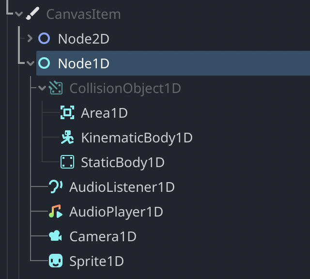
I just remembered I had already done something similar with the colors in Node1D:

I used faded cyan for CollisionObject1D. So, yeah, I like the colors in this PR.

@MewPurPur
Copy link
Contributor Author

MewPurPur commented Aug 22, 2023

I opted for a bit of desaturation because while cyan is a bright color, our 2D blue is darker even than the 50% gray, so abstract blue would have looked bad in some places (as most of our interface is blueish)

We don't have abstract 2D classes icons currently, but it might become a thing 🤷

@Calinou
Copy link
Member

Calinou commented Aug 30, 2023

How it looks with the latest revision of this PR:

Before After
Screenshot_20230830_203840 Screenshot_20230830_203824

PS: Scrollbar, Slider and Separator abstract classes are lacking icons. Maybe we can use diagonally rotated variants like we did for BoxContainer? Either way, that would be for a future PR.

editor/editor_node.h Outdated Show resolved Hide resolved
editor/editor_node.cpp Outdated Show resolved Hide resolved
Copy link
Contributor

@YuriSizov YuriSizov left a comment

Choose a reason for hiding this comment

The reason will be displayed to describe this comment to others. Learn more.

See above.

@MewPurPur
Copy link
Contributor Author

@Calinou Was already in my plans, I just wanted to finally determine what'll happen with abstract node icons.

@MewPurPur
Copy link
Contributor Author

MewPurPur commented Aug 31, 2023

This push should resolve the suggested changes.

Copy link
Contributor

@YuriSizov YuriSizov left a comment

Choose a reason for hiding this comment

The reason will be displayed to describe this comment to others. Learn more.

The implementation looks great now!

I've come around to the idea of hardcoding desaturated colors, so I think we can go ahead with this.

@YuriSizov YuriSizov modified the milestones: 4.x, 4.2 Aug 31, 2023
@akien-mga akien-mga merged commit 5588980 into godotengine:master Sep 1, 2023
15 checks passed
@akien-mga
Copy link
Member

Thanks!

@aaronfranke
Copy link
Member

With this PR, descendants of types without explicit icons are missing icons. I think this is a bug. Before:

Screenshot 2023-09-04 at 1 12 46 AM

After:

Screenshot 2023-09-04 at 1 14 39 AM

@YuriSizov
Copy link
Contributor

YuriSizov commented Sep 5, 2023

With this PR, descendants of types without explicit icons are missing icons.

Not entirely this PR's fault, but it did expose something. I'll make a fix.

Sign up for free to join this conversation on GitHub. Already have an account? Sign in to comment
Projects
None yet
Development

Successfully merging this pull request may close these issues.

9 participants