I'm developing a number of pipelines that I use to utilize different software in order to measure recombination in bacteria. In order to validate my results, I relate the results of each pipeline.
- workflow_reads maps reads to a manually picked reference. Recombination is then inferred on the cg-alignment or each gene in the reference.
- workflow_assemblyalignmentgenerator uses the pipeline developed by kussell-lab.
- workflow_mcorr uses syntenic cg-alignments. Specifically for Rleguminosarum
- workflow_PHI uses Bruen's recombination inference tool.
I want to investigate the relationship between recombination-rate and GC3 content. I found a new method for inferring recombination rate in bacteria kussell-lab/mcorr and wanted to use it to indirectly replicate Lassalle et al. 2015. In this study they use PHI which I will come back around later. The GC3 content is easy to measure. Just align the reading frame, and count the proportion of G's and C's on every third position.
I wanted to have a strong signal, so I chose the species with the strongest known relation. In Lassalle et al. 2015 they show that a linear relationship between recombination and GC3 has an R^2 = .68 for Streptococcus pyogenes. Thus I randomly selected ~60 S. pyogenes genomes from genbank, aligned the core genomes and measured the recombination for each gene. When I use kussell-lab/mcorr, I get the following results:

Figure 1: Recombination rate inferred from the core genes of 64 randomly selected S. pyogenes genomes from genbank shown against the GC3 content of each gene. Relationship missing.
This figure shows that either there is no relationship, or something is wrong with the method. The problem is that mcorr most often infers that recombination is lacking (close to zero).
As a measure to make Figure 1 more comparable to the main figure in Lassalle, I made 20 bins with an equal number of genes in each, and calculated median phi_pool:
 Figure 1.1: Recombination rate inferred from the core genes of 64 randomly selected S. pyogenes genomes from genbank shown against the GC3 content of each gene. 20 bins. Relationship is negative at best.
I think the problem is that even though there is recombination, it is hard to infer it from single genes. Recombination is measured using linkage-disequilibrium (LD). If the sequences are too short (average gene length 1000) means that there is not much LD to measure. If we concatenate syntenic genes and inferm recombination from these, we might have enough signal to actually measure recombination.
I found a dataset of core genes from 5 genospecies of Rhizobium leguminosarum. Other studies on this data suggests that the recombination/GC-bias should be existing in this dataset. I concatenated the genes in bins of different sizes, inferred recombination. The code for this pipeline can be found in workflow/. These are the results I got.
 Figure2: Recombination rate against GC3 content for concatenated core genes of size 20K.
As we can see, again, there is no relationship between the GC3-content and recombination rate. Maybe there is a relationship for genospecies D, bin size 20000. But only if you remove all the points in the bottom.
I tried removing the tails of the distribution, but this doesn't help on the relationship. I'm starting to think that either something is wrong with this method, or I'm using it wrong. As a sanity check, in order the check if there is a relationship in this data or not, using a method that we know works (PHI in Lassalle et al. 2015), we can check that the data we're feeding into mcorr actually has a signal.
I ran PHI for each gene in the core genome of these 5 genospecies of R. leguminosarum. The pipeline for this can be found at workflow_PHI/, and these are the results I got:

Figure 3: 20 bins with an equal number of genes in each. mean_GC3 is the mean GC3 content in that bin and ratio is the number of significantly recombining genes over the total number of genes in the bin. Significance of recombination is inferred with PHI.
Finally we get a strong signal. The R^2 are somewhat high. I think they are low for some of the genospecies because of a limited sample size. The sample sizes for each genospecies (R. leguminosarum) are as follows:
| genospecies | # isolates |
|---|---|
| A | 32 |
| B | 32 |
| C | 116 |
| D | 5 |
| E | 11 |
| Table 1: Overview of the number of isolates (samples) in each genospecies. |
At this point we know that the data is OK. Thus, something must be wrong with the way we apply the mcorr recombination inference tool.
I wanted to compare the results of mcorr and PHI, but here two problems arise. 1 PHI calculates p-values and mcorr calculates recombination rates. These are very differently distributed, and hard to compare. Nevertheless, here are the results:
 Figure 4: Comparison of the recombination rate (mcorr) and p-value of test for recombination (PHI) when the core genome genes are concatenated into 20K bins.
This pretty much shows what we have been looking at all the time: That there is no relationship between what the two tests (mcorr and PHI) measure on the same data.
Figure 4: Comparison of the recombination rate (mcorr) and p-value of test for recombination (PHI) when the core genome genes are concatenated into 20K bins.
This pretty much shows what we have been looking at all the time: That there is no relationship between what the two tests (mcorr and PHI) measure on the same data.
I discovered a new problem: The distribution of p-values looks weird when it operates on concatenated genes:

Figure 5: Distribution of p-values for the PHI-test of recombination when the genes are concatenated into 20K long bins.
Well, that tells us that we should definitely not concatenat the genes before putting them into PHI, or any other statistical program for that matter - that is - if we trust PHI's p-values.
Now we can completely ditch the workflow/ directory. Let's compare mcorr and PHI on non-concatenated genes. This can easily be done by setting the bin size to minus infinity, or just 1. So maybe I don't have ditch the pipeline completely, just don't use the bin_size variable.
I inferred recombination in the genes without concatenating them. This means that we have a lot more points, with greater variance. We already know from initial analyses that mcorr is not able to expose a possible relationship between recombination rate nad GC3-content. But we know that PHI can (Fig. 3).
Before I'm showing the comparison, I want to show the distribution of p-values for PHI. It still looks a bit weird to me (not uniform), but it looks a lot better than before (Fig. 5).
 Figure 6: Distribution of p-values for the PHI-test of recombination when the genes are not concatenated. (To be honest; I don't think these distributions look nice. Too polarized.)
And here is the comparison between the two methods:
 Figure 7: Comparison of the recombination rate (mcorr) and p-value of test for recombination (PHI) when the core genome genes are not concatenated.
I don't know what to think of this. I don't see any relationship. My conclusion is to ditch the mcorr test completely. Maybe I will go a bit into its theory, but I don't want to base any generality test on it.
ClonalFrameML uses EM and Viterbi in order to infer recombination. Unlike mcorr, ClonalFrame is originally designed for use on single gene data. I ran each gene from the Rhizobium leguminosarum dataset through ClonalFrame, and plotted each genes recombination rate per mutation rate as follows:
 Figure 8A: Genes from the Rhizobium leguminosarum dataset. Unitig 0.
 Figure 8B: Distribution of the parameters from ClonalFrameML. Unitig 0.
In order to make the plot more comparable to the Lassalle results, I tried plotting in a small number of bins, and adding a linear line:
 Figure 9: Genes from the Rhizobium leguminosarum dataset. Unitig 0. Binned into 20 GC3-categories
The R^2 value is very close to the one inferred in Figure 3. It should be noted that the GC3 scale is much wider when plotting the results of ClonalFrame. That is probably because ClonalFrame is more robust. When inferring recombination with PHI, some genes cannot be successfully inferred from.
The other genospecies will follow soon.
For each gene in the R. leguminosarum data, I inferred the recombination rate with ClonalFrameML, and independently of that I inferred the p-value of signal for recombination. Plotting these results against each other gives the following figure:
 Figure 10: X-axis: recombination rate per mutation rate inferred with ClonalFrame. Y-axis: -log(p-value) of signal for recombination inferred with PHI. Each point is a gene from the core genome of R. leguminosarum. Blue line: linear model fit, Red line: Shrinked cubic splines
| genospecies | # isolates | PHI R² | ClonalFrame R² |
|---|---|---|---|
| A | 32 | 0.65 | 0.64 |
| B | 32 | 0.27 | 0.21 |
| C | 116 | 0.58 | 0.71 |
| D | 5 | 0.01 > | 0.01 > |
| E | 11 | 0.22 | 0.70 |
Table 2: Comparison of linear model fits for PHI and ClonalFrameML.
Genospecies C consists of 116 isolates (samples). I want to investigate whether the recombination/GC3 signal relationship is still there if we break genospecies C into geographical groups.
Genospecies C stems from 3 geographical groups. 30 from DK, 46 from DKO and 40 from F. (I assume DK in denmark, DKO is Denmark Organic and F is Faroe islands.)
Concern: DK and DKO are in geographically close proximity to each other. Does it make sense to group into organic and non-organic (DK)?

Figure 11: Number of significantly recombining genes (PHI) per bin. There are 20 bins with an equal number of genes in each. The genes are from genospecies C, unitig 0 from Rhizobium leguminosarum, where each pane represents a geographical group.
 Figure 12: Median recombination rate per mutation rate (ClonalFrameML) per bin. There are 20 bins with an equal number of genes in each. The genes are from genospecies C, unitig 0 from Rhizobium leguminosarum, where each pane represents a geographical group.
It is curious that PHI (Figure 11) and ClonalFrame (Figure 12) are so divided on the results for DK (non-organic).
It got me thinking that it might be because ClonalFrameML is able to infer recombination from a lot more genes than PHI is. In this specific dataset for genospecies C, I have 9990 genes. ClonalFrameML successfully infers recombination from 9890 of these (100 missing) whereas PHI is only able to successfully infer recombination from 8551 of these (1439 missing) which is quite a lot. I want to investigate whether the 1439 genes missing from the PHI analysis are somehow confounding a stronger relationship between GC3 and recombination. Thus I made the following two plots: (figure 13A and 13B)
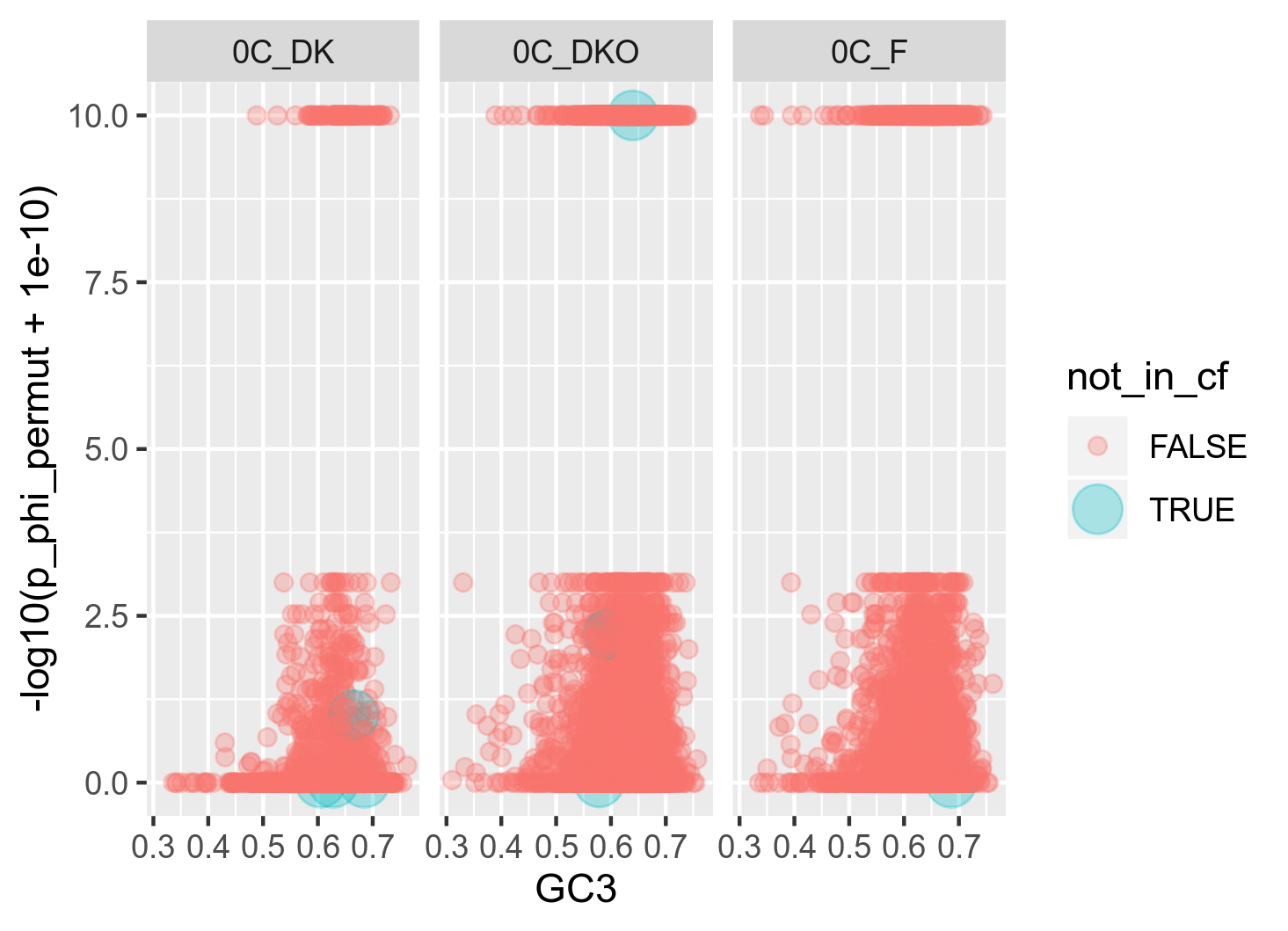
Figure 13A: Raw relationship (raw in the sense that I usually plot with some 20 bins) between GC3 and recombination as inferred with PHI. The red points are the genes (n = 9) that could not be successfully analysed with ClonalFrameML. In order to highlight the location of these genes in the plot, the size has been raised on these.
My interpretation of this plot is that the number of genes that are included in ClonalFrameML but missing from PHI are very few and widespread

Figure 13B: Raw relationship (raw in the sense that I usually plot with some 20 bins) between GC3 and recombination as inferred with ClonalFrameML. The red points are the genes (n = 1348) that could not be successfully analysed with PHI.
My interpretation of this plot is that most genes have been skipped in 0C_DK. This might explain why the model fits have such different measures of power (R^2) between the two methods in this geographical group
The reason why these genes are not included in the PHI test is that the individual genes do not have enough informative sites to test significance.
The conclusion then must be that ClonalFrameML has more power than PHI. And also, as stated in the ClonalFrameML paper - ClonalFrameML has a tendency to underestimate values of high R/theta in the case where phylogenetic grouping and recombination are happening at the same time. This effect might be visible in figure 10 pane B.
In bacteria, due to gBGC newly incorporated (recombined) genomic fragments might have a higher GC-content than the original genes. We know that newly recombined genes are still segregating in the population. Thus, we can investigate this relationship by showing how the number of informative sites correlates with GC3.
Because the number of informative sites per gene is exponentially distributed, we will visualize it with log-transformation.
 Figure 14: Informative sites (log-transformed) against GC3 for each gene in the core genome of Rhizobium leguminosarum. Each pane represents a genospecies.
There doesn't seem to be any correlation between the two covariates here.
Because the variation in the number of informative sites can be structured differently between geographical groups, it might be possible to get a clearer signal by stratifying these groups:
 Figure 15: Informative sites (log-transformed) against GC3 for each gene in the core genome of Rhizobium leguminosarum. Each pane represents a geographical group from genospecies C.
Stratifying into geographical groups does not change the lack of correlation between GC3 and the number of infinite sites.
Problem: PHI only calculates the number of informative sites on genes that have enough informative sites to be able to say significantly if recombination is happening or not. This impacts a major bias on genes with a low number of informative sites. This analysis needs to be redone. Another thing is that I need to include the lengths of the genes.
First thing I had to reconstruct core genomes from the xmfa-files. This is done using the reference annotation. It should be noted that it is non-trivial to retain the open reading frame when reconstructing the chromosomes. I ran PHI with 1000bp long windows with a step size of 25 bp. I used the bundled 'Profile' program. Visualizing without further tweaking gives the following results:
Figure 16: Recombination inferred in windows throughout the chromosome (unitig 0) for all genospecies.
Figure 17: Recombination in windows throughout the chromosome (unitig 0) for all genospecies.
Binning into 500 bins on the position (horizonthal axis) gives the following much more readable plots:
Figure 18: Recombination in 500 bins throughout the chromosome (unitig 0) for genospecies C. (Visually, there is no difference between the genospecies. Thus this single figure will suffice as a representative.)
Idea: It could be interesting to look into the genes located in the long regions of high recombination. Curiously, the GC3-content is low in these regions.
Concern about p-values equal to zero and multiple testing: When we adjust for multiple testing (dividing significance threshold by number of tests), we offset the distribution of p-values. The problem is, that when many p-values are equal to zero, which they are in our case, multiple test adjustments have no effect. This effectively means that the number of significantly recombining genes is inflated. This is why I have 20000 to 60000 significantly recombining genes in each genospecies.
The solution to this problem is to use ClonalFrameML instead, or to increase w in PHI such that a bigger incompatibility matrix is computed and more linked sites are taken into account.
And maybe use reads and align directly to the reference instead of this xmfa-to-mfa reconstruction mess.
Scanning the chromosome for recombination and GC3 proved itself problematic and unnecessary. By plotting recombination inferred instead with ClonalFrame and GC3 per gene is shown in the following figure:
 Figure 19: Recombination per gene throughout the chromosome (unitig 0) for genospecies C. Genes with GC3 values above median GC3 are teal in all panes. Below the median GC3 they are red. Notice the inverted y-axis in the GC3-pane. This was done in order to make it easier to align the peaks between the GC3 and recombination rate panes.
Larger version of Figure 19 here.
The list of the genes with the highest rate of recombination for each genospecies can be seen here.
Let's work a bit more on the previous plot. What if there is regions present, but we have too many points to recognize it visually? By making a rolling window we will loose the ends of the chromosome, but we will get a smooth overview of the variation in recombination and GC3 throughout the chromosome. Because there was very little difference between the genospecies, I decided to stick with just a single one - Genospecies C. Because this method is highly sensitive to the width of the window, I created an animation where the window width is increasing by 1 percent-point in each frame.
 Figure 20: Recombination (y-axis) and GC3 content (color) throughout the chromosome, calculated in a rolling window. For each frame in the animation, the width of the window is increased by 1 percent-point. Low GC3: red, median GC3: grey, high GC3: green. The y-axis is log-transformed.
If you would rather browse the stills, these can be accessed here.
The animation shows that depending on what size the window is set to, the graph shows a very different progression of recombination througout the chromosome.
Let's try flipping the visualization: GC3 as y-axis and recombination rate as color: Figure 21. The stills for Figure 21 can be accessed here.
After looking at the chromosome, I can conclude the gBGC hypothesis does not have a region-wise base. But there seems to be some structuring of recombination and GC3 content when averaging ~100 genes.
As it turned out, I used gene trees as input for ClonalFrameML, when I should have use genome-trees (or core genome trees). I ran ClonalFrameML again, and remade the most important plots.
I made an interactive plot to look for GC3 and recombination structure in the scaffolds
 Figure 21: Comparison of results from ClonalFrameML and PHI.
 Figure 22: 20 bins for GC3, where the number of significantly recombining genes (PHI) are shown on the y-axis.
 Figure 23: 20 bins for GC3, where the median R/theta value from PHI is shown on the y-axis.
 Figure 24: GC3 and R/theta from ClonalFrame.
 Figure 25: Unitig 0 from each genospecies. The top 1% most recombining genes are colored blue.
 Figure 26: Same as 25, but with boxplots instead of chromosomal position.