Add/drag handle #9569
Add/drag handle #9569
Conversation
 oandregal
added
the
[Feature] Drag and Drop
oandregal
added
the
[Feature] Drag and Drop
| @@ -66,6 +66,30 @@ export class BlockMover extends Component { | |||
| onFocus={ this.onFocus } | |||
| onBlur={ this.onBlur } | |||
| /> | |||
| <Draggable | |||
There was a problem hiding this comment.
Thinking it might be worth setting this as an optional prop (default draggable to true) on the block mover.
There was a problem hiding this comment.
This still needs to take into account the current BlockDraggable conditions. Are you thinking of something additional to those?
There was a problem hiding this comment.
Yes, I was thinking something that would let you use the mover without drag handles for a certain UI if needed.
oandregal
force-pushed
the
add/with-draggable
branch
from
53b10d3
to
755e0aa
Compare
| > | ||
| { | ||
| ( { onDraggableStart, onDraggableEnd } ) => ( | ||
| <IconButton |
There was a problem hiding this comment.
Not sure we should use the button styles here. It looks a bit weird on hover.
There was a problem hiding this comment.
I think the space should also be a bit tighter overall.
There was a problem hiding this comment.
I'll leave @jasmussen apply his svg / css :magician: skills while I watch from the distance and learn.
 oandregal
force-pushed
the
add/drag-handle
branch
from
oandregal
force-pushed
the
add/drag-handle
branch
from
3fd4c44
to
1895044
Compare
|
Also for design feedback: note that this PR also changes how Gutenberg indicates which block is being dragged: it uses the block's opacity instead of showing a grey box above the block. In the spirit of doing one thing at a time, I wouldn't have changed that behavior in this PR if it wasn't for this: the grey box was a dedicated div that acted as a drag handle and that was made visible when the dragging process started; now that we've removed the dedicated drag handle we no longer have that div node to play with. Also: the opacity seems nicer to me in this case. If we still consider the grey box a preferred UI, I can figure out how to maintain that behavior. |
|
Very nice work here. I pushed a little polish in 4128f21:
That is, buttons are now slightly smaller so as to better fit on a single paragraph height, which is the smallest block we can have. The paragraph is actually 56px tall, and the buttons are now 72px (3*24px). So I've compensated by vertically centering them. Here's with a little debug help:
This is before:
I'm going to next take a stab at tweaking the hover style of the drag handle. It shouldn't be a button, the hand cursor itself should be mostly sufficient, perhaps with a color change on hover.
I think it's okay to visit this, it's a bit challenged as is. The thing is, you can now style the editor... you can change the text color and the background color using editor styles. But unless @youknowriad with his new CSS parser can do magic here, we can't know which background color to show on a block that's being dragged. Until now we've simply assumed white. Ideally we'd know what the color would be, it's a little hard to see that you're dragging a block right now since it has no background. But I think it's good to surface this discussion on what to do here. Another option is, instead of showing a clone of the block, showing a small icon of the block. Like, imagine as you "lift the block off the page", it transforms into a small block next to your cursor, and expands again when placed. That way we'd cover less of the page. But I know @mtias has some opinions here we should listen to. |

|
In 8c575d2 I committed a change I'd like a sanity check on. From the commit message: Try: Remove hover style and make un-tabbable Here's how this looks when mousing:
Here's how this looks when keyboarding:
Note by the way that in Chrome on Mac I'm seeing a "copy" cursor as soon as I start dragging. I should be seeing the |


Some further info on this, the copy cursor is supposed to show up in the file system while you're dragging a file and holding ⌥ at the same time. Ironically, I'm experiencing the inverse behavior both in master and in this branch: when I'm holding ⌥, the copy cursor disappears and the correct The behavior is correct in Safari — when I drag normally, I'm seeing the correct So it seems as though Chrome is either buggy, or my system is buggy, or some part of our code makes Chrome think that by default a drag action is a copy/duplicate action as opposed to a move action. |
|
In a96bb4b we experimented with setting the dnd event to
Change reverted in 3e595c5. |

|
Removed the hover color from the drag handle, and also made it bg color friendly. |

|
Created an issue to track the cursor issue at #9610 |
|
The
|
Good catch, thanks. Is this implicit approval of the assertion that the drag handle should not be part of the tab order/be keyboardable? |
|
Yup, I'd agree taking it out from the tab sequence and hiding it with |
|
@jasmussen in 8ee6afa I've changed the |
Then, I'd suggest to remove |
|
I removed the aria label and tabindex. I would honestly prefer we remove the tooltip as well — the drag handle feels obvious to me, and because it is an addition for mouse users to the clickable up/down arrows, it doesn't feel necessary to me. On the flipside, it feels intrusive, and often invokes even when it shouldn't:
— at this point I'm dragging, so the tooltip should disappear. In other words, if we are to have a tooltip, we need to make sure it disappears as soon as you start dragging. I also feel like we should consider doing something about the transparent background while dragging. I'm going to try something, but not sure it'll work. |
|
Not sure why |
|
@nosolosw I'll let you respond to the onfocus thoughts. For now, I've made a change to the visual styling of the dragondrop:
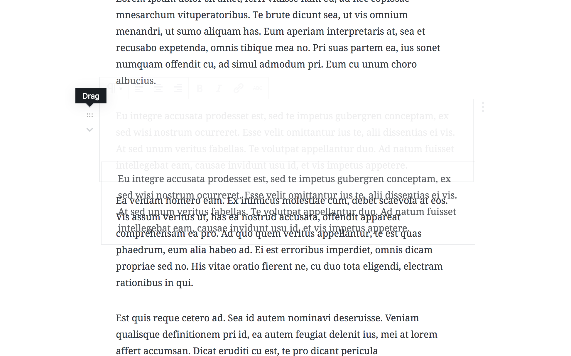
I know this is kind of like how it used to be. I'd like to explain why it is this way. Most importantly: we are not cloning a block when you are dragging, we are moving, so it's important the block you move is not seen as a clone. Hence the gray BG. Also, I hid the block toolbar and mover on the "block that's left behind", it didn't make sense to keep those there. But I am hiding them on the dragged block. I tried unhiding the editor-block-mover on the draggable clone — because otherwise the grip you're holding disappears when you are dragondropping, that's a little weird. But doing so makes dragondrop not work. Any idea why? |
 oandregal
force-pushed
the
add/drag-handle
branch
from
oandregal
force-pushed
the
add/drag-handle
branch
from
de12ca4
to
48b8fd5
Compare
So drag is something that can be turned on/off depending
on different UI needs.
The drag handle is part of the mover so we want to keep it visible
while dragging.
This makes BlockDraggable DOM agnostic and uses it as a base to
compose drag data. The vision is that we may have an ImageDraggable
component in the future that would abstract what data the dragging
operation needs to drag images, and so on.

The goal would be to use it by only providing one prop, the
blockClientId.

Making this a single commit in case we want to revert.
oandregal
force-pushed
the
add/drag-handle
branch
from
b8061f8
to
f253641
Compare
|
I noticed neither the draggable handle nor the movers are available in spotlight mode, and I wanted to check whether that is the intended behavior? Every so tiny design nitpick: I noticed the icon for the drag handle (6 dots) is not the same shade of gray compared to the mover icons and it seemed to me they should be the same color. However, I also thought the color difference might intentional to make the draggable handle stand out a bit. (screenshot) |
Fixes design nitpick from #9569 (comment).
Yes, that's intentional. It's more of a mode for writing and focusing, than it is for rearranging. But thanks for checking int.
EAGLE EYE SHERI! Awesome. PR here: #9948 |
|
|
||
| .is-dark-theme & { | ||
| background-color: $light-opacity-light-200; | ||
| .editor-block-list__layout .editor-block-list__block.is-selected { // Needs specificity to override inherited styles. |
There was a problem hiding this comment.
It looks like the changes here introduced a regression in Spotlight mode.
It should be fixed here #9951
Fixes design nitpick from #9569 (comment).
Fixes design nitpick from #9569 (comment).
|
Just one note. Nothing for new issue really.
|
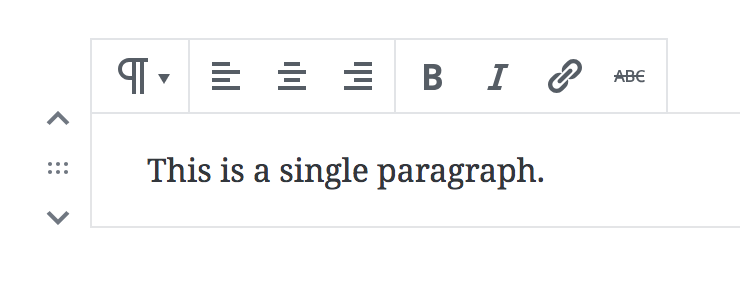
This PR adds the drag handle to the up/down mover.
TODO
BlockDraggableconditions.onDragStart/onDragEnd.isDragHandleVisibleprop.BlockDraggable?Test
Regular drag-n-drop operation (including child blocks, and embeds).