Set aspect ratio preserving CSS on embedded content with fixed size iframes #9500
Conversation
|
Okay, I pushed some CSS to make videos responsive. It's good, but it's not perfect, which I'll get to in a second. Just a heads up, don't merge quite yet. First off, the aspect ratios are solid, and I included the math in comments. See also this codepen: https://codepen.io/joen/pen/pOwoGV?editors=1100 The responsiveness works well because it doesn't require recalculating the embed widths, and is more performant. It also presumably is only applied to video where an aspect ratio is detected, which is perfect in other words. This also works perfectly in the editor:
I also put this in a However, and this is probably why the responsiveness was reverted or phased out since I last added it many moons ago: it doesn't work on the front-end when there are captions:
Why? Because due to how the responsiveness works, the video (and only the video) needs its own container which isn't an iframe. This explains why it works in the editor, where the markup is — (largely, I sanitized a bit) — this: Note how the video has the additional On the frontend, however, we get this: That means we can't really use the responsive trick, because that will cover the caption. @notnownikki Can you make it so that same wrapper that exists in the editor, exists on the frontend? Doesn't have to be for all embeds (but can be), just ones that need to be responsive (i.e. video). If you can do that, I can fix things up so the responsiveness is solid in both places. Eventually if we can get this working, should we consider removing the onResize responsiveness that exists for embeds right now? The idea being that a CSS only solution might be more performant? |

I think this should be in
I'll look at it now :)
This is exactly what I want to do! |
|
@jasmussen I added the wrapper div and added a block migration so that existing embeds will update when the posts are edited. There seem to be some lint issues with the new css though, Would you be able to fix those if you move the css over to |
|
Behold, our magic at work:
Isn't that amazing? I think it's amazing. That's Twenty Seventeen, which has no concept of blocks. 🤘
I could swear I fixed those. They blocked my commit and I had to fix them before I could push. So I'm confused why they regressed. But I've fixed them again in 3720784 |

|
@jasmussen Last commit removes the aspect ratio preservation javascript from the sandbox. It's working brilliantly on the front end, but in the editor there's something throwing it off and I'm not sure what. If you embed a 16:9 video you'll see it's not as high as it needs to be in the editor. Perhaps the caption editable is overlapping somehow? |
Note that this changes the sandbox component a little bit. We want to make sure that the changes we made here don't negatively affect other things that use the same component.
|
Okay I pushed a fix:
However as noted in the commit note, I had to make a change to the sandbox component in order to make this work. But I'm not sure where else that component is being made — for example if it's being used for embeds that are not supposed to be responsive, the height property I added is undesirable. Do we have a way to scope this a bit so only videos receive the height stuff? |

| body > div > iframe { | ||
| width: 100%; | ||
| height: 100%; |
There was a problem hiding this comment.
Note that this height property is necessary in order for the responsiveness to work, basically because every element that contains the embed needs an explicit height in order for a single percentage height to work properly.
But if this component is used for things that aren't aspect ratio responsive, we need to scope it. Something like:
html.is-video,
html.is-video body,
html.is-video body > div,
html.is-video body > div > iframe {
height: 100%;
}
There was a problem hiding this comment.
Ah, I see :) Ok, I'll see how it can be changed around to only get applied to things we're doing aspect ratio preservation on.
There was a problem hiding this comment.
Feel free to send this PR right back at me if we can have a CSS class or separate style declaration for aspect ratio responsive stuff only.
There was a problem hiding this comment.
It would be cool to have an .is-responsive or .has-aspect-ratio class to target here.
There was a problem hiding this comment.
Agreed. I was thinking .wp-embed-has-aspect-ratio and then the editor should be able to use that to apply the height to the sandbox iframe.
|
Alrighty, we have a class applied to embeds that have a fixed aspect ration, Test by embedding videos with different aspect ratios, and a tweet to test normal content, because the new behaviour should only depend on their being an iframe with fixed dimensions, and not the content type. |
| @@ -142,6 +142,11 @@ class Sandbox extends Component { | |||
| body > div, | |||
| body > div > iframe { | |||
| width: 100%; | |||
| } | |||
There was a problem hiding this comment.
Gloriously done. I haven't tested, but based on looking at the code this should work. 👍 👍
|
If this is ready for review, would you mind extending the review range to for example gutenberg-core, and perhaps assigning a 3.9 milestone? |
 notnownikki
removed
the
[Status] In Progress
notnownikki
removed
the
[Status] In Progress
| @@ -136,6 +136,28 @@ export function getEmbedEdit( title, icon ) { | |||
| return false; | |||
| } | |||
|
|
|||
| /** | |||
| * Finds the first iframe with a width and height and returns | |||
There was a problem hiding this comment.
Few minor things about the doc block.
- Should it read 'or an empty object if there is no iframe with width and height.'?
- My understanding is there should be a line separating the function description from the params.
- The param description should be capitalised -> 'The preview HTML'
- Typo in the param description - 'possible' -> 'possibly
| * @param {string} html the preview HTML that possible contains an iframe with width and height set. | ||
| * @return {Object} Object with extracted height and width if available. | ||
| */ | ||
| getiFrameHeightWidth( html ) { |
There was a problem hiding this comment.
I think this could be camel-cased as Iframe instead of iFrame. It looks like there's a FocusableIframe component in the codebase so would be good to be consistent in terms of case.
| getiFrameHeightWidth( html ) { | ||
| const previewDom = document.createElement( 'div' ); | ||
| previewDom.innerHTML = html; | ||
| const walker = document.createTreeWalker( previewDom ); |
There was a problem hiding this comment.
I might be wrong, but I think it should be possible to simplify this to something like:
const iframe = previewDom.querySelector( 'iframe' );
if ( iframe ) {
	return {
		height: iframe.height,
		width: iframe.width,
	};
}| // calculate the aspect ratio and set an extra css class so that the rendered | ||
| // content keeps the correct height no matter how wide the block is set to be. | ||
| const { height, width } = this.getiFrameHeightWidth( html ); | ||
| if ( undefined !== height && undefined !== width ) { |
There was a problem hiding this comment.
I wonder if most of this logic could be moved into getIframeHeightWidth and that could become getAspectRatioClassName so that setAttributesFromPreview isn't doing so much. Or they could be separate functions.
|
|
||
| if ( aspectRatioClassName ) { | ||
| aspectRatioClassName += ' wp-has-aspect-ratio'; | ||
| const className = classnames( this.props.attributes.className, aspectRatioClassName ); |
There was a problem hiding this comment.
Could avoid the concatenation here by making classnames do the work:
const className = classnames( this.props.attributes.className, 'wp-has-aspect-ratio', aspectRatioClassName );| @@ -218,6 +281,7 @@ export function getEmbedEdit( title, icon ) { | |||
| const cannotPreview = includes( HOSTS_NO_PREVIEWS, parsedUrl.host.replace( /^www\./, '' ) ); | |||
| // translators: %s: host providing embed content e.g: www.youtube.com | |||
| const iframeTitle = sprintf( __( 'Embedded content from %s' ), parsedUrl.host ); | |||
| const sandboxClassnames = className ? type + ' ' + className : type; | |||
There was a problem hiding this comment.
Could use classnames again here, as it'll ignore className when its undefined:
const sandboxClassnames = classnames( type, className );
|
@talldan thank you! I'll make all those changes. |
|
Ok, think I fixed all those points. I moved all of the aspect ratio CSS code into |
|
Looks good to me. Thanks for making those changes. Looks like codecov has failed, not sure what can be done about that. |
 notnownikki
changed the title
notnownikki
changed the title
| * @param {string} html The preview HTML that possibly contains an iframe with width and height set. | ||
| */ | ||
| maybeSetAspectRatioClassName( html ) { | ||
| const previewDom = document.createElement( 'div' ); |
There was a problem hiding this comment.
Minor: DOM is an acronym and as such should be capitalized as previewDOM (reference)
| @@ -176,7 +158,7 @@ class Sandbox extends Component { | |||
| // put the html snippet into a html document, and then write it to the iframe's document | |||
| // we can use this in the future to inject custom styles or scripts | |||
| const htmlDoc = ( | |||
| <html lang={ document.documentElement.lang }> | |||
| <html lang={ document.documentElement.lang } className={ this.props.type }> | |||
There was a problem hiding this comment.
What is the type prop meant to represent?
There was a problem hiding this comment.
it's the type that the oembed response contains, it was meant for styling video and image content differently, however I'm not sure it's actually used any more.
| */ | ||
| maybeSetAspectRatioClassName( html ) { | ||
| const previewDom = document.createElement( 'div' ); | ||
| previewDom.innerHTML = html; |
There was a problem hiding this comment.
I am very wary of the security implications of this line. This will allow JavaScript in the preview markup to be evaluated, even though we're never including it in the DOM. As a demonstration, paste the following into your console while viewing the editor:
document.createElement( 'div' ).innerHTML = '<img src=/ onerror=\'alert("haxd")\'>'Now it's a question as to whether we consider embed preview markup to be "safe". Given that the Sandbox component exists, I'm operating on the assumption that the answer is no. Therefore, this is a security vulnerability if it comes to be released.
There was a problem hiding this comment.
Previously: #1334 (comment) (not as fun as it was previously since Photobucket appears to have since let their oEmbed API languish and die)
There was a problem hiding this comment.
Looking at this now. It might have to be a regular expression that picks out the iframes, so we avoid creating actual elements.
There was a problem hiding this comment.
Changed this to use a regex in #9770
There was a problem hiding this comment.
Another simpler option might be document.implementation.createHTMLDocument as a "sandbox" of sorts.
Example: https://github.com/aduth/hpq/blob/f17b3fdc9c5692e9f676f94c33a003d191c81bd6/src/index.js#L21-L23
|
The demo content should have been updated here. While the deprecation migration saves it from being flagged as invalid, it does cause the demo post to trigger an autosave after delay. |
|
There's a report in #10109 about this CSS causing a conflict with a theme that's doing its own responsive video handling. It's only in one theme so far (that we know of) so maybe just something the theme dev needs to patch, but if there's a more widespread practice of themes including some kind of responsive video functionality, it may be worth revisiting a way to make this more robust or opt-in. |
Description
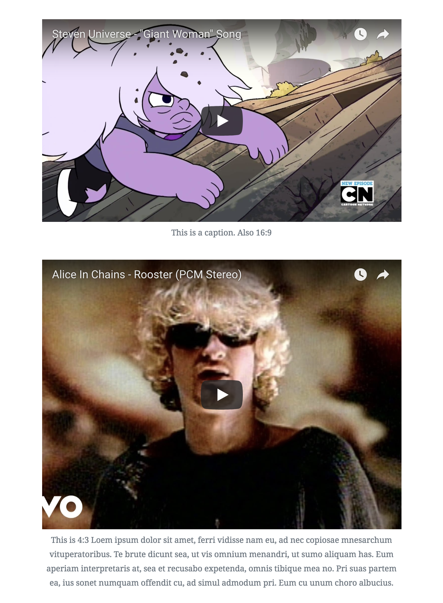
To support the wide styles, we need to preserve the aspect ratio of fixed size embeds when they are resized to full width.
This applies a css class to embedded content that uses iframes (e.g. YouTube, Vimeo) to preserve aspect ratio.
How has this been tested?
Embed the following videos:
https://www.youtube.com/watch?v=XT13ijUfSts
https://www.youtube.com/watch?v=uAE6Il6OTcs
The first should have
wp-embed-aspect-16-9applied, and the second should havewp-embed-aspect-4-3.Types of changes
Bug fix
Checklist: