Try adding a keyboard-navigable font size selector with visual feedback #17418
Conversation
 youknowriad
force-pushed
the
try/accessible-font-size-selector
branch
from
youknowriad
force-pushed
the
try/accessible-font-size-selector
branch
from
d1251bc
to
39d802d
Compare
|
I just ran a test with VoiceOver + Safari (Mac):
|

|
In addition to @enriquesanchez's comments above, a quick test on Windows 10 with Firefox + NVDA:
I haven't really looked into the code yet so might have further feedback in the next few days 🙂 |
|
Update on this: I have removed the VoiceOver is now behaving a little better: "Choose preset. Popup button. Font size. Font size. Group." (It only repeats the "Font size" bit when entering the fieldset) NVDA is still not announcing the current value of the button; it now reads out "Choose preset button submenu". Would love some further feedback on this. NOTE: I haven't touched the focus management issues yet so keyboard interaction is still pretty broken. Will work on that next. |
|
Thanks @tellthemachines! This is looking so much better already. I tested your latest updates on both NVDA (Firefox) and VO (Safari). On NVDA + Firefox:
I wasn't able to focus on any of the available options with keyboard only, but I assume this is the part that you mentioned still needs some work. On VO + Safari:
|
 tellthemachines
force-pushed
the
try/accessible-font-size-selector
branch
from
tellthemachines
force-pushed
the
try/accessible-font-size-selector
branch
from
69c011c
to
a4366ee
Compare
tellthemachines
requested review from
ajitbohra,
chrisvanpatten,
gziolo,
jorgefilipecosta,
nerrad,
ntwb and
talldan
as code owners
|
I think I've addressed most of the issues with focus management and labelling of the custom select control. |
tellthemachines
added
the
Needs Accessibility Feedback
| if ( ! isFocused ) { | ||
| return; | ||
| } | ||
|
|
There was a problem hiding this comment.
It'd be interesting to know the reasoning behind removing this code. I'm not sure what it does, but I think it terms of documenting its removal some details in the PR description would be great.
There was a problem hiding this comment.
Yes, this seems dangerous for me. This means if we close a modal/popover programmatically (not by focusing something else explicitly) and the focus is outside of that modal/popover when we do so, the focus will return to the button that opened the popover) which IMO is not what we want right?
There was a problem hiding this comment.
I'm not sure what it does, but I think it terms of documenting its removal some details in the PR description would be great.
What it currently does is return if no element within the wrapped component is focused, so that focus goes back to the document body. I can't think of any situation where we would want this to happen, especially when using a component the sole purpose of which is to return focus to the previously focused element when closing a modal or popover. So I'm particularly curious to know why it was added in the first place. I know it's part of this changeset but I can't reproduce the issue it fixes after my changes.
Note that this return doesn't get triggered when we deliberately move focus to a specific element, such as when we use the Block Navigator. It only gets triggered when focus is for some reason lost while we are still inside the wrapped component. This is something that, for the sake of accessibility, should never happen, so I'm not sure that we should be catering to it.
Removing this code fixes the issue of focus being lost when closing the font size dropdown because in the focusActiveItem function focus is blurred from the dropdown just before closing. I'm not sure why we're managing focus with this function though; I thought NavigableMenu would be enough to provide keyboard navigation with the arrow keys? Perhaps @youknowriad could shed some light on this.
Happy to hear further feedback and suggestions!
There was a problem hiding this comment.
I think this check exists to address the issues that there might be several nested components that are wrapped with withFocusReturn and all of them can respond when they get unmounted. I suspect, this is a way to ensure that it's handled only once in such a case. This should be confirmed though.
There was a problem hiding this comment.
I think this check exists to address the issues that there might be several nested components that are wrapped with withFocusReturn and all of them can respond when they get unmounted.
Hmmm I don't think that's what it does, because if we have nested withFocusReturns (such as this font size picker nested in the sidebar) the parent keeps tracking focus even when it's inside the child component, so I wouldn't expect focus to be lost in the parent unless it were also lost in the child.
We don't seem to have any instance of a parent popover/withFocusReturn-wrapped component that closes when a child popover is closed (that's probably an accessibility anti-pattern anyway), but I have verified that, with the current changes, when opening the font size picker and then closing the sidebar with it still open, focus is correctly transferred to the open sidebar button.
|
Hi @tellthemachines! 👋 I did another round of testing today. Here are my results: Test with Dragon 15 (Windows + Firefox): I tried assigning the label explicitly: ..and I still couldn't interact with it. I then tried also adding an ... and it worked! 🎉 🎉 🎉 What do you think about making this change? Test with NVDA (Windows + Firefox): When focusing on the element, NVDA announces:
When interacting with it with keyboard, I wasn't able to just use
It properly indicated number of options, which one was selected and which one I had just selected 👍 The popover stayed open after selection, I was expecting for it to close. I had to click I ran another test with the small changes I proposed previously for Dragon (explicit label and aria-label added). NVDA announced the component as:
And when interacting with it:
It still announced items and selection to my expectations. Test with VoiceOver (Mac + Safari): VO announces the component as:
When interacting with it: Using I opened the list with
...and was able to select an option from the list. VO properly announced the number of available options and which one was selected.
When selecting an option, VO announced:
I'm not sure why "Font Size" is being repeated twice. This did not happen with NVDA. |
|
Thanks for testing everything so thoroughly @enriquesanchez ! Re adding an aria-label to the button, sure, let's do that 😄 The up/down arrow navigation issue with NVDA is a tricky one. What's happening is NVDA is not going into forms mode when entering the component, so the arrow keys are working as expected in browse mode. However, triggering forms mode by pressing Insert + Space causes the arrow keys to navigate the options but NVDA doesn't read them out, so that's not terribly good either. I'm wondering if we should stop pretending that this is a select and abandon the arrow navigation altogether. The other issue with it is that I can't think of how to make it work on Windows only, and not on any of the Mac browsers. I can reproduce the issue with the popover staying open after an option is selected, on Firefox with and without NVDA and from time to time on Safari, but I haven't found the cause yet. Will investigate further. VoiceOver repeating the fieldset legend (the "Font Size" bit) is IIRC a bug on their side, and I think it's already been reported to them. |
 mcsf
changed the title
mcsf
changed the title
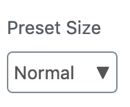
@tellthemachines I agree 100% with this. From previous attempts and testing, I think it's clear that getting full parity with a native select is just not going to happen. I think we can view this from the lens of a menu button (like the ones we already have on the block toolbar). From what I've gathered, the trick with the menu button is how to display the current state of the button (Regular, Large, etc.) while also having an obvious accessible name that users of speech recognition software could still interact with. This is where I think having a visible label ("Preset Size") and assigning that same label to the button (
With Dragon, if I say "click Preset Size" I should be able to open the menu button, even though the actual real label of the button is "Normal" (from Not sure if you've come across this article: https://inclusive-components.design/menus-menu-buttons/ . In particular, there's a couple of sections called 'The "choose" event' and 'Persisting choices' (almost at the end of the article) that have examples very similar to what we want here. |
 tellthemachines
force-pushed
the
try/accessible-font-size-selector
branch
from
tellthemachines
force-pushed
the
try/accessible-font-size-selector
branch
from
f5da04e
to
2659627
Compare
 tellthemachines
force-pushed
the
try/accessible-font-size-selector
branch
from
tellthemachines
force-pushed
the
try/accessible-font-size-selector
branch
from
2659627
to
5c72293
Compare
@enriquesanchez I tried implementing the menu-menuitemradio pattern described in that article and it messes up our current focus handling with the arrow keys completely, on both NVDA and VoiceOver. I have removed arrow key navigation when the dropdown is closed and added the aria-label to the button, but still trying to figure out why the dropdown doesn't always close on selection with Firefox and Safari. I will probably not be able to work on this for the next few days. The PR is updated with my latest changes if anyone wants to pick it up in the meantime. Note: some of the e2e tests are failing because they're still expecting the old |
|
As discussed on WordPress Slack, this one should be closed in favor of #17926. /cc @youknowriad |
Very early exploration based on one of the codepen examples here #16473