Try additional borders and padding for nested blocks #14961
Conversation
 kjellr
added
[Type] Enhancement
kjellr
added
[Type] Enhancement
|
You are so very much my favorite. Took this for a spin and made my own GIF:
My immediate take-away feeling is that this has solid potential, I think you're on to something. The next step needs to be adding the inverse behavior, i.e. in addition to being able to select the Media & Text block and have the Paragraph highlighted, you need to be able to select the Paragraph and have the Media & Text block highlighted instead. Especially for columns, this will make a ton of sense. I understand we need some developer help in order to make that happen, i.e. you need a "has child selected" class. @gziolo do you know who might be able to help with this? Another thing that might be worth exploring, is some CSS animation. It could be for the dashed border to fade in, perhaps even relatively slowly. But more interestingly, I would love to see the margins that are added to the columns block animate in. These animations would not be for decorative purposes, but they would help visually explain that something is happening because you selected the block, and help imply that when you deselect, you'll see the preview of the block again. I don't think the added margin will feel jarring to anyone editing these — they'll click the block, then deselect, and in a matter of seconds learn the UI. But a little animation can probably make it even clearer. Looking a little bit ahead too, I wonder if it's worth it to consider whether this is a nested block UI that a block should opt out of. For all of the complex blocks that currently use nesting, this UI feels like an obvious step in the right direction. But I wonder if we'll feel it is unnecessary if/when the Quote block gets nesting. On a final digression, and on the topic of columns, those dashed outlines really do highlight the additional complexity it adds that the individual column blocks are treated and shown as individual block containers. I really think that — separate from this PR — we need to look at a way to simplify that, so it's just Columns block and content, not that in-between extra layer. I understand that you need to be able, in the future, resize columns, as well as choose vertitcal lignents on a column level basis. But this is a problem that's solvable without having every single nested block be manipulable — our friends at TinyMCE don't require you to select the TD block first in order to resize a table column:
This final columns thought alludes to an additional aspect to the parent/child selection challenge. What if the parent and the child block could be selected at the same time? Which is basically the case with the TinyMCE block shown above, I imagine such an interface might work well for a number of our blocks, for example the Quote block. What would this look like? What would the toolbar(s)? |


I can have a look at it later today 👍 |
|
It looks like all the logic required to apply the class you need is already implemented but it's enabled only in focus mode: To get started you can apply this patch: diff --git a/packages/block-editor/src/components/block-list/block.js b/packages/block-editor/src/components/block-list/block.js
index c5abcdc5d..5145e47f1 100644
--- a/packages/block-editor/src/components/block-list/block.js
+++ b/packages/block-editor/src/components/block-list/block.js
@@ -442,6 +442,7 @@ export class BlockListBlock extends Component {
'is-typing': isTypingWithinBlock,
'is-focused':
isFocusMode && ( isSelected || isParentOfSelectedBlock ),
+ 'has-child-selected': isParentOfSelectedBlock,
'is-focus-mode': isFocusMode,
},
classNameWe can think of whether we can consolidate the existing class names later. |
It works! Thanks @gziolo! 🙌 I'll run with this for now, and we can refine once we figure out for sure that this direction is solid. |
kjellr
requested review from
ellatrix,
gziolo,
noisysocks,
talldan and
youknowriad
as code owners
|
Thanks to that patch, I expanded those styles to cover when a parent block is selected. Here's a new GIF:
I totally agree with the reasoning here. I added a slight animation to the padding, but I'm a little concerned about the heaviness of it. Padding is not one of the "easy" things to render, and if you're interacting with one of the blocks on the top of the screen, that means it also pushes down every single block below it as it animates each frame... which can definitely chug a little bit. I'm already seeing it jump a bit when working with the top-most block, so I'll almost definitely remove this animation. But it's worth seeing for now. The border color actually does have a super-slight One weird thing... you'll notice that the
Yeah, I do think blocks should be able to opt-out of this. I'm sure there are already some 3rd party blocks that this will do weird things with. 😄
This is interesting to think about too. What do you think the use case would be for this? This is a bit of an aside, but this line of thought made me wonder whether we should be able to use command-click (or control-click on Windows) to select multiple non-sequential blocks. I could see that being really helpful for block transforms & grouping. |
It might be the side-effect of some performance optimization we apply for non-selected blocks. It would have to be confirmed by @youknowriad who implemented async updates. If my lead is correct, I don't think this would be very difficult to change it. |
|
After looking at the shared screencast, I'm coming to the conclusion that in the current shape there is a way too many blocks highlighted using borders. Have you considered highlighting only immediate parents of the selected block? How about having different levels of shade depending on whether there is child-parent, child-grandparent, child-grandgrandparent relationship? |
I think the Columns block is where this is the most evident. Unless you specifically nested a group block inside of a group block or something, you generally wouldn't see this issue. The columns block is really confusing on its own... I don't think many people really think of the individual columns as distinct blocks, but we render them as such. For that specific use case, we could hide/remove the spacing from the individual columns blocks if we really want to. (Today, we already make it so that you can't select individual column containers). In general though — I know @jasmussen was originally suggesting that we only apply these borders/padding to direct parents/children at some point to help simplify this issue. That might work, but I do worry about having things jump around too much. Currently, I like that you click once, and you get the entire structure. |
|
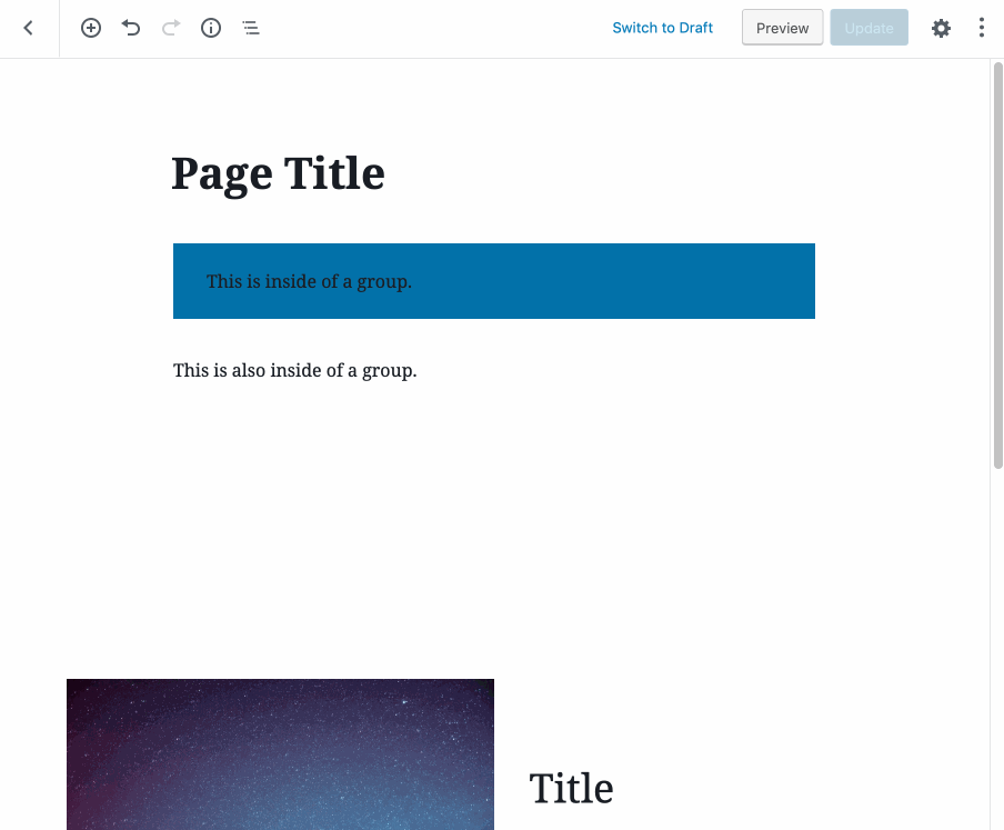
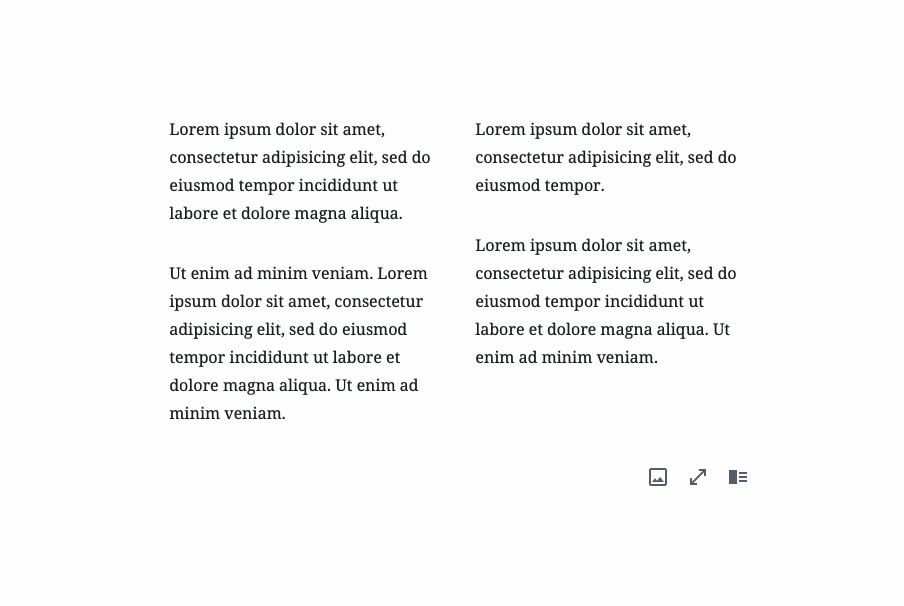
This is really nice work, Kjell, thank you so much for tackling this. I'm going to respond in categories because moreso than the code, there's a lot of conceptual stuff to work through here! Right off the bat, though, this feels like a massive improvement to the media & text block, and the Cover block. I feel just those two immediately validate this concept entirely. Columns This one is also improved. Seeing the nesting does help, and it does not feel jarring that the interface changes on select vs. deselect. But I also agree with both of you — we need to find a performant way to animate the padding, or it likely won't work. This may turn into something very very complicated, not sure — but it has to be liquid smooth to be actually helpful. I also agree that it's too many borders. But I also think that this is not the problem of the borders, but the added burders suddenly just make visible complexity that is already present. Which means we have to fix that complexity, the borders just make them visible. I still do think that showing only two levels of borders could work, and will likely be necessary for the padding change to work — or very quickly the padding will become so pronounced with multiple levels of nesting that there won't be any space left to edit. But it also brings me to ... The complexity of the columns block When the columns block was first introduced, there was only two levels of hierarchy. There was the parent columns block, and there was content in each of the columns. This worked fairly well. But then the in-between column block was introduced. I understand the technical reasons why this had to happen, it is markup after all, and there were flex reasons for it too. But the user experience of that added intermediate has not been polished as it deserves to be. It feels like it was an obvious given that the user experience had to account for every block in the hierarchy being manipulable, because that was how the underlying structure was too. How would you set a width on a single column, if you couldn't select it? How can you set the vertical alignment of a single column if you can't select it? This is what I was alluding to by showing the TinyMCE interface for the table, whose markup is multiple levels deep, yet the UI is vastly better there. I noted: "What if the parent and the child block could be selected at the same time?" Let's just look at it again:
In this GIF, I've clicked inside a cell. I suppose a paragraph would be the equivalent inside a column block. But the table remains manipulable — a popout toolbar allows you to perform basic manipulations on both the table itself, and even column and row elements inside. You can even right-click in the table to make changes to individual cells? Going by the "UI must match hierarchy" approach that the columns block has taken, how would this translate to a Gutenberg nested UI interface? Imagine having to click the block navigation button to be able to select the row, before you can perform row manipulations. This is what I'm referring to. Flatten the columns block to at most two levels. Media & Text has already taken steps towards this — the embed part of it is technically an individual block, but it's not surfaced as something you can delete or move or align individually, because it is a locked part of the media & text block. The user experience, as a result, is wonderful. Do the same for the columns block. Hide the column block entirely. Don't let a user manipulate it at all, or even select it. If you need to be able to set the width of a column, let the user do that either through a panel in the sidebar when you have the columns block selected, or let the user do that by dragging a blue vertical separator between the columns. Or hey, keep both selected! This is a quick and dirty mockup, very dirty, let's not do this — there will be toolbar overlap and all sorts of craziness, and if we pursue this idea separately we'll probably need to actually unify the toolbars into one. Purpose only to get a point across:
If we could get such an interface to work for parent and child blocks, there would be no need to select the parent ever. Consider how this could be a lovely interface for both a blockquote block, a list block, if those get nesting element support. Bringing it back The point here is that this PR surfaces existing complexity in the columns block, and works to improve it. I really believe that it is a great step in the right direction, and that the fact that the columns block is still not a great experience is not the fault of this branch. We should continue to explore column block improvements on the side. I do think it's worth exploring only highlighting two nesting levels at most — even if just to try it. The most exciting aspect of this branch, IMO, is that the change that happens as you select a block is not at all as jarring as one might worry it would be. I have a feeling it might be the same if we try the "max two levels" — provided it's not too challenging to try that, of course! This PR can also not be a panacea to selecting the parent block. There will still be situations that require a UI that even this branch cannot fix: such as crazy slideshow blocks that have hidden layers off screen. Barring a really nice block design for that, it would be nice with a block-editor canonical way to select all layers there. Honestly a layers panel in the sidebar, or even inline, could be interesting for such blocks. Here's an old doodle of that:
Next steps I'm not sure how technically tricky the following is, so if it's completely impossible that's fine too. But I'm excited about this branch, so consider the following a wishlist:
|


|
Really interesting thoughts on the column block, @jasmussen. I do really like the "select a whole column" approach you outlined... I'm not sure how intuitive that'd be given our current setup, but it's a potential direction. Worth exploring separately.
That's definitely something I can explore. I don't think it'd take too long, and it seems like the sort of thing that'd be worth trying out before we judge it. My hypothesis is that it'll work great in the "nested blocks within nested blocks" scenario, but will be a little confusing for the columns block since when you click on an individual child block, it won't be immediately clear how to select the entire Columns parent block. Before I get that going, I just committed an alternate approach that totally hides the border/padding from the individual Column block — similar to the way we handle this today. This was a quick change, and I figured I'd try it out first:
In general, this works fine. It's obscuring the complicated part of the UI, and I don't think many users will miss it (especially given that we already hide that part of the UI today). I'll still keep going with the exploration, but we've got this approach working in our back pocket.
This is a difficult one. I wonder if I can rely on some |
I definitely thing that this experiment highlights the shortcomings of having the individual columns selectable as is currently the case. It is a much nicer experience with the reduction in complexity. What this tells me is that if you do need to be able to set alignments and widths on individual columns, we need a different UI for it. As I noted around the TinyMCE examples, I feel like there are paths forward for that, definitely separate from this exploration, but also definitely further emphasized by it!
I put together a quick one: https://codepen.io/joen/pen/XQEXEq?editors=1100 I don't know that we can easily port this to the block editor, I imagine it could be fragile in too exotic an environment. So if it doesn't work, then that's fine too. But the approach is simple: instead of animating the padding, we set a smaller-than-100% width instantly, and then we use |
Ah cool, that's pretty convincing. 🙌 I'll take a look at using that here. |
|
@jasmussen I just updated the branch with a new animation to try out. I tried a variation of what was in your pen, but in practice it seemed a little unconvincing because it didn't also animate in the top padding. I added an additional https://codepen.io/kjellr/pen/vMRvyv?editors=1100 That pen applies a simple
I also updated the PR with this change. You'll notice some oddities in the columns block because the |

|
Wow that scale idea is interesting! I would never have thought of that. In practice, it's working decently, although I intellectually know the text is smaller, it feels okay to me! There's a small vicual hiccup with some black borders briefly showing on deselect in Chrome:
I don't think you should necessarily spend time addressing that, though. As a proof of concept, it feels like we have two solid approaches for performant animation here, either of them could work. and be optimized. I think the next step, really, is to think about what we can make of this branch and ship as an iterative improvement. Whether as a small initial version that can grow into something more later, or as a more generic version that is opt-in even now. Do we need the column block to be selectable with the mouse here? Or do we want to explore a different UX for the columns block entirely that allows the column to be selected in a different manner? I would love to take a stab, next week, at some mockups and possibly some experiments in this branch, just to kind of continue the experiments started here in a few different directions. Thanks so much for this. I feel like we're on the cusp of something very cool. |

|
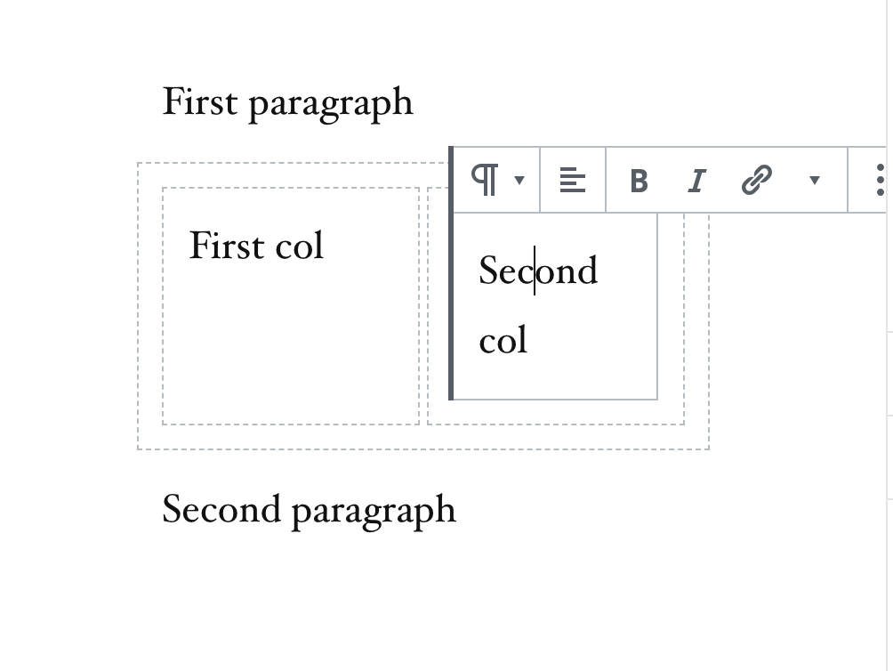
So this is an interesting one. I can reproduce the test failure @gziolo pasted above locally, and I have identified that it is happening because, with @kjellr 's extra border and padding, the text inside the second column ("Second col") is now wrapping onto two lines, so the first
|
Shortens the text inside the column block so that it doesn't wrap into 2 lines.
Modifies writing-flow test to include shorter copy in the columns block.
What an obscure bug! Thank you so much for digging into this. I pushed a tentative change to verify that: I shortened the sample |
| @@ -34,7 +34,7 @@ describe( 'adding blocks', () => { | |||
| await page.keyboard.type( 'Paragraph' ); | |||
| await pressKeyTimes( 'Tab', 3 ); // Tab to paragraph result. | |||
| await page.keyboard.press( 'Enter' ); // Insert paragraph. | |||
| await page.keyboard.type( 'First col' ); | |||
| await page.keyboard.type( '1st col' ); | |||
There was a problem hiding this comment.
This one technically doesn't need to change for the test to pass today. Just the second one was causing issues. But I figured it would make sense to be consistent about this wording.
There was a problem hiding this comment.
I guess I don't understand why the second one is changing either. You've just changed Second to 2nd everywhere? What difference does that make?
There was a problem hiding this comment.
It's a not-so-great fix, but it solves the problem that @tellthemachines noted above, and gets the tests to pass.
Essentially, the text "Second column" was dropping to its own new line when the additional padding was added, breaking the number of ArrowUps expected to get up to the toolbar. Shortening that text to "2nd column" prevents the line break, and allows the tests to keep passing.
I'm definitely up for a more future-proof solution, but not sure what that would be.
There was a problem hiding this comment.
Ah, I see now what you mean. In that case, please, please, inline comment the test so we know why it changed and would fail otherwise. :)
There was a problem hiding this comment.
please, please, inline comment the test so we know why it changed and would fail otherwise. :)
Great idea! Added in 1b9d6bb.
|
I think we're basically at a point where we're ready to give this a try. Just to summarize some known downfalls of this approach that we'll want to follow up and look into:
And a few alternate/related directions to explore:
|
|
|
||
| // Arrow up in inner blocks should navigate through (1) column wrapper, | ||
| // (2) text fields. | ||
| await page.keyboard.press( 'ArrowUp' ); | ||
| await page.waitForSelector( '.is-selected[data-type="core/column"]:focus' ); |
There was a problem hiding this comment.
If I understand https://github.com/WordPress/gutenberg/pull/14961/files#r305412715 correctly, this is no longer necessary? Could it be removed?
There was a problem hiding this comment.
Yes, I believe that's correct. Removed in 7a0a201.
|
We've been sitting on it for quite a while now, and this seems pretty solid. Tests are passing, and it's been tested in a range of different scenarios, and it's already got all the required ✅s I checked in with @mtias about this PR last week, and am going to merge it in today. I'll assign it to the 6.3 milestone, so that we have a little time to test and look out for issues before it lands in the plugin. I'll also pursue additional PRs for some of the followup iteration:
Thanks, folks! |
|
Nice, let's try this to see how it feels. In the meantime, I think we should revert "clickthrough" because testing is showing that it's not the right solution. |
* Add extra padding and borders to child blocks

(When their parents are selected.)

* Small tweaks margin/padding of selected Media+Text/Group blocks.

* Add has-child-selected class to parent blocks.

Props @gziolo

* Adjust border/padding to also apply when child blocks are selected.

* Try an animation when nested blocks are selected.

* Hide the "Column" block.

* Try using a scale animation for child blocks.

* Reduce scale animation to be really tiny.

* Re-add has-child-selected class.

* Selecting parents: Try clickthrough.

Clickthrough has you select the parent before you can select the child. This is already in place on the mobile breakpoints, this just expands it to desktop as well.

It is a work in progress, right now it is not working as intended: once you have "unlocked" the deepest level, it becomes immediately locked and you have to click through the layers again to unlock it again. The deepest layer should always be unlocked until you deselect all blocks again.

* Add some visual debugging for nested overlays

* Add hasChildSelected prop

* Add borders/padding to direct children + parents only.

* Revert "Merge branch 'try/clickthrough' into try/additional-borders-padding-for-child-blocks"

This reverts commit 9a9297b, reversing
changes made to 783708f.

* Revert "Add borders/padding to direct children + parents only."

This reverts commit 783708f.

* Revert "Add hasChildSelected prop"

This reverts commit a3e9dbd.

* Remove animation, adjust specificity.

... so that only direct children get borders/padding, whereas all parents do too.

* Columns block adjustments.

Ensures better compatibility with the borders/padding.

* Clean up media-text block CSS.

* Correct block breadcrumb position for the column block.

* Move all block movers up above contextual toolbars.

* Clean up block list appender margins.

* Clean up block list appender margins for the columns block.

* Reduce specificity for the group block appender overrides.

* Resolve merge inconsitencies after rebasing this branch

* Improve compaibiilty with custom inner containers.

Like those used for the Group + Cover blocks.

* Move extra padding to just the columns and group blocks.

* Try fixing e2e test

* Clean up columns block placeholder padding.

* Modify writing-flow test to pass.

Shortens the text inside the column block so that it doesn't wrap into 2 lines.

* Followup to 82dfc34

Modifies writing-flow test to include shorter copy in the columns block.

* Update snapshots for writing-flow test.

* Add inline comments about the test adjustment.

* Remove previous attempt to fix failing tests.
Addresses #14935, related to #9628.
This is so far just a rough proof-of-concept, but it gets things started. As described in #14935, the general goal is to:
For now, this PR just tackles the first one. We'll need a new
has-child-selectedparent class added in order to address the second one as well. (I could use a developer to help with that!)Current state