ResizableBox: Add visual handles for side resizers #14543
Conversation
|
@melchoyce What do you think? |
|
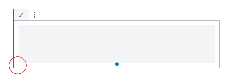
I really like the way this is looking, @marekhrabe! Thanks for working through this. In the image below, I circled three different line weights which bothered me a bit. There's a really thin 1px block outline, a 3px left block border, and then the 2px blue resizable bar.
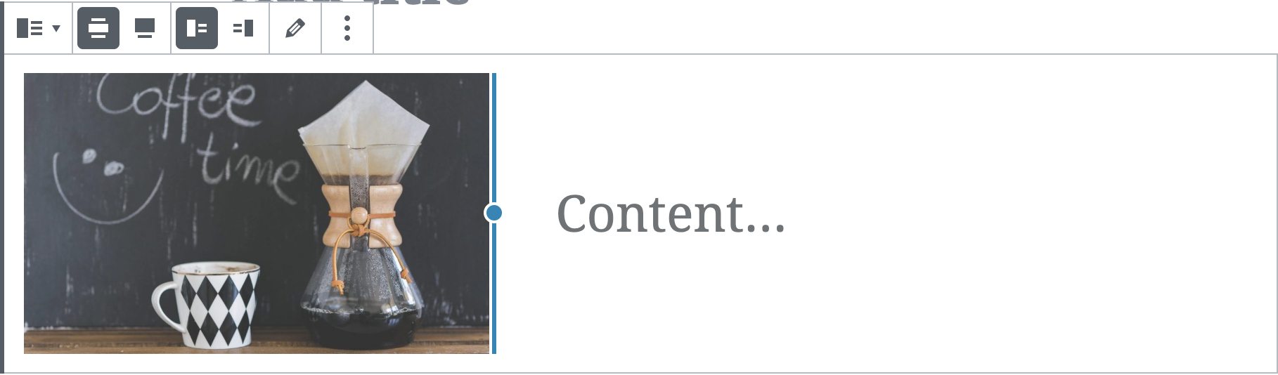
In an attempt to add a bit of consistency, I made the resizable blue border thicker in the example below to match the weight of the left block border. This feels a little heavy, so I'd like some feedback from other designers. @melchoyce @kjellr thoughts?
|

|
Also the blue dot and also the blue line both have a white outline of 2px to distinguish them from content. Would that be something that we should focus on too? Just a tiny technical one: we cannot center the blue line properly towards the blue dot, unless we either make it even one more pixel wider than you did or we make the dot one pixel smaller. |
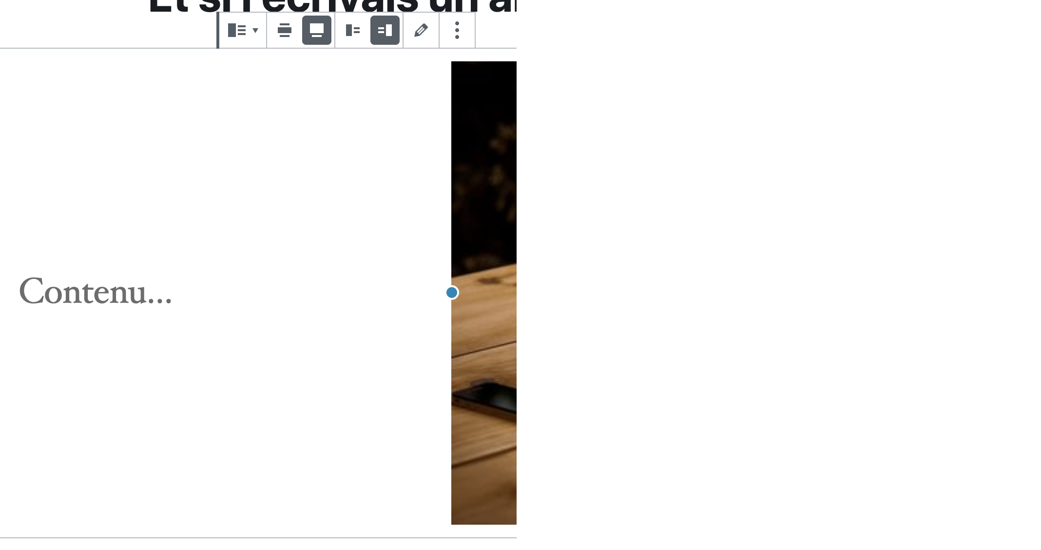
Yeah, we need to adjust this a bit so that it works on dark themes. Currently it's pretty jarring:
A couple options:
I'd like to see these match up nicely, so let's try making the dot one pixel smaller. |

|
Hmmm, opacity value would probably clash in a weird way where the line and dot meets. I can try it without those border lines it but I remember it used to "disappear" in the image. |
|
CoBlocks doesn't do anything for dark themes, looks like, but it works a little better because all of the lines are thicker:
|

|
New thickness and using a light gray instead of full white when dark theme detected (same as the selected block border in fact). Let me know what this iteration looks like
|

|
The circle doesn't make clear that this is for resizing, which isn't a problem with the mouse cursor, but it could be confusing for users of touch devices? Perhaps when the control is being moved, it can swap the circle out for arrows |
|
I tested this today and it feels pretty comfortable. The line weights were great.
Adding anything more than simple dots might get too overwhelming, especially on mobile. I took a look at Google Docs and they just use simple squares. There are more of them but I think we're at a good position here. Ultimately I'd like to see us work toward the resizing while displaying values like in CoBlocks, but that can be another PR.
|

Absolutely! I'm trying to do granular improvements with my PRs instead of one big. General ideas tracked in #14410 Would you say this is ready to go from a design perspective and I can ask for a final code review? |
From a design perspective, yes. It's ready to go. 👍 |
| // Hide side handle line by default | ||
| .components-resizable-box__side-handle.components-resizable-box__handle-top::before, | ||
| .components-resizable-box__side-handle.components-resizable-box__handle-bottom::before { | ||
| transform: scaleX(0); |
There was a problem hiding this comment.
A couple animation notes: Just noting that scale is one of the less performant animations. I don't think it's a huge issue here since we're only animating borders basically. Shouldn't have a huge impact.
In any case though, we should move these into an animation property and combine it with opacity animation as well so this animation relates a bit more to some of the other animations we have happening in the UI. Then we can also loop in the @reduce-motion mixin for users that want to opt out of the animation as well.
@marekhrabe I have that change ready locally — do you mind if I push it to this branch?
There was a problem hiding this comment.
I have that change ready locally — do you mind if I push it to this branch?
You rock! Please do 🤘
|
I had an issue when resizing the media & text image when it's full-width aligned. I don't really think it's related to this PR but worth mentioning. There's a flickering effect and sometimes the image appears cropped or disappear entirely.
|
There was a problem hiding this comment.
Nice work here 👍
I'll leave the final word for @kjellr to add his commit if needed.
|
Alright, I merged those animation changes in. I had to sync up with |
|
@kjellr I think something went wrong here with the rebase/merge? |
|
Nice let's ship it |
|
🎉 Excellent, thanks folks! |
|
It's been a pleasure collaborating on this! 🥳 How do I proceed? I cannot merge, as Travis CI is pending and doesn't seem to do anything or provide a way to trigger it. |
|
Merged, I don't expect this to break any tests, but let's keep an eye on the builds in master. |
|
After using this in the wild, I've noticed that the conversion of my It likely happens because we have styles for both
What was the reason for moving this into animation? Would you be opposed of going back to the transition and implementing opacity and reduced motion for it instead of animation? Unless I'm missing something crucial, it should be an easy change. |

|
Ah, good catch. We could re-adopt |
|
Cool, I'll spin up a PR and update the mixin (or figure out another solution). I'll ping you there :) |
|
Thank you! |
|
I've brought back the transition and it solved the issue mostly but some kind of tiny flicker still appeared in limited cases and I haven't been able to figure out how to get rid of it fully. With that, I'll leave this like it is for now and potentially later investigate the underlying library. I think that the problem lies somewhere there… |
Description
This builds on top of my #14481 which made handles much bigger. This PR adds a secondary visual aid to them, apart from the mouse cursor.
The blue line design was suggested in #14410 (comment) by @melchoyce. In this PR, it differs a tiny bit from the sketch as it has an extra white border around the blue circle. Without changing the markup to add more elements, this is the best we could do I think.
I've made them appear only on hover in the first iteration - sliding out of the blue circle to indicate what control they belong to.
How has this been tested?
Test with blocks: Media & Text, Image (align it "center" to show most handles at once) and Spacer. They all use
ResizableBoxinternally.Screenshots
Types of changes
New feature (non-breaking change which adds functionality)
Checklist: