Block API: Add support for icons for block categories #10651
Conversation
 mtias
added
[Type] Enhancement
mtias
added
[Type] Enhancement
|
Thanks for working on this. Can we shift the icons to be rendered on the right so that text always aligns visually on the left? |
|
What if the text was always rendered with space on the left for an icon, so both the icons and the text would always line up? |
|
For reference, this is an old mockup I prepared to avoid the issue with icon alignment:
The icon on the right avoids having different indentations for the various categories, and at the same time optimizes space. :) |
|
Note: we should also update:
|

|
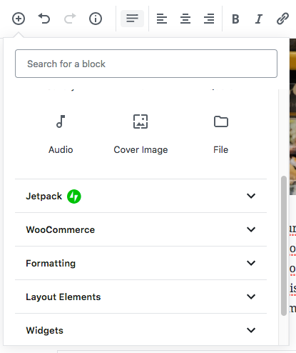
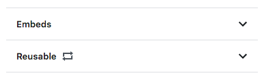
Good call, folks - I like the suggestion for the icon on the right side. Updated the PR, here are some screenshots: Inserter with an icon on the "Common" block category: "Reusable" category in the inserter with one or more existing reusable blocks: Inserter with a custom SVG icon on a custom category: This is ready for another look. |
| import { cloneElement, createElement, Component, isValidElement } from '@wordpress/element'; | ||
| import { Dashicon, SVG } from '../'; | ||
|
|
||
| function RawIcon( { icon = null, size = 24, className } ) { |
There was a problem hiding this comment.
I suspect the default size property here might have some unexpected side effects on the different types of block icons and the different places where we render them. Mind a sanity check here @jasmussen or @chrisvanpatten as you know more about all the specificities.
There was a problem hiding this comment.
Interesting timing, I'm actually trying to fix a regression in #10938 (comment) related to this.
24 should be default, but it's okay if an SVG needs to override that and show a 20x20 icon.
If 24 is not default, then that's a bug, as is discussed in that link.
There was a problem hiding this comment.
It looks like we were explicitly showing Dashicons as 20x20 while this PR makes them 24x24 ?
There was a problem hiding this comment.
@youknowriad Yeah dashicons should show at 20x20 for weird sizing reasons, but material icons should show at 24x24
| @@ -0,0 +1,35 @@ | |||
| /** | |||
There was a problem hiding this comment.
My expectations from the name and description don't really follow into the implementation. If it's "without styles", why do we apply a default width? And an unstyled variation seems more appropriate as a prop of a default component type, e.g. <Icon isUnstyled />.
There was a problem hiding this comment.
Well, I consider the width an attribute, and not a style 🤷♂️
And regarding the component name - Icon felt a little too broad, and I'd probably expect an icon component to be more flexible in terms of how the icon could look. So I'd instead expect to have an Icon component that could use the RawIcon, but add on top of it.
What do y'all think?
There was a problem hiding this comment.
I'd go for either Icon or, considering:
Icon felt a little too broad, and I'd probably expect an icon component to be more flexible in terms of how the icon could look
then I might go with UnstyledIcon.
There was a problem hiding this comment.
I'm good with changing to UnstyledIcon, @aduth @youknowriad does that make sense to you?
There was a problem hiding this comment.
I'd probably expect an icon component to be more flexible in terms of how the icon could look.
Can you elaborate on what you mean by this? I'm not sure I follow, and am having a hard time understanding what specifically we're implying in these multiple layers of icon components.
There was a problem hiding this comment.
I personally still have a small preference for just Icon, if we need to make a distinction between styled and unstyled later, we can add it as a prop.
There was a problem hiding this comment.
I've been thinking and started gathering a list of what <Icon /> would provide more than <UnstyledIcon />, but I didn't get too far with it.
I guess I'm good with renaming this one to <Icon />, it seems @mcsf and @youknowriad are good with <Icon />, @aduth does that sound well to you?
There was a problem hiding this comment.
Cool, thanks 👍
Renamed <RawIcon /> to <Icon /> in 3486d0b
I'd appreciate another look when y'all get a chance.
| { title } | ||
| { icon && <RawIcon icon={ icon } className="components-panel__icon" size={ 20 } /> } |
There was a problem hiding this comment.
What's the impact of this change on other usage of PanelBody with icons? Are we ok with all panel body icons being moved to the right or should it be specific to the inserter?
There was a problem hiding this comment.
Last time I checked, the only usages were in the inserter, and this PR has verified them all.
Whether we're planning to use the PanelBody for something else, and icons would make sense on the right in these cases - perhaps @mtias @jasmussen would know better.
There was a problem hiding this comment.
It looks like it was introduced explicitly for this particular usage (Inserter), so yes, I think I'm fine with the change.
There was a problem hiding this comment.
Yes, it was added for the reusable block feature.
There was a problem hiding this comment.
At the moment custom categories are provided using a backend filter IIRC cc @gziolo, how do we provide SVGs from the backend? Do we have the corresponding JavaScript API to add these categories?
 tyxla
force-pushed
the
try/block-categories-icon-support
branch
from
tyxla
force-pushed
the
try/block-categories-icon-support
branch
from
8e44061
to
d947c68
Compare
| @@ -14,10 +14,10 @@ exports[`core/embed block edit matches snapshot 1`] = ` | |||
| aria-hidden="true" | |||
| class="dashicon dashicons-embed-generic" | |||
| focusable="false" | |||
| height="20" | |||
| height="24" | |||
There was a problem hiding this comment.
I think this is an issue actually. As outlined here #10651 (comment) Dashicons should be 20x20 by default.
There was a problem hiding this comment.
Oh, that's a fair point. I'll reflect this in the component then, and will add some tests too.
There was a problem hiding this comment.
Updated in c7959cf, thanks for the suggestion!
|
Tested and works well. |
|
@youknowriad thanks for merging this one! However, it seems we forgot to remove a commit from the branch before merging. So I've filed a PR for this: #11191. |
|
I tested with WordPress 4.9.8 and Gutenberg 4.2.0-rc.1 and didn't see a Dashicon to the right of the "Common" category name. Is this because it's something that needs to be opted into using custom code? Note: I followed the testing steps quite literally and it's possible I'm missing something. |
|
@designsimply - it's expected that you don't see it. Adding the Common category icon was for testing purposes for this PR, and even though we merged it with this PR, we reverted it in #11191. |
|
Aha. I see. Thank you for the clarification! |
I also would prefer the icon to be on the left. Then assign an icon to each of the default categories, just like the WP admin sidebar. Having them on the right is inconsistent with the rest of WP/Gutenberg UI, and doesn't make finding the category you want any easier since you can't quickly scan a single column. |
Description
This PR adds support for icons for block categories. In addition to supporting Dashicons, the idea is to introduce support for external components, functions and svg icons, in order to allow for third party plugins to be flexible with the icons for the categories they register.
Since
<BlockIcon />already supported all those kinds of methods to define an icon, we're abstracting the functionality to a separate component, and reusing it here and in<BlockIcon />.How has this been tested?
BlockIcontests -npm run test-unit packages/editor/src/components/block-icon/Icontests -npm run test-unit packages/components/src/icon/npm run test-unitnpm testScreenshots
Inserter with an icon on the "Common" block category:

https://cldup.com/Eupr3BAnyc.png"Reusable" category in the inserter with one or more existing reusable blocks:

Inserter with a custom SVG icon on a custom category:

https://cldup.com/etFPNTYIK3.png(see Automattic/wp-calypso#27878 for testing it)
Types of changes
<RawIcon />component and exposed it.<RawIcon />.<BlockIcon />to use<RawIcon />.PanelBodyto use<RawIcon />for block categories.<PanelBody />.nullicons (no icons).<RawIcon />to<Icon />.Dashicondefault to a size of 20x20, while keeping 24x24 for the rest of the icon types.Checklist:
Notes