Column width value changes. It's hard to set width. #16370
Comments
|
From a technical implementation, this was tricky to find the appropriate "expected" behavior. The current behavior is essentially:
So in your example, if you had resized the middle column instead of the last column, the first would not have been affected. In retrospect (and evidenced by this issue), this behavior is not as obvious at it had hoped to have been. I think it's fair to say we should optimize to try to reduce (or eliminate) the chance that if a user had previously assigned an explicit percentage width to a column, it should not be subject to future width redistribution. However, in pursuing this, we would likely encounter a problem the current logic is trying to account for, which is that without redistributing columns, we can't ensure that the sum total of the widths is 100. Perhaps this is reasonable, especially if we also consider to show some messaging to the user that the values they've selected are not "valid" (similar to the contrast warning?). Thoughts? Suggestions? |
|
@aduth Yeah, that's tricky. What I did with CoBlocks resizing before was change the adjacent column width only and not distributed. In this case it's easier to manage the widths and still have a total sum of 100. I hope this helps. |
|
I recently ran into this problem as well and would love to see one of the solutions offered above. Is it okay if the values of the columns don't add up to 100%? I think so. Adding some text in case this happens seems is possible, but I don't think it should break anything if they don't add up to 100%. For example, if I set each column to be 15%, it would just look like this on the front-end.
Can this be a solution? If y'all think it's necessary for some messaging in the editor that the widths don't equal 100%, I can mock that up. |

|
@mapk I'm coming around to this idea, since I think more often than not, the current behavior rarely results in an expected outcome, and is more frustrating than it is helpful. That being said, there's a question from a usability perspective of whether there should be something to help a user create a set of columns which add to 100%. If we remove the current behavior, then it's up to a user to manually edit each column and assign their widths appropriately if they want to occupy the full width available. This was more of a problem before #16129, since at least now the most common arrangements are presented as predefined options. I never explicitly referenced it here, but based on @phpbits advice in #16370 (comment), I had opened #16822 in the summer as a slight adjustment to the current behavior, in case that's something worth pursuing. However, given the challenges outlined there, maybe the simplest option for moving forward would be to allow manual width adjustments to be truly manual. I do think if we go this route, that a warning would be appropriate to communicate to the user if the columns do not sum to 100%. |
|
@aduth excellent! I think @talldan made a good comment in #16822.
I'll work through a couple ideas in mockups.
|
|
This ties in to #7694 and #15660 as well, where eliminating interactivity on the "Column" block necessitates that the existing controls be moved to the "Columns" parent. In fact, #16077 implements exactly this, though it maintains the existing behavior of resizing adjacent blocks. If we remove this behavior, I think it could simplify the pull request a fair bit. I think it could use some design thought as well, since I'm not sure if the range controls as presented are the best option. Separately, #16024 implements the necessary work to disable interactivity on the "Column" block, but I think it can be addressed independently from the resizing controls. |
|
There's a lot to consider here. Even #16791 and #16790 play into this a bit. Quite honestly, I think pulling the column widths out of the Column block and into the Columns block (parent) is a better way to go here. I created some mockups to convey how this might work. Columns block - Initial state after selecting "3 columns" from the placeholder
Columns block - manual adjustment of columns
PrototypeNotes
|


|
I like the idea of a toggle option to control whether the automatic width distribution should take effect. I still think, based on the early discussion in this issue, and the changes considered in #16822, we might still want to try to improve that default behavior. It also means we have to continue to deal with the complexities surrounding the width distribution, but this is more of a technical challenge that we can overcome. I can see about reviving #16077 with some of these new iterations. One thing which might impact your proposed design: If we go all-in for #7694 / #16024 so far as removing interactivity on the "Column" block altogether, we will need to find a place for all of the current column settings. Notably, this also includes the vertical alignment option for a column. My original thinking with #16077 in having "Column 1", "Column 2", etc. subheadings separate from the width control for that column was in order to better accommodate this possible need. |
Interesting thought. I imagined the "align top" settings for each column could remain part of the individual Column block like so...
But your idea to bring all the individual column settings into the parent Columns block might work well. This would move those settings from the block toolbar and into the sidebar. Does that feel okay? |

|
I think it could go either way. The main idea with #7694 was to flatten the block hierarchy, where it is currently cumbersome to navigate in and out of the blocks in a Columns block. If it could be achieved, the only blocks that a user would select are either the Columns wrapper, or one of the content blocks within any of the columns (i.e. no "Column"; it technically still exists, but would not be selectable). But, based on the discussion we're having here, it might turn out to not be worth the effort if we have lots of settings specific to individual columns such that it makes more sense that the user can and should interact with those individual column blocks (as it exists today). |
|
Whilst I understand the issue attempting to be solved I do think that the solution is too complex and adds cognitive load For example, compare the old screen now to new:
I would argue you don't need to see all columns at once, can perhaps this distil down to just be the one you are in at that point? At any point, we end up with multiple elements doing the same thing we should consider how can we reduce and simplify. I just don't think such a complex interface is a good step forward, but I do think we can have that functionality just not all on at once. Looping in @jasmussen here as I know you have some solid experience with this type of distilling. |

|
What a thread! And great ticket, thank you! I'm just back from vacation so it's very possible my brain is still booting, but looking at the GIF in the original ticket, the solution seems very obvious to me: don't change any column values automatically. The fact that we do feels like a bug — I just typed in 20%, why is it now 30? I understand why it's 30%. It's because we are trying to be helpful to redistribute the remaining space, as Andrew put it. But why do we? What if I want my columns block to be 200% wide? 4 columns each at 50%? Maybe I want that horizontal scrollbar — the Shelf theme does it. Right now we are adding complexity in order to solve a problem caused by complexity in the first place. If we simply did not re-distribute column widths, we would not need any additional UI. Perhaps a small warning box that says "your columns block is now more than 100% wide" ([needs copy review]). Are there other problems the redistribution of widths is solving that I'm glossing over? |
|
While I understand the concern for adding complexity, providing a holistic view that is easily accessible is a plus. Right now having to click through individual columns to figure out their width is a process of "hunt and click". It's a bit daunting to try and remember where these settings are located. I've noticed this in usability tests as well. Seeing them in one place unifies the experience. It's extremely valuable to surface automatically adjusted parameters rather than making hidden automatic adjustments on unseen columns. BUT that being said, eliminating the auto-adjustments altogether could be interesting. Maybe this is a good first step? Are there any potential theme-related problems that could arise from this? Also, I agree we should communicate any non-100% widths to the user. Where should the warning text exist? As a user, I'd like to see a warning associated to the same area I created the error. So probably on the child Column block sidebar. But would it show only on that individual Column sidebar? Thinking this through, the warning indicates the overall Columns block width problem. IMO, that warning would need to show on all child Column block sidebars unless it gets resolved. Would we also want to show it on the parent Columns block sidebar as well? That last one seems too disconnected if I have to click to a child block to fix the width. |
@karmatosed I don't personally feel that considering the two screenshots in isolation is a fair comparison because, for me, the bigger challenge in the current behavior stems from how a user selects these blocks (or even learns to know that they exist), similar to what @mapk is saying. Granted, it's a challenge that has and will continue to be acutely relevant as we transition into full-page editing, where many levels of nesting will be common (i.e. face the challenge head-on). One thing that #16077 has going for it is at least that it makes the auto-adjustments more obvious in how changing one column will impact its siblings. I agree that a good first step could at least be to explore a pull request which disables the auto-adjustments altogether. Conversely to this point about how grouping the controls in the "Columns" wrapper would make the auto-adjustment impact more obvious, I think removing the auto-adjustment and keeping the per-block width controls could at least alleviate some of the current confusion. |
|
I am totally into taking this in steps. I do think it's fair to view together as it shows the cognitive issues, but absolutely this needs to have a solution that scales. Selection is key but that shouldn't force us into adding UI to compensate. It's a tangly problem to work on though so taking it step by step makes sense. |
|
It's also good to note it's not a lot of added UI. Those options (outside of the toggle) exist already in other areas. The solution proposed just unifies these elements into a more predictable location. |
|
Whilst yes 'a lot' is in the eye of the person experiencing, for me it was that. By unifying in the way it was it was surfacing in a place that felt more than previously. I totally recognise that was my experience though in what had been done. A note worth considering is when we do these changes to usability test them to check what it feels like outside of us. None of us might be right and that's totally ok as we take it in steps. |
I fiercely agree, this is something to address. But I also feel it is important to separate that conversation from this one. Specifically, it's about trying to not duplicate UI. Being able to adjust column widths in two different looking interfaces depending on whether the columns block is selected, or whether individual column wrappers are selected, is likely going to add additional confusion: if I can edit in two different looking places, which one is right? And is there a connection between them? One solution is discussed in #7694, which suggests that the individual column wrappers could be made "passthrough", or invisible. This is somewhat like how Media & Text works, where you don't have to select a column to resize the split. The tradeoff is that you either have to make a complicated UI to set individual padding/background properties for each column, or you just can't. The alternate route we tried taking in the https://wordpress.org/plugins/layout-grid/ that I worked on. In this version, the interface for resizing columns are the drag handles left and right of each column:
It's technically duplicate UI, but because it visually looks identical regardless of what is selected, it doesn't feel separate. |

|
One point I like from the above screen is it takes away from the sidebar. There really is something about interacting directly. I know there's an issue for the grid and well this is making me feel I'd love it even more across blocks. |
@jasmussen, I totally agree there would be confusion if the UI existed in two locations. To help prevent that, I recommended removing those options from the individual Column child block. Would that help ease your worry? Or just add to it? 😆 |
|
Sorry, I missed that bit. This could be a small step on the way, but I can't help but feel like this is just another way to accomplish the same which might just confuse in different ways. So long as the column (singular) is selectable, users might look there and be confused. Your idea here, combined with the passthrough feature, I'd jump on that in a heartbeat, but as mentioned that would come with tradeoffs (no individual padding/background options, or a complex UI for it). Because of the rabbit hole that is, I do think the very first thing to test, especially since it's likely to be a small PR, would be to remove the auto-redistribution of column widths. |
|
Really good thread here – lots of great points! Thank you, everyone. I too support the idea of the passthrough feature combined with this UI.
However, this would also move the It sounds like the first good step might be to disable the auto-readjustments for now. Then we can take another go on the UI that includes the vertical alignments too, and work toward the passthrough feature. The individual Column child blocks have always been a bit confusing for me. Especially in light of this bug here: #19354 |
|
if i was to build my own visual editor, my first instinct would to be have the value set by the user persist in the editor, no matter what. if they dont total to 100, then just use some quick math to get a ratio. for example, user sets 20, 20, 100... then the total is 140... so the output values would be 14, 14, 72. the key feature here being that the new values are generated on the output, not in the editor, that way you can enter anything, like 1000 1000 3000. not only would it be dummy proof, it would allow for easier math, like 1, 1, 2 would convert to 25, 25, 50 just an idea it would also be totally backwards compatible |
|
I've opened a pull request at #19515 to experiment with removing the auto-adjustment which happens to a column's siblings when its width is changed. |
It's an interesting idea, but I think it might be difficult to try to communicate this behavior to users in a way that wouldn't be confusing. For example, what labels would we use for these inputs? Strictly speaking, these aren't percentages, they're just values which end up being considered as relative to the values of a column's siblings. Even then, considering your example of entering "20", "20", "100".. I think as a user, I might expect that if I entered "20", it would constitute 20%, even if it's fair to say that it can't represent 20% if we want the total to equal 100%. It would be unexpected to me that it would be evaluated as effectively 14%. |
|
Moreso than the math becoming hard explain to a user, I believe there is an implicit expectation that if I manually type in a specific number, that number should not be changed without my explicit consent. Any redistribution could happen as a separate action: "We noticed your columns add up to more than 100%, would you like to redistribute the values to fit? [Yes]/[No]". |
|
#16077 has its advantages. It eliminates all the finicky focus clicking in a busy / constrained focus clicking area that is trying to cover: 1) Select Columns parent 2) Select Column box 3) Select Column box content. I like the idea of a toggle for manual-fit / auto-fit to 100%. If there is a good case for 200% it could be a combo toggle. Regarding the auto-fit algorithm, I vote with @phpbits to only auto-adjust the column box to the left / right of the box being adjusted. It yields a result that is in the control of the user. For a user to get back to a fractionaly proportional symmetry (e.g 1/3 | 1/3 | 1/3) see suggestions in #17918. |
|
I am checking in... How is this issue coming along? |
|
@paaljoachim The changes at #19515 reflect the latest here. There is an open question there about the expected behavior, which I hope to get some design feedback. I may plan this week to at least try the "half-way" behavior described there (where there is still some automation, but only when first assigning an explicit width). |
|
#19515 was merged today, which should have a significant improvement on the workflows as described in the original comment of this issue. Specifically, changing the width of one Column should no longer have a direct impact on the width assigned to another within the set. Through feedback provided during development of #19515 and as explored in some of the earlier comments and mockups in this issue, there is still room for improvement. These may include some or more of:
It may be most effective to consider each of these in individual task issues, perhaps more as decisions and specific solutions around them become more clear through continued discussion here. |
|
Could you add the following items discussed in #19515 to your checklist above...
|
|
I am checking in. It would be nice to get a status update. |
|
I think we should close this issue now, the original intent of it is solved and there are separate issues for other improvements. |
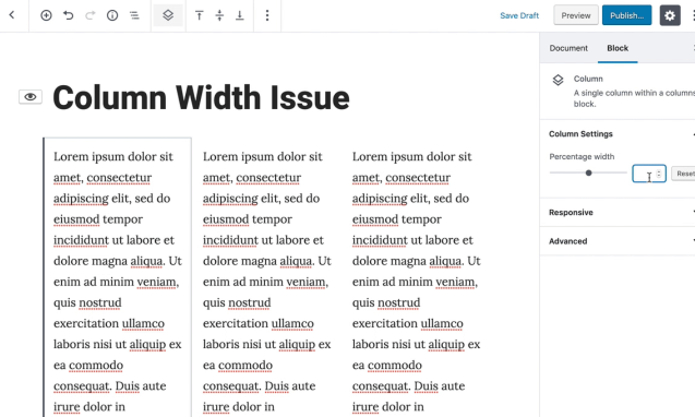
Describe the bug
It's really hard to set columns block width. Other column's width are changing the values whenever other column width changes.
To reproduce

The text was updated successfully, but these errors were encountered: