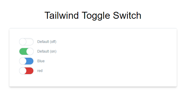
An switch toggle for https://tailwindcss.com/
Basic Html for an toggle switch
<div class="mb-2">
    <div class="form-switch inline-block align-middle">
        <input type="checkbox" name="1" id="1" class="form-switch-checkbox" />
        <label class="form-switch-label" for="1"></label>
    </div>
    <label class="text-xs text-grey-dark" for="1">Default</label>
</div>You can install the package with yarn or npm:
yarn add TowelSoftware/tailwindcss-togglenpm install TowelSoftware/tailwindcss-toggleMoved most Tailwind classes in to an component since an toggle switch is going to be used more then one time. Also sadly Tailwind don't have support for all css classes yet
@tailwind preflight;

/* CHECKBOX TOGGLE SWITCH */
.form-switch {
    @apply relative select-none w-12 mr-2 leading-normal;
}
.form-switch-checkbox {
    @apply hidden;
}
.form-switch-label {
    @apply block overflow-hidden cursor-pointer bg-white border rounded-full h-6  shadow-inner;

    transition: background-color 0.2s ease-in;
}
.form-switch-label:before {
    @apply absolute block bg-white pin-y w-6 border rounded-full -ml-1;

    right: 50%;
    content: "";
    transition: all 0.2s ease-in;
}
.form-switch-checkbox:checked + .form-switch-label,
.form-switch-checkbox:checked + .form-switch-label:before {

}
.form-switch-checkbox:checked + .form-switch-label {
    @apply bg-green shadow-none;
}
.form-switch-checkbox:checked + .form-switch-label:before {
    @apply pin-r;
}

@tailwind utilities;If you are going to use it in single file *.vue components checkout how it is implemented in the TailwindToggle.vue file.
You would then go on to use it in your app like this.
<div>
    <AppToggle v-model="isToggleOn" onText="Hide Map" offText="Show Map"/>
</div>
<script>
    import AppToggle from '@/components/AppToggle'
    export default {
        data () {
            return {
            isToggleOn: true
            }
        }
    }
</script>