Display System can be a block in a larger framework of cooperating modules. Read more about it here
However, it can also be used standalone.

This is a general purpose, configurable system for data display. It currently contains 8 modules, which are explained further on.
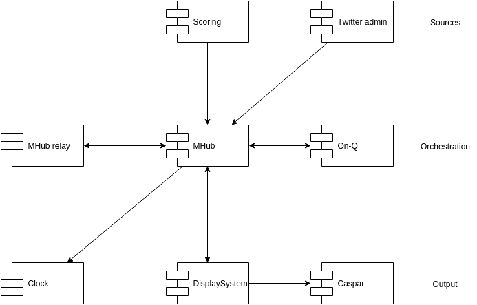
All modules can be controlled via websockets. In particular, we support mhub, which was made for this purpose and supports a higher level of messaging, routing, relaying and clustering. In any case, ordinary websocket is supported, as long as it delivers messages in the format described in the modules.
Also, all modules can be controlled via a javascript interface, so you can write your own scripts to interface with them. Lastly, we provide a control panel that can be opened in a separate screen to control the modules.
generated with DocToc
You can check out display system online, however, you can't really customize anything. It is a nice way to check it out though.
Everything is served over https, which allows the webcam to work. If you want to control the system via websockets, you can easily set up your own mhub. See Controlling the modules via websockets for a description to get that running.
Either:
- If you know what
gitis: clone the repository:git clone https://github.com/FirstLegoLeague/displaySystem.gitand check out the branchgh-pages. - Otherwise, just download the zip from: https://github.com/FirstLegoLeague/displaySystem/archive/gh-pages.zip and unpack.
There are a few ways to use this package
- Double click
index.html. This shows a white screen. Don't worry. - Open the console by pressing
F12and selecting theconsoletab. - Type
displaySystem.modules.time.show()and hitenter.
Ok, some clarification. All modules are hidden by default. Also, all modules are accessible to javascript, which makes it possible to control them. In step 3, you just executed some javascript to show the time. Let's do this some more:
displaySystem.modules.time.hide()displaySystem.modules.clock.show()displaySystem.modules.clock.start()
You probably do not want to do this every time you load the display. So, open config.js and replace
'clock': {
    // visible: true
},
by
'clock': {
    visible: true
},
And reload the page. Voilà, the clock is visible by default. You can also do this with other modules.
Also, you probably always want to use the page in full screen mode. To enable full screen, press F11.
A few key bindings are available by default, but they can be customized by adjusting the keybindings configuration
q: show the timea: hide the timew: show the clocks: hide the clocke: show the lower thirdd: hide the lower thirdr: show the twitter barf: hide the twitter bart: show the listg: hide the listc: show the control window
Since the display can be controlled by javascript, you could create a control window with buttons and such to control everything. You may set this up with two monitors, one facing the audience and one facing you. This way, you can control the screen without having buttons visible.
Luckily, we have already done this for you, but there is a catch. The control window does not work when you are using the display system directly from the file system (if this is the case, the address bar starts with file:///). There are a few ways to solve this:
- Use the online version, but as said, there is not much to customize here.
- Host it somewhere online (most hosting providers allow you to FTP the files).
- Host it locally, for this you need to install a web server. The easiest one I can think of is installed like this:
- install nodejs from https://nodejs.org/
- open a command window (from the start menu, type
cmdand press enter) - open the folder where you downloaded this display system (in the command window)
- type
npm install - type
npm start - you can now open the application by navigating to http://localhost:1391
- Lastly, you can also control the display system by other means, but this gets more complicated. More on that below.
So, the control window. To open it, press c
The control window shows buttons for all commands that the modules have. There are also input fields if the commands can take arguments. Try and use this to display the time or the clock (for instance in the online version).
If you want to use the display system as an overlay to a video feed (which is the original purpose), you need to get rid of the white background and replace it with live video. There are several ways to do this
- Use the browser as your video mixer. To do this, use the
cameramodule. By feeding in a video signal (for instance using a usb camera), you can create a composite output. You may want to set the background module to black if the screen size does not match the video size. If you have a webcam, you may already have discovered this in the online version. - Give the background a special color, and use a separate video mixer with chroma key capabilities to mix the overlay over a video feed. Use the background module to do this.
- Use more advanced software video mixing software, like caspar CG. In the newest versions, you can use a
HTML producerto overlay a webpage (like this display system) over a video. Make sure, you disable the background module to have a transparent background. Also, from within Caspar, you can create JavaScript functions to control the modules, much like we have done manually from the console.
All basic configuration is done in the config.js file. The configuration options are:
wsHost: Websocket host to connect to, if anymserverNode: Node to subscribe to when using mhub, can be omitted otherwisemodules: Object of modules to load. The keys should correspond to names of js files in the modules folder, the values can be an empty object or some configuration, see the modules section for configuration options per module. The config already contains all options, but some are commented out. Enable them by removeing the comments.modulePath: Path to load the modules from, defaults tomodules. Can even be an url to another domain, since everything is loaded as a normal JavaScript file.
If the display system is configured to listen to a websocket server, which can be mhub or some other websocket server, it expects messages of the form:
{
    "topic": <module:action>,
    "data": {
        arg1:value1
    }
}
For example:
{
    "topic": "twitter:addMessage",
    "data": {
        "id": 123,
        "user": {
            "screen_name":"FLL"
        },
        "text": "FLL is great!"
    }
}
Since websockets only support text transfer, the above object should be serialized to JSON. It is automatically deserialized and passed to the apropriate module. To get mhub-server running, just read the instructions. In short:
Install:
npm install -g mhub
Configure sever.conf.json:
{
    "listen": {
        "port": 13900
    },
    "verbose": true,
    "nodes": ["default", "test", "overlay", "twitter"],
    "bindings": [
        { "from": "twitter", "to": "overlay", "pattern": "*" }
    ]
}
Start:
mhub-server
Send a message:
//*nix
mhub-client -n default -t twitter:addMessage -d '{"id":123,"user":{"screen_name":"FLL"},"text":"FLL is great"}'
//windows
mhub-client -n default -t twitter:addMessage -d "{""id"":123,""user"":{""screen_name"":""FLL""},""text"":""FLL is great""}"
In your config.js, make sure you have the following options:
wsHost: "localhost:13900",
mserverNode: "overlay"
Note that in the mhub-server config (server.conf.json), the twitter node is forwarded to the overlay node. That makes this setup work.
For the online version, mhub-server needs to run with tls enabled. To do this, add certificate files to server.conf.json:
{
    "listen": {
        "port": 13900,
        "key": "../certs/privkey.pem",
        "cert": "../certs/fullchain.pem"
    },
    "verbose": true,
    "nodes": ["default", "test", "overlay", "twitter"],
    "bindings": [
        { "from": "twitter", "to": "overlay", "pattern": "*" }
    ]
}
These files are created by the great folks at daplie, who provide certificates for the localhost.daplie.com domain, which just points to localhost (127.0.0.1). The files you need are these:
Note that in the default (online) config.js, we have:
wsHost: "wss://localhost.daplie.com:13900",
mserverNode: "default"
All api functions are automatically exposed as mhub topics. For example, where we used displaySystem.modules.clock.show() via the command line before, we can now do the same via websockets:
mhub-client -n default -t clock:show
When data needs to be added, for example when arming the clock via displaySystem.modules.clock.arm(30), we need to add a data segment to the mhub-client message:
mhub-client -n default -t clock:arm -d '{"countdown":30}'
Being able to send messages via websockets is nice, but it would be even more nice to connect a twitter feed to the whole lot, right? Luckily there is a command line application to read a twitter stream: node-tweet-cli
Install it like so:
npm install -g node-tweet-cli
Login (see the instructions if it is not clear):
tweet login
Now test your twitter stream in the console:
tweet stream lego
This would start streaming live twitter messages in your console. You are now one step away from connecting everything:
tweet stream lego --json | mhub-client -n default -t twitter:addMessage -i json
This command uses pipes to take the output of the tweet utility and pipe it into mhub-client.
By the way... the hosted version listens to localhost:13900/ on the default node. So you can set up node-tweet-cli and mhub-server locally and still use the hosted version of the display system. Isn't that sweet?
If you have a number of displays, all showing the time, you may want to be sure every display is showing the correct time. By default, the time module shows the system time, but that may be different (if not configured properly) between systems.
Also, you may want to set another time altogether, for example number of minutes into a match.
To set the time, you could just use the control window, but you can also use the websockets interface.
A nice way to ensure a consistent time is to just pipe a timestamp into mhub-client.
First install the cli-time utility:
npm install -g cli-time
Then make sure that in the mhub-server config (server.conf.json), the time node is forwarded to the overlay node.
Then pipe it through to an mhub-client instance:
cli-time -m json -i | mhub-client -n default -t time:set -i json
To set the time to 0 and start counting:
//*nix
mhub-client -n default -t time:set -d '{"timestamp":"0"}'
//windows
mhub-client -n default -t time:set -d "{""timestamp"":""0""}"
Note that the "0" is quoted and it actually means setting the time to Jan 1 2000 at 00:00 in your local timezone.
This bit lists the available configuration options for the modules (that you can use in config.js). Also, it lists the available javascript functions you can call. Use the following code in the console (behind F12):
displaySystem.modules.<module>.<function>()
For example:
displaySystem.modules.time.show()
Background color of the application. Can be used for chromakeying. If not used, the background color is not defined, which can mean transparent in for instance a casparCG HTML producer
Configuration options:
visible: initial visibility, defaults to truecolor: color of the background, can be any css color, which includes names, rgb, rgba and hex colors.
Exposed api:
show(): show the backgroundhide(): hide the background, which can mean transparent in some applicationsset(color): sets the background to the specified colorclear(): clear the background by setting it to transparent
mhub topics:
background:showbackground:hidebackground:setdata:{color:<color>}background:clear
Shows attached camera stream as the background
Configuration options:
visible: initial visibility, defaults to falseaudio: whether audio should be on for the camera capture, defaults tofalse
Exposed api:
show(): show the videohide(): hide the video
mhub topics:
camera:showcamera:hide
A gallery of images. Partially transparent images may be used to display for example some logos in corners of the screen. Note that in addition to displaying images, you can use a custom css stylesheet to completely customize your experience (this is somewhat of a more advanced usage though).
To store images online, use any image hosting service, like imgur, postimage or tinypic
Another option for gallery is to display arbitrary pages. These will be displayed in an iframe. Note that not all websites can be displayed this way. Some of them do not allow rendering in an iframe.
Configuration options:
visible: initial visibility, defaults to false,timeout: time between transitions, in seconds. Enter 0 to disable transitions.transition: method of transition. Currentlyfadeis the only option, it is also the default.size: sizing method to display the image, can should be a valid css3background-sizeproperty. In practice: one of the following:cover: enlarge the image to cover the screen, some parts may be croppedcontain: enlarge the image to fit the screen, there may be empty space around the image100% 100%: stretch the image to fit the screen, it may become distortedauto: display the image as is
images: array of image urlspages: array of urls
Exposed api:
show(): show the galleryhide(): hide the galleryprev(): transition to previous imagenext(): transition to next imageset(index): sets the image specified by the indexload(images): loads the given images, either as an array of strings or a single string of newline separated urlspages(pages): loads the given pages, either as an array of strings or a single string of newline separated urls
mhub topics:
gallery:showgallery:hidegallery:prevgallery:nextgallery:setdata:{"index":<number>}gallery:loaddata:{"images":[<string>]}gallery:pagesdata:{"pages":[<string>]}
Simple individual images or bits of text that can be placed anywhere on the screen. This is useful for displaying watermarks or logos.
To store images online, use any image hosting service, like imgur, postimage or tinypic
Configuration options:
visible: initial visibility, defaults to false,sprites: an array of objects, containinghtml(optional): html content of the sprite. This can be text or more elaborate content<cssProps>: any css property to set. For exampleleftortop. Note that the property names should be camelCased, likemarginLeft
Exposed api:
show(): show all spriteshide(): hide all spritesshowSprite(index): show a particular spritehideSprite(index): hide a particular sprite
mhub topics:
gallery:showgallery:hidegallery:showSpritedata:{"index":<number>}gallery:hideSpritedata:{"index":<number>}
A simple countdown clock. This is the same clock as available on https://github.com/FirstLegoLeague/clock
Configuration options:
visible: initial visibility, defaults to falsecountdown: initial time in seconds
Exposed api:
show(): show the clockhide(): hide the clockarm(countdown): arm the clock. By default it arms to 2:30 minutes. You can arm to a different time by passing in seconds. Hencearm(10)arms the clock to 10 secondsstart(countdown,startTime):countdownis seconds to countdown from, without data uses previous set arm timestop(): stops the clock, and leave it at the countdown timepause(): pauses the clock when running, and resumes it when paused (toggle)
mhub topics:
clock:showclock:hideclock:armdata:{countdown:<sec>}clock:startdata:{countdown:<sec>,startTime:<timestamp>}clock:stopclock:pause
Shows the current system time. Or some other time if you wish
Configuration options:
visible: initial visibility, defaults to falseformat: time formatting, defaults toHH:MM(hours and minutes).
Exposed api:
show(): show the timehide(): hide the timeset(timestamp): sets the time (and ticks along). Pass in a unix timestamp. Egset('2015-02-07T13:00')orset(1423314000000)set(): passing nothing sets the time (back) to the system timeset('0'): passing0sets the clock to zero (it actually sets the clock to Jan 1 2000 at 00:00 in your local timezone)
format(mask): a formatting string to display the time, defaults toHH:MM
The time formatting if based on Steven Levithan's excellent dateFormat() function. For possible mask configuration, see his blog article
mhub topics:
-
time:show -
time:hide -
time:setset the current time, data should be of the form:{ "timestamp": "2015-05-14T15:48:54+0200" }This is just an iso formatted time string, the standard output of cli-time
-
time:formatdata:{mask:<string>}
Shows a list of things, for examples, rankings or schedules
Configuration options:
visible: initial visibility, defaults to falseheader: header of the listdata: data of the list, an array of arrays of strings
Exposed api:
show(): show the listhide(): hide the listset(pasteFromExcel,header): set the list, paste data from excel and add an optional header.
mhub topics:
list:showlist:hidelist:setdata:{pasteFromExcel:<csvData>,header:<string>}list:setArraydata:{data:[[<string>]],header:<string>}
Shows a table of data, similar to list, but more generic in its data format
Configuration options:
visible: initial visibility, defaults to falseheader: array of titles for the columnsdata: data of the list, an array of arrays of strings
Exposed api:
show(): show the listhide(): hide the listset(pasteFromExcel): set the table, paste data from excel. The program assumes the headers are in the first row of the excel.
mhub topics:
table:showtable:hidetable:setdata:{pasteFromExcel:<csvData>}table:setDatadata:{data:[[<string>]],header:[<string>]}
Configuration options:
visible: initial visibility, defaults to falseline1: initial first lineline2: initial second line
Exposed api:
show(): show the bar (and hides after 5 seconds)hide(): hide the barpersist(): shows the bar and never hides, untilhide()is calledtoggle(): toggles the visibility of the barset(line1,line2): sets the text of the bar, you can pass in two strings:set('hello','world')
mhub topics:
lowThird:showlowThird:hidelowThird:persistlowThird:togglelowThird:setdata:{line1:<string>,line2:<string>}
Configuration options:
visible: initial visibility, defaults to false
Exposed api:
show(): show the twitter barhide(): hide the twitter baradd(author,tweet): add a message to the bar
mhub topics:
-
twitter:show -
twitter:hide -
twitter:adddata:{author:<string>,tweet:<string>} -
twitter:addMessage: add a message, data should be of the form:{ "id": 114749583439036416, "timestamp_ms": 1430250098759, "text":"Tweet Button, Follow Button, and Web Intents javascript now support SSL http:\/\/t.co\/9fbA0oYy ^TS", "user": { "screen_name":"twitterapi" } }This is basically a subset of the twitter api output
To include custom styling, create a custom stylesheet to override a default style. Use this for instance to customize fonts, text sizes, colors or background images. You can host it somewhere yourself or serve it up with npm start, as described above.
Configuration options:
href: url to a stylesheet, can be local, or hosted somewhere. It can also be an array of stylesheets, which is used for theme modifiers.gist: gist id to load alongside the stylesheet, can be used to customize themes
Exposed api:
set: set the stylesheet, passing in thehrefparametergist: load a stylesheet from a gist id. All css files are concatenated and used as data urlreset: resets the stylesheet back to theconfig.jsoption
This module controls screen geometry. It allows you to rotate the display, control overscan parameters and zoom.
Configuration options:
zoom: zoom level of the windowaspect: either the string "native" or the aspect ratio of the device used. This can be used to compensate for aspect ratio problemsrotation: rotation of the display in degreesoverscan: array of overscan amount in pixels
Exposed api:
right: rotate rightleft: rotate leftzoomin: zoom in with 10%zoomout: zoom out with 10%zoomreset: reset the zoom level to 1
mhub topics:
geometry:rightgeometry:leftgeometry:zoomingeometry:zoomoutgeometry:zoomreset
This is a module that handles key bindings. By default it can show and hide other modules and show the control window, as explained in the Using key bindings section above. However, this module is completely user configurable.
The module uses David Flanagan's keymap.js, which is kept in a repository by 鬼道 (luics)
The keybinding configuration takes a map of key bindings with handlers. The key bindings should be strings in the form:
alt-ctrl-f
v
shift-f3
That is:
- a key like "A", "7", "F2", "PageUp", * "Left", "Delete", "/", "~"
- some optional prefixes like "alt-", "ctrl-", "shift-". These shoulde appear in alphabethical order
The handlers could be strings, in which case they are prefixed by displaySystem.modules.. This causes a string like clock.show() to be correctly executed. This allows for a simple way to bind module functions to keys.
Alternatively, handlers could be functions,. In that case, you can do pretty much anything you want, for example define "display groups" under numeric keys, to toggle the visibility of a set of modules.
This is the actual control window (which you must have seen by now). Display Systems comes with a standard control window that just creates buttons for all api functions of all loaded modules. You can change this by specifying a custom url to open.
Configuration options:
urlurl to load
Exposed api
open()opens the controls in a popup window
mhub topics:
controls:open
Themes can be used by pointing the css module configuration to a stylesheet. This stylesheet can be hosted anywhere. In particular, the following are available:
themes/rednblue/rednblue.css: a simple red and blue theme with slanted edgesthemes/rednblue-plus/rednblue-plus.css: an extra fancy red and blue theme
For screenshots, see the themes folder
We will provide a yearly theme especially for the FIRST LEGO League. Currently, there is none.
You can add your own themes in two ways:
- Host them somewhere yourself, by setting up a server, or hosting it through a
gh-pagesbranch in github (which we do for our themes). - Create a GitHub "Gist". Add as many css files as you like, then copy the last bit of the url (the Gist id) and paste it into the
gistfield in the css module.
The second method creates a stylesheet that can be used to override a certain theme or make small adjustments to it.
You can write your own modules. The displaySystem API provides the following methods:
- config(configuration)
- registerModule(definition)
The registerModule method expects a definition object with the following keys:
name: Name to register the module under. If omitted, the module is not registered and cannot be accessed programaticallytemplate: HTML to insert in the page. This should be a JS string.style: CSS to insert in the page. This should be a JS string. Note that the CSS is inserted at the front of the head. So any custom CSS in the head will override module defaults.factory: JS to execute when the module is loaded. If the factory returns something, it is registered under the module's name and can be accessed viadisplaySystem.modules.<name>. The factory receives the configuration defined inconfig.js.
For string input, you can use multiline which is included for convenience