Removes non-compact rank symbols in favor of compact rank #229
Conversation
|
We should recheck if this is a clean PR in the morning 😂 |
|
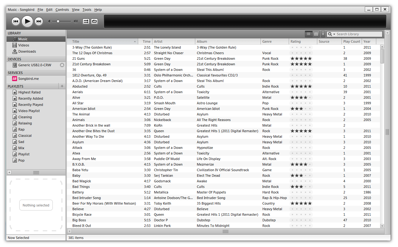
Just for the record: The non-compact rank was inspired by music players showing stars (see blow). It was introduced to be consistent in UIs provided by other software. The compact rank was intended for users not wanting to waste screen space. Regarding the modern screens, I would even favor the non-compact rank. However, the information density per centimeter on the screen might not be as high as the one perceived at the neighboring columns. When not sorting according to the rank (but to the author, title, year, ...), the difference between the different count of stars is difficult to distinguish. I didn't quickly find a reference for that. Meaning: How distinguishable should icons be and how to measure whether a chosen icon is different enough from another icon. I am aware of the work of Moody regarding notations, but I couldn't find general work on user interface design. @samystyle, maybe you can comment on that? |
|
I agree, that the implementation in the screenshot looks good, is easy to use and to understand. Therefore, if no one implements the behavior as shown above, I vote for removing the "non-compact" version and use the compact ranks as default (as done in this PR). |
|
While probably not allowed to formally vote, I agree that the PR should be merged. Implementing a non-compact rank could be done at a later stage and should preferably also support changing the rank by clicking in the column as well. Thinking about the discussions about using JabRef on high resolution screens, it appears that density is not always a problem. Still, an ugly UI still it, which I believe the current non-compact is. Better to remove and possibly re-introduce in a better way later. |
|
One can already change the rank by clicking on the column. Both left click (directly change) and right click (context menu offering to change the rank). I fully agree that having both options is an option overload only necessary for some edge cases. In case I discover good icons for the extended rank, I will bring them back in and adapt |
Removes non-compact rank symbols in favor of compact rank
|
I am against having both options. Either compact or non-compact, but the user should not have a choice here. We already have too many preferences for the user, making it difficult for us developers to maintain the code. |
|
Yes. If it is was not clear, this is also my opinion. But I like the proposal of Olly as an replacement for the current "compact rank" solution. |
|
I was rather thinking of having two different column types to select from (still the same entry in the .bib-item, no idea how the table column system works though). Will at least solve the preference problem and hopefully the ugliness problem. (Yes, people may use both in the same table layout, but let them... I can even imagine a quite good use case there.) However, no strong opinion on this as I never use the ranking, in JabRef or in any music organizer, anyway. But I would see a potential drawback in not being able to left-click to change the ranking in the same simple way as a multi-star approach if I used it. I imagine... |
|
I think two column types are even more ugly to implement in comparison to having a switch in the rendering. 😞 Oh, you mean that a star should be directly clickable to select the ranking. That'll be hard to implement... |
a7c6f63e25 correct license to match the SPDX license identifier. (#281)
d704bf80af Update locales-nl-NL.xml (#229)
5ffb73b05a Bump nokogiri from 1.13.9 to 1.13.10 (#280)
04be62eda6 Update locales-pt-BR.xml (#251)
b4db583787 Update locales-pt-BR.xml (#265)
b656b1b6f9 Fix date format for Basque (#274)
e7ec9bff94 Bump nokogiri from 1.13.4 to 1.13.9 (#272)
9125705f62 Update locales-nl-NL.xml (#279)
87445b0b65 Add composer.json (#161)
2919a84bff Fix page label in NO locales

git-subtree-dir: buildres/csl/csl-locales
git-subtree-split: a7c6f63e25323ac2f375943417d7f778f875f11c
Why?