Sheet
A sheet appears as a card that partially covers the page and can be dragged in a vertical direction to show more content. The page's content is visible behind the sheet to help people to remember the context they suspended when they opened the sheet.
👉 To get started, make sure you have followed the getting started steps
A sheet needs to live inside of a ModalityLayout. The ModalityLayout will provide an overlay that is disabled until the modal component closes. It will also add the possibility of tapping the overlay to close the modal component. The ModalityLayout should be placed at the root of your page for the best user experience.
In your XAML page, add the following:
<Contentpage
   ...
   xmlns:dxui="http://dips.xamarin.ui.com"
   ... >
<dxui:ModalityLayout>
    <dxui:ModalityLayout.Behaviors>
        <dxui:SheetBehavior>
            <dxui:SheetBehavior.SheetContentTemplate>
                <DataTemplate>
                    <!-- sheet content goes here -->
                </DataTemplate>
            </dxui:SheetBehavior.SheetContentTemplate>
        </dxui:SheetBehavior>
    </dxui:ModalityLayout.Behaviors>
    <!-- page content goes here -->
</dxui:ModalityLayout>
👉 All pictures and GIFs are taken from a iOS simulator, but the look and feel of this component is the same for android / ios devices.
👉 Samples can be found here
👉 A small demonstration of Sheet was visible at .Net Conf:2020
To open a sheet, set the IsOpen property to True.
👉 This is a bindable property and should be bound to a view model property that changes when people tap a view element inside of the page.
👉 An
OpenCommandis available for you to use directly from XAML from a different control (i.e an Button.Command can bind to Sheet.OpenCommand byx:Reference.
<dxui:ModalityLayout>
    <dxui:ModalityLayout.Behaviors>
        <dxui:SheetBehavior IsOpen="True">
            <dxui:SheetBehavior.SheetContentTemplate>
                <DataTemplate>
                    <!-- sheet content goes here -->
                </DataTemplate>
            </dxui:SheetBehavior.SheetContentTemplate>
        </dxui:SheetBehavior>
    </dxui:ModalityLayout.Behaviors>
    <!-- page content goes here -->
</dxui:ModalityLayout>

The sheet snaps to points when the user ends the drag gesture. The default is 0, 0.5, 0.98. It will snap in the direction of the latest registered movements. If 0 is registered as a snap point the sheet will close if it is released below the second snap point and the direction is downwards. If 0 is not registered the user can‘t move the sheet below the first snap point. The default SheetOpeningStrategy is FirstSnapPoint (0 is not considered a snap point).
If the speed of the gesture is above a certain threshold the sheet will either fully open or close depending on the direction. This threshold can be adjusted with FlingSpeedThreshold(default is 2000 pixels/second).
<dxui:ModalityLayout>
    <dxui:ModalityLayout.Behaviors>
        <dxui:SheetBehavior IsOpen="True"
                            SnapPoints="0, 0.5, 0.98"
                            SheetOpeningStrategy="FirstSnapPoint">
            <dxui:SheetBehavior.SheetContentTemplate>
                <DataTemplate>
                    <!-- sheet content goes here -->
                    <Label Text="This is the sheet content"/>
                </DataTemplate>
            </dxui:SheetBehavior.SheetContentTemplate>
        </dxui:SheetBehavior>
    </dxui:ModalityLayout.Behaviors>
    <!-- page content goes here -->
</dxui:ModalityLayout>
The content of the sheet might have some kind of view element that should close the sheet. This can be achieved by using our Modality.CloseOnClick attached property on the view element.
<dxui:ModalityLayout>
    <dxui:ModalityLayout.Behaviors>
        <dxui:SheetBehavior IsOpen="True">
            <dxui:SheetBehavior.SheetContentTemplate>
                <DataTemplate>
                    <!-- sheet content goes here -->
                    <StackLayout>
                        <Label Text="This is the sheet content" />
                        <Button Text="Press to close"
                                dxui:Modality.CloseOnClick="True" />
                    </StackLayout>
                </DataTemplate>
            </dxui:SheetBehavior.SheetContentTemplate>
        </dxui:SheetBehavior>
    </dxui:ModalityLayout.Behaviors>
    <!-- page content goes here -->
</dxui:ModalityLayout>
👉 This attached property can be attached to any type of
Xamarin.Forms.Viewelement.

All colors can be changed, look for color properties to start customising it the way you want.
<dxui:ModalityLayout>
    <dxui:ModalityLayout.Behaviors>
        <dxui:SheetBehavior IsOpen="True"
                            ContentColor="#6399AE"
                            HandleColor="#C23D32"
                            HeaderColor="#6399AE">
            <dxui:SheetBehavior.SheetContentTemplate>
                <DataTemplate>
                    <!-- sheet content goes here -->
                    <StackLayout>
                        <Label Text="This is the sheet content" TextColor="White" />
                    </StackLayout>
                </DataTemplate>
            </dxui:SheetBehavior.SheetContentTemplate>
        </dxui:SheetBehavior>
    </dxui:ModalityLayout.Behaviors>
    <!-- page content goes here -->
</dxui:ModalityLayout>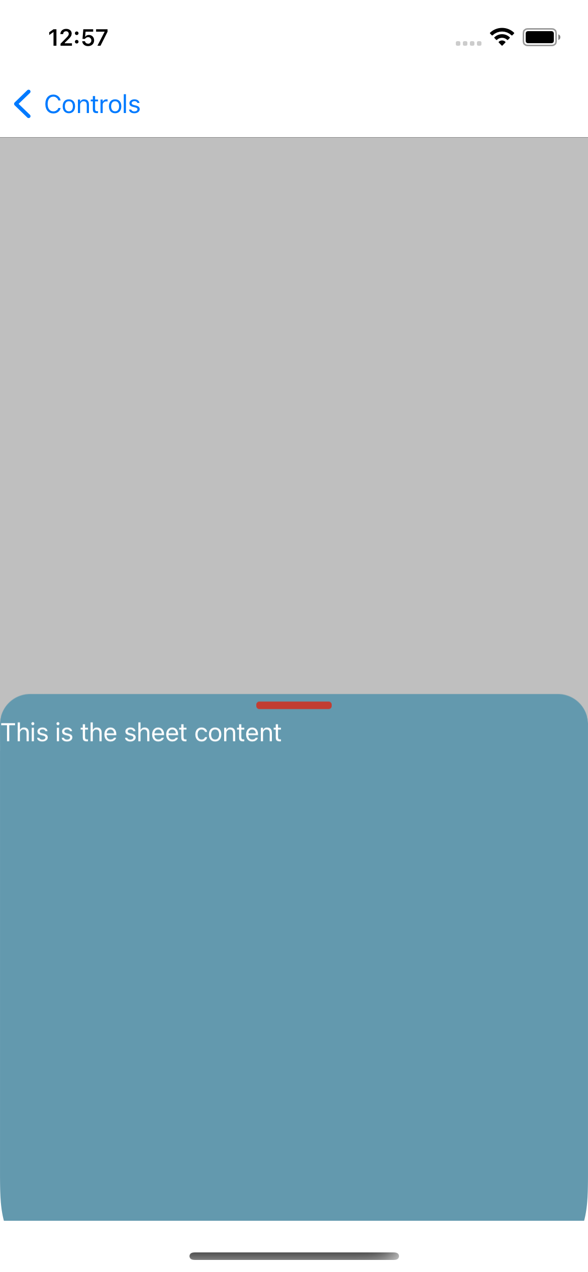
The content of the sheet might need it's own BindingContext. This is natural when working with the MVVM pattern.
In the following examples, we have added a SheetPageViewModel that provides an instance of InsideSheetViewModel from a property.
-
SheetPageViewModelshould be theBindingContextof the entire page. -
InsideSheetViewModelshould be theBindingContextof the sheet's content.
xaml:
<ContentPage>
    <ContentPage.BindingContext>
        <local:SheetPageViewModel />
    </ContentPage.BindingContext>
    <dxui:ModalityLayout>
        <dxui:ModalityLayout.Behaviors>
            <dxui:SheetBehavior IsOpen="True"
                                BindingContextSheetContent="{Binding InsideSheetViewModel}">
                <dxui:SheetBehavior.SheetContentTemplate>
                    <DataTemplate x:DataType="{x:Type InsideSheetViewModel}">
                        <!-- sheet content goes here -->
                        <Label Text="{Binding Title}" /> <!-- "Sheet Title" is the value here -->
                    </DataTemplate>
                <dxui:SheetBehavior.SheetContentTemplate>
            </dxui:SheetBehavior>
        </dxui:ModalityLayout.Behaviors>
        <!-- page content goes here -->
    </dxui:ModalityLayout>
</ContentPage>SheetPageViewModel:
public class SheetPageViewModel : INotifyPropertyChanged
{
    public Func<object> SheetViewModelFactory => () => new InsideSheetViewModel();

    public event PropertyChangedEventHandler PropertyChanged;
}InsideSheetViewModel:
 public class InsideSheetViewModel : INotifyPropertyChanged
    {
        public string Title => "Sheet Title";

        public event PropertyChangedEventHandler PropertyChanged;
    }
👉 The demonstration page can be outdated.
| Property | Explanation | Remarks | default value |
|---|---|---|---|
VerticalContentAlignment |
Determines how the content of the sheet should align. | Fit |
|
SheetContent |
The content of the sheet. |
BindingContextFactory to set the binding context when the sheet opens |
null |
BindingContextFactory |
Used to set the binding context of the content of the sheet when the sheet opens. | If this is not set, the BindingContext of the ModalityLayout will be used. |
null |
ContentColor |
Determines the background color of the content part of the sheet. | ColorPalette.LightAir |
|
HeaderColor |
etermines the background color of the header part of the sheet. | ColorPalette.LightLight |
|
HandleColor |
Determines the color of the handle in the sheet. | ColorPalette.QuinaryAir |
|
IsDraggable |
Determines if the sheet should be drag-able or not. | true |
|
IsOpen |
Determines if the sheet should be visible or not. | false |
|
OpenCommand |
Command to use directly in your XAML to open the sheet. | ||
Opened |
Event that gets raised when the sheet has completed it's animation and is open. | ||
OpenedCommand |
Command that executes when the sheet has completed it's animation and is open | null | |
OpenedCommandParameter |
The parameter to pass to theOnOpenCommand
|
null | |
Closed |
Event that gets raised when the sheet has completed it's animation and is closed. | ||
ClosedCommand |
Command that executes when the sheet has completed it's animation and is closed | null | |
ClosedCommandParameter |
The parameter to pass to the OnCloseCommand
|
null | |
BeforeClosed |
Event that gets raised before the sheet start it's animation when closing | ||
BeforeClosedCommand |
Command that execute before the sheet start it's animation when closing. | null | |
BeforeClosedCommandParameter |
The parameter to pass to OnBeforeCloseCommand
|
null | |
BeforeOpened |
Event that gets raised when the sheet is about to start it's animation to open. | ||
BeforeOpenedCommand |
Command that execute when the sheet is about to start it's animation to open. | null | |
BeforeOpenedCommandParameter |
Parameter to pass to OnBeforeOpenCommand
|
null | |
CloseOnOverlayTapped |
Determines if the sheet should close when the overlay is tapped. | true | |
ActionButtonSize |
The size of the label of the action button. | NamedSize.Small |
|
ActionCommand |
Gets or sets the command that is invoked when the action button is activated. | null | |
ActionCommandParameter |
Parameter passed to ActionCommand. |
null | |
ActionClicked |
Event that gets raised when the user has clicked the action button. | ||
ActionTitleColor |
Color of text in the action button. | Theme.TealPrimary |
|
ActionTitle |
Action button text. | If this is not empty action button is visible. | string.Empty |
CancelCommand |
Gets or sets the command that is invoked when the cancel button is activated. | Can be set to a CancelSheetCommand to provide a function that decides if the sheet should close when Cancel button is clicked. Sheet is closed by default. This command will also be invoked when the overlay is tapped. |
null |
CancelButtonSize |
The size of the label of the cancel button. | NamedSize.Small |
|
CancelCommandParameter |
Parameter passed to CancelCommand
|
null | |
CancelClicked |
Event that gets raised when the user has clicked the cancel button. | ||
IsCancelButtonVisible |
Determines if the cancel button is visible. | false |
|
CancelTitleColor |
Color of the text in the cancel button. | Theme.TealPrimary |
|
CancelTitle |
Cancel button text. | Cancel |
|
IsTitleSeparatorVisible |
Determines if the separator between the title and the sheet content should be visible. | true |
|
TitleSeparatorColor |
Color of the title separator. | ColorPalette.QuinaryLight |
|
Title |
Title text | ||
TitleColor |
Color of the text in title. | ColorPalette.Dark |
|
TitleSize |
The size of the title label. | NamedSize.Medium |
|
TitleFontAttributes |
Title font attributes. | FontAttributes.Bold |
|
Position |
Current position of the sheet expressed as the ratio of the height of the modality layout the sheet covers. 0 if closed, .5 if halfway open, etc. | This is OneWayToSource by default. Setting this does nothing. Use if you need to be aware of the position. Use MoveTo(double position) if you need to move the sheet programmatically. |
|
IsBusy |
Hides content of sheet with an activity indicator. | false
|
|
SnapPoints |
Decides where the sheet will snap to when gesture is ended | If the user should be able to close the sheet this list must contain 0. Max position of the sheet will be the highest value in the list. Values are clamped between 0 and 1. |
[.0, .5, .98] |
FlingSpeedThreshold |
Threshold that must be reached for the sheet to fully open or close when gesture has ended. | Drag movements are continuously registered to determine if the user wants to fling the sheet open or closed based on the speed of the gesture. Unit is pixels per second. Default value is 2000. Use FlingSensitivity.Low, FlingSensitivity.Medium or FlingSensitivity.High for pre-defined values. Else set to whatever int you want. |
2000 |
SheetOpeningStrategy |
Position of the sheet when it opens. | Possible values given with SheetOpeningStrategyEnum. |
FirstSnapPoint |
InterceptDragGesture |
Should the sheet intercept drag gestures when not fully opened | This is an internal requirement. If this is true the sheet will intercept all vertical drag gestures if it is not fully opened. Scrollable controls will not work before sheet is fully opened. Other gestures should work as normal regardless. |
true |
By default, the ModalityLayout will close any open modals before showing a new modal, thus limiting simultaneously open modals to one. This behavior can be disabled by setting the property ShouldCloseOpenedModals to False.
| Property | Explanation | Remarks | default value |
|---|---|---|---|
ModalityLayout.ShouldCloseOpenedModals |
Determines whether the layout should close any opened modals before opening a new one. | true |
