Added underlines to links in toots #9898
Conversation
Link text color is #f1ebff, surrounding text is #ffffff. They have a contrast ratio of 1.2:1. Not only is hard to see links that are so close in color to the text, they also require a pointing device (mouse) to quickly scan for links. Instead of having to meet a 4.5:1 contrast ratio, adding the underline will allow this to pass a WCAG check.
|
IMHO, I'd rather choose a better color than adding underlines, as these do aesthetically not look that nice. And the theme could work better with a little more contrast. |
|
Links in toots practically always look like example.com/foo, not like other text, so the homogenity of color and style with other text is a feature, not a bug. |
|
This reference (which is a collection of references) may be useful: On Link Underlines
That is an option, but you will want to target a 4.5:1 contrast ratio with the background and a 3:1 contrast ratio with the surrounding text.
That is a matter of opinion. I think they look fine with underlines. More importantly, I can use it with underlines. I think usability trumps aesthetics.
I am not sure I understand. Are you saying that the link text matching the surrounding text is a feature? |
|
Yes. Readers do not have to guess whether a piece of text is a link by color or underline, because it never looks like other text, it looks like a URL. The slight color difference is a minor help in skimming, but it is not fundamental in my opinion. Keeping visual clutter down is important. |
Thanks, that is actually interesting, because it states that (G182) this is actually a visual clue to make links identifiable even without color vision. Thus, it addresses a slightly different case than the contrast. It also explains, you can use other clues, like a different font size or so. |
The is demonstrably not true. I tooted a11y.reviews yesterday. No sub-page, and it does not use a common TLD.
The slight color difference is so slight as to be imperceptible except under ideal conditions (no glare on screen, good screen, good vision, etc.). What you perceive as visual clutter is making it harder for some users (or all users in some conditions) to easily visually identify links. Now that you know the interface is harder for some users (which is also backed up by contrast ratios and best practices as outlined by WCAG), are you comfortable telling those users that your preference for "less clutter" overrides their ability to use it?
It does. Which is why I added underlines. Instead of solving for contrast, underlines address it better for all sighted users.
Yup, but after years of testing this, underlines work best as they result in the least page reflow and weird spacing. |
|
I like @aardrian’s approach and I think it could work, but just to toss out another option if it may be of interest, the WCAG guidelines also allow for color alone to be used for links if the links have a contrast ratio of at least 3:1 against their surrounding text and a contrast ratio of at least 4.5:1 against the background color. And as that goes, one potential color combination that may be an option is #a47aff, which has a contrast ratio of 3:1 against the surrounding white text and 4.5:1 against the background. For convenience, I’ve also thrown together a quick CodePen snippet where you can see how that looks.
|

|
Regarding all the above, I'd definitely prefer underlines on links. it's by far the easiest way to differentiate them from other text. |
|
Even now, when you hover the mouse over the link, the underline will be displayed. |

|
@mayaeh because not everyone uses a mouse (there are no @aardrian already provided some additional reading material on this. I suggest you read that too.
|
|
@scottaohara i don't have any dog in this fight, since I use a custom theme with a much more noticeable link contrast (and there is a high-contrast theme included by default in mastodon for those that would like to use it), but it's absolutely false to say that there are no focus styles for keyboard users when it comes to links:
|

Per my statements above:
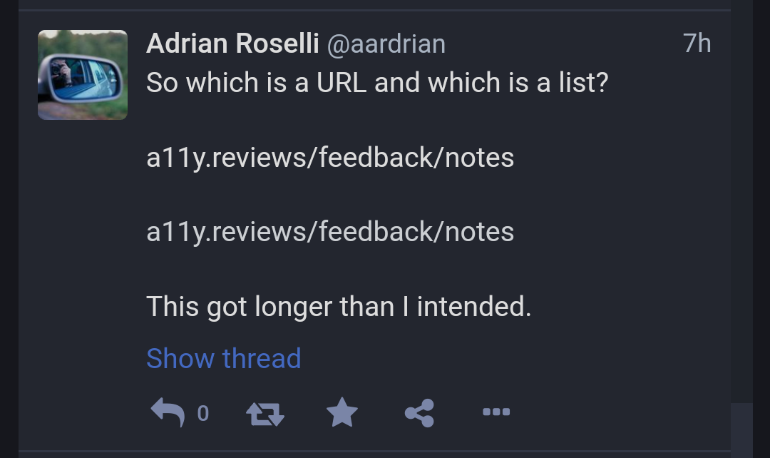
And @scottaohara beat me to it. I am going to attach this image, however, showing how non-standard TLDs, slash-separated lists of items, and non-linked URLs are confusing and require me to go tapping or mousing or tabbing to see what is what. Oh, I also kinda came to Mastodon because Twitter has been so historically crap at supporting accessibility in any meaningful way. I would like to see it do better, and since I can contribute I am doing just that. Trying to make it better.
|

There is no |
|
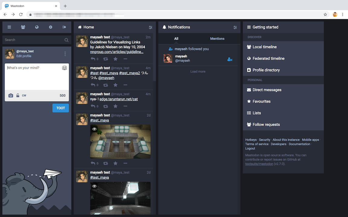
@aardrian I'm not sure where you took that screenshot, but it seems to be using a custom theme. Links look like this on mastodon:
This isn't great, and I agree it should probably be changed, but it's much better then the artificially darkened screenshot you posted.
I know exactly what I'm seeing. Whether the style is applied by the user-agent or by the application, there is still a style that's applied on |
|
There is a high-contrast theme in Mastodon. |
|
@scottaohara @aardrian I was forgotten about touch screen. |
|
The screen shot is off my mobile, where I mostly read Mastodon. I am using the Toot Cafe site theme. I have also browsed other Mastodon instances with different themes. It's part of why I suggested an underline instead of trying to find every color combination for every theme that meets WCAG minimums.
I would like to see these guidelines you reference. Most of the accessibility practitioners I know (including me) recommend against leaving the defaults as they can be difficult to see on some backgrounds. Further reading: Avoid Default Browser Focus Styles |
It is not sufficient because it also suffers from the same contrast issues and lack of underline. I attached a screen shot from my mobile using the high contrast theme.
|
|
@nightpool I'll be more clear, there are no defined What you showed was a screen shot from what I assume is Chrome. Here is a screen shot showing a focus outline from Firefox on macOS. Which is what happens when you don't define custom focus styles on heavily styled (dark theme) web documents/applications
I would also be interested to see the documentation you're referring to that says to not change default focus styles. Also being an accessibility practitioner, I'd be interested in knowing of these documents and then reaching out to these people to ask them to stop providing misleading information... per G165:
|

|
WCAG G165 specifically addresses using the default focus indicator: They address the concerns you have about visibility but say that it's sufficient for users to be able to customize the default focus indicator using assistive technology. But, again, discussions of the focus indicator are off topic. It does look like there's a bug in the high contrast theme here. We should fix the high-contrast theme. |
You are correct. I forget about that because, frankly, nobody who actually does this stuff pays attention to that one. In fact, many actively counsel against it (see my link above). There are a few Sufficient Techniques that (since WCAG 2.0 was published) we have found to not be truly sufficient after a decade of testing. It's one of the reasons automated accessibility checkers are meh and trying to only meet WCAG at the minimum is frustrating to watch. That being said, it doesn't address the issue I raised as that only satisfies for when a control has focus, not conveying its affordance (clickability in this case) before that interaction.
Agreed. In the meantime, can we approve the link underline here? I haven't heard any arguments against that go beyond aesthetics. |
|
I would prefer to solve this with high-contrast links rather then an underline. Specifically I would prefer to solve this with high-contrast links in both the main style and the high-contrast styles—preferably with a 3:1 contrast for the main style and a higher contrast for the high-contrast styles. If we do choose to go the underline route we should specifically exclude hashtags and mentions, since those are already delineated by a sigil and should not be set off from running text in the same way that links generally can be. |
|
Hmm. After playing around with some styles, it does seem hard to achieve a 3:1 luminance contrast with the body while also maintaining an appropriate contrast against the dark background... |
|
Which is part of the reason for why a lot of people (accessibility practitioners in particular) simply opt for underlined links. |
|
So can't you just include this change (underline) in the hard-contrast theme? |
That was my point as well, I think that is the best solution. |
I am all for seeing the high contrast theme actually be high contrast. But the issue I have raised is for links in the main theme / all themes. They all either need an underline (easiest) or better contrast (trickier because each theme uses different colors). Telling users who cannot see links to switch to the high-contrast theme still does not address all use cases. It assumes that when in the sun or using the phone dimmed at night that users know there is a high-contrast theme and can easily get into the preferences to change it. Again, are they are any arguments against this other than aesthetic preferences of the project maintainers? I think I have identified plenty of cases for adding underlines. They are grounded in WCAG, US case law, international law, best practices, years of user research, and usability. |
|
As a user, I should not need to understand URI syntax in order to discover links. I should be able to rely on visual or acoustic cues ensuring the discoverability of interactive elements. One of the seven fundamental principles of design as stated in “The Design of Everyday Things” by Don Norman says: “Discoverability. It is possible to determine what actions are possible and the current state of the device.” (Source: Donald A. Norman, 2013. The Design of Everyday Things. Page 72. Basic Books) Several reasons for why the discoverability of links in the default theme cannot be ensured have been named. In my opinion, there haven’t been arguments against underlined links which would outweigh these reasons in importance. Maintaining a clean aesthetic is not more important than ensuring the operability of a web page. An interactive element that one cannot perceive is not operable. |
|
Underline seems to apply also to the hashtag and the name of the reply destination.
|
|
(I've deleted a comment from this thread for being overly hostile and dismissive. Everyone on both sides is reminded to be civil, respectful, and assume good faith when discussing this issue) |
|
Does anyone here have the authority to add the Accessibility label to this PR? |
|
Thanks, @sorin-davidoi ! |
|
One problem among several with the "people can totally tell links are links because they're always a URL" claim: Mastodon isn't going to be the biggest fish in the pond for long, and other ActivityPub software may well start emitting links that aren't in URL form. |
|
rather than "may well start", it is already here. some of my friends who
run a single user pleroma instance for themselves sometimes will end up
posting a thing where the link is just contained in the word "this" or it
is a filename like "photo.jpg" and on hover, you realise you can click it.
(or, with that javascript code to add underlines, then i can tell without
having to). i don't know what exactly causes that but that's how it ends up
looking for me in masto web.
…On Thu, 21 Feb 2019, 17:03 Deutrino, ***@***.***> wrote:
One problem among several with the "people can totally tell links are
links because they're always a URL" claim: Mastodon isn't going to be the
biggest fish in the pond for long, and other ActivityPub software may well
start emitting links that aren't in URL form.
—
You are receiving this because you commented.
Reply to this email directly, view it on GitHub
<#9898 (comment)>,
or mute the thread
<https://github.com/notifications/unsubscribe-auth/AHIJzBzrYwxq2Kt5F_kcW3Rh8K_i25kJks5vPtFMgaJpZM4aL5SZ>
.
|
|
With @dolljoints' comment about only the word this being linked, I believe we definitely cannot rely on a URL as a link signifier. Can we approve the link underline here? I haven't heard any arguments against that go beyond aesthetics. |
|
Is there any reason why this PR has been left for so long? |
|
For comparison, this same change (adding underlines to links) went from PR to approved and deployed in under 2 hours on the ECMA TC39 site (the body that standardizes the JavaScript language): tc39/tc39.github.io#141 |
|
Just a rambling rando but, here's my take: Ultimately however, it should be up to the user, neither Gargon nor the instance owner, as to how links are styled, and probably different options at that for outgoing.links vs @people or #hashtags. I'm not actually a mastodon user (yet), so take this all with a grain of salt (does masto even support settings like i described currently?). If you think I'm a crank, don't @ me just delete comment and move on. |
|
hey how about we merge this? links in the default UI are hard to read and there already are non-url links everywhere, this is a good accessibility measure and letting it rot will not make the problem disappear. Make a toggle if you want, but this PR is good for the community |
|
thank you wxcafé!
…On Wed, 24 Apr 2019, 16:58 wxcafé, ***@***.***> wrote:
hey how about we merge this? links in the default UI *are* hard to read
and there already are non-url links everywhere, this is a good
accessibility measure and letting it rot will not make the problem
disappear. Make a toggle if you want, but this PR is *good* for the
community
—
You are receiving this because you were mentioned.
Reply to this email directly, view it on GitHub
<#9898 (comment)>,
or mute the thread
<https://github.com/notifications/unsubscribe-auth/ABZATTHAKPRE4XROTLNYB3LPSB7TLANCNFSM4GRPSSMQ>
.
|
|
well I mean, I didn't really do anything apart from commenting, gargron doesn't seem to want to do anything except ignore this, so once again mastodon is blocked on a basic accessibility issue |
|
yeah, i just like seeing people be vocal about this. it feels validating.
obviously you just said you think it should happen too but. it's nice to
see ppl talking about it.
…On Sat, 27 Apr 2019, 23:51 wxcafé, ***@***.***> wrote:
well I mean, I didn't really do anything apart from commenting, gargron
doesn't seem to want to do anything except ignore this, so once again
mastodon is blocked on a basic accessibility issue
—
You are receiving this because you were mentioned.
Reply to this email directly, view it on GitHub
<#9898 (comment)>,
or mute the thread
<https://github.com/notifications/unsubscribe-auth/ABZATTHAXZN4W3HC5XOQF5DPSTKGBANCNFSM4GRPSSMQ>
.
|
|
This PR adds an underline to The PR #9949 adds the same underlines, but with more precision for what gets underlined when, and only in the "high contrast" theme. It was opened after this PR, and it has been merged. |
|
Ah, so this is fixed? So this here can be closed? |
No. I addressed why setting underlines on the high contrast themes is insufficient in my comment above: #9898 (comment) The high contrast change in #9949 would have been unnecessary had this PR been merged. As it is, I think the high contrast theme still fails to pass contrast checks. Regardless, as long as this PR sits unmerged, Mastodon default themes are still in violation of WCAG. And unusable for many. Please, @Gargron , can we approve the link underline here? I haven't heard any arguments against that are more than a personal preference. |
|
Well… yeah… the default theme has a bad contrast anyway. That's also already bad for accessibility… 🤔 Don't know whether underlines in links are the biggest problem there… 😉 |
|
it not being the biggest problem doesn't mean it's a problem and maybe we can start with applying the solutions we have to fix the problems we can before moving on to other problems, rather than sitting around waiting for everything to be magically solved at once. |
|
@Gargron, can we approve the PR, please? All the arguments against it have been raised and addressed. Copious amounts of evidence have been provided. Benefits have been demonstrated. Related issues have only addressed narrow cases. Let's help users across contexts and make it satisfy WCAG. |
|
Please merge. |
|
I am 100% in support on @aardrian’s changes as-is, but I’d like to propose a slight amendment to them that might make them more palatable to those concerned about aesthetics. Adding
|

|
@evanminto, the catch there is different themes may not guarantee sufficient contrast. See my comment (#9898 (comment)) on a similar suggestion above. Though that might be a good addition for the individual themes. |
|
The color of links has been changed to be distinguishable via contrast; those who want to see underlined links can switch to the high-contrast theme (unfortunately some users had to switch away from the high-contrast theme after the underlines were added because it made it less legible for them). This PR will not be merged. Thank you. |
Link text color is #f1ebff, surrounding text is #ffffff. They have a contrast ratio of 1.2:1. Not only is hard to see links that are so close in color to the text, they also require a pointing device (mouse) to quickly scan for links. Instead of having to meet a 4.5:1 contrast ratio, adding the underline will allow this to pass a WCAG check.