Find a solution to the growing block toolbar size combined with the need for more items in the toolbar #24805
Comments
|
The latest revision to the toolbar included some explorations of the "sub-toolbar" you mention. Perhaps a good example was how it originally worked for the image editing tools, where the entire toolbar was replaced. There are some technical difficulties in ensuring it works well in terms interactions, accessibility, and APIs for developers. It also would need clear guidelines on when it'd be appropriate to use. |
|
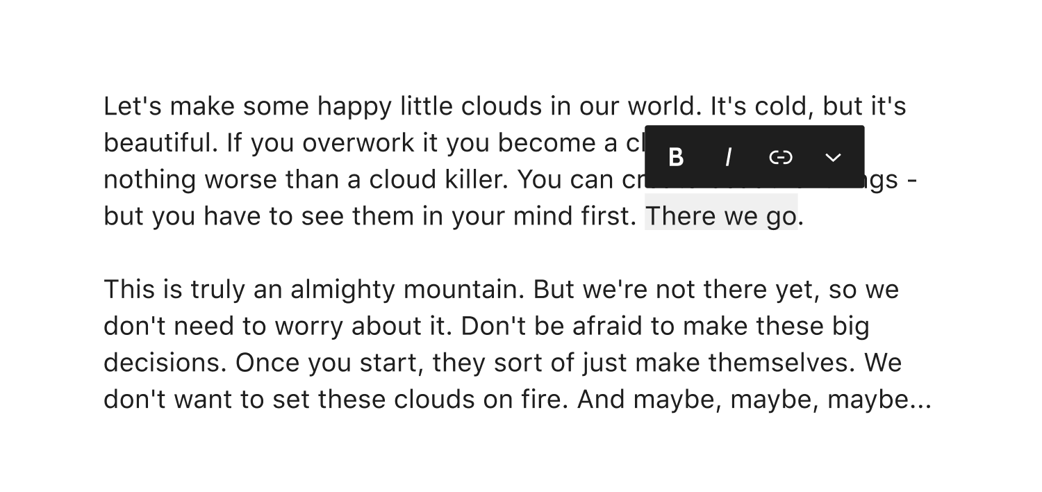
Included in the toolbars of many text-based blocks are inline operations - bold, italic, link, etc. Might we create space for block-level operations (movers, transforms, drag and drop, select parent) in the block toolbar by migrating those inline actions to the selected text? I think there may be some a11y benefits to this - fewer tab presses to manipulate a selection, decreased distance between cursor and action. But no doubt there are trade-offs that I am not seeing as well. |
|
@jameskoster Assuming it works from an a11y perspective, moving the inline formatting controls closer to the text may be the answer. There is one thing to keep in mind, however: the inline formatting controls can be used even when there is no text selected. As an example, if your text cursor is in a word, pressing the "Bold" button will bold the entire word. For this reason, we would have to always show the inline formatting controls when the focus is in text... not just when there is a highlighted text selection. The most obvious potential issue I see here is when your text cursor is at the start of, for example, a Paragraph block. The inline formatting controls would be visible right on top of the block toolbar. And of course, this little formatting controls popover would always be overlapping some text once you go past the first line. I think potential UI overlap problems like this are why the block toolbar design ended up the way it did at the start of the project. I do think there's benefit to showing the inline formatting controls more contextually, however. The sub-toolbar idea I have could expand to include a sub-toolbar for inline formatting controls. This would cause those controls to only take up a single button space in the toolbar by default. Additionally, we could make it so that the inline formatting sub-toolbar is automatically opened whenever your focus goes into a rich text field in the block. To get back to the main toolbar, you could either:
Both of our ideas have one notable benefit in common: collapsing/moving the inline formatting controls would already free up enough space to unstack the movers, bring back a dedicated drag handle, and split the block icon from the switcher, all without increasing the default block toolbar size beyond its current length. |
|
Thanks @ZebulanStanphill for this excellent recap of the overall issue. I think this deserves a well thought accessibility feedback, which I haven't fully elaborated yet 🙂 For now, I'd like to highlight one of the points you made related to the "block movers":
This is a very good point. Besides all the other accessibility and usability concerns already reported by @sarahricker on #21935 (comment) I think this point highlights the new design isn't ideal from a design perspective in the first place. This really looks like a single button:
A good user interface should be designed around the content, not the other way around. In this case, the "content" is the multitude of buttons that need to be displayed within the toolbar. "Squeezing" the buttons or removing parts of the UI (the grab handle) to make them fit in a limited space doesn't seem to me the best path to resolve the underlying issue. |

|
One notable aspect of the block toolbar is that it's designed to be contextual. It only shows controls for the currently selected block. But as it turns out, block's can have a lot of controls. At first, it may have seemed like stuffing a lot of this stuff into the inspector was the answer. (The inspector has a lot of a11y issues as well, but that's a topic for another issue.) But many blocks have lots of important controls that ought to be shown in the toolbar. The problem is that there are already a bunch of controls that need to be shown for almost every block anyway, so there's tons of controls that are all seemingly of equal importance, but not enough room to show them all at the same time. But if you think about it, moving a block and formatting inline text are two very different kinds of actions. Right now, we're always showing controls for both at the same time... but perhaps we shouldn't. I think what needs to happen is that the block toolbar needs to become even more contextual. We've already helped this cause along in the past by collapsing the block alignment and text alignment controls into dropdown menus. Unfortunately, I don't think we can use dropdown menus for block movement controls without it feeling really awkward, and the same goes for inline text formatting controls. My sub-toolbar idea is (at least conceptually) similar to collapsing stuff into a dropdown menu, but with a less awkward design and maybe with more persistence, i.e. the toolbar might stay in the sub-toolbar state even after tabbing out of it? I realize that such a thing may be difficult to pull off accessibly. I guess you'd have to announce the current block toolbar state every time you tab into it? But regardless of what the specific solution is, I think that somehow making the block toolbar more contextual is key to solving this problem. |
|
To better prepare the discussion on this issue with the accessibility team, I'm posting two animated GIFs to better illustrate the proposed behavior, as I'm not sure all the accessibility team members are up to date with this proposed pattern. As mentioned above, this pattern is already (partially) used in the Image block for the image editing tools. When clicking the "Crop" button in the block toolbar, part of the toolbar UI gets replaced with the image editing buttons:
Worth noting the current implementation accessibility is seriously broken, see #24676 and #24766. The other proposed usage of this pattern, so far, is for the the navigation menu toolbar in #24021. Clicking the "Link" button replaces the whole toolbar with another UI that provides the form to search for posts to link to:
|


|
I'd suggest #23375 as a more thorough overview of the proposal for the updated link interface. |
|
Is this something the "Tools" feature could help alleviate? |

|
@stokesman More and more I'm starting to think that tools/modes are the answer. I've avoided them up until now out of fear that they would complicate the UI. But ironically, I think they may be the only way to make the UI less complicated, by only showing controls related to the current tool. I suspect they would also have a lot less accessibility issues compared to the sub-toolbar idea. I'm not sure if modifying the Select tool to have movement controls is the right approach, but if we can make it work without sacrificing its current accessibility, then let's go for it. It's better to only have 2 tools/modes rather than 3. One other potential issue I see with the mode/tool approach is that a lot of users don't seem to even realize that the modes/tools even exist. That's understandable, considering that all they can see is a pencil icon in the top toolbar. Icon-only controls are bad for accessibility anyway, so we should consider using visible text labels to improve the accessibility there. What does everyone else think about the idea of using editor modes/tools to tackle this problem? |
|
@ZebulanStanphill and @stokesman I opened an issue a few days ago that exactly faces the idea of modes: #24751 I would be happy to recieve your feedback! |
I'd tend to think this is an interesting idea worth exploring. Thinking also at the future of the editor, as more functionalities will be added there will be even more controls to display in the UI. I don't think that trying ways to "squeeze" a multitude of controls within UIs that offer a limited space is the best path forward. Reducing the buttons size isn't great. Replacing "on the fly" parts of the toolbars with extraneous UIs breaks the toolbar pattern (see #24766, #24021). Also, right not the block toolbars contain a series of controls that are: 1) related to the block itself (switcher, movers), 2) related to the block's content (formatting), 3) a set of controls within the "More" menu, mostly related to the block itself. These controls belong to different objects however they're displayed in the same UI. A better separation and improved logical grouping would help but there's no space to display an additional toolbar. On a more general level, Gutenberg has two different, opposite, needs: show a multitude of controls because it's a feature-rich editor and at the same time make the UI as clean as possible to to provide users with a pleasant writing experience (actually, this has been one of he desiderata in WordPress for many, many years). Maybe adding a "modes" layer on top of the editor would help solving all these needs. Each mode would provide only the controls that are needed in that specific mode. This concept is not new and it is used in other web publishing platforms and document editors (for example in GDocs there are the Editing, Suggesting, and Viewing modes). In WordPress, there are a few embrional cases of "modes", for example "Bulk select" in the Media Library and the Customizer "reorder" mode for Widgets and menu items. The existing Edit and Select (originally named "Navigation") modes in the block editor were introduced mainly for accessibility reasons, where Select mode drastically reduces the amount of Tab key presses necessary to navigate the list of blocks. Personally, I would have liked even a more deep separation between these two modes. I'd tend to think well designed, well scoped, and accessible modes could the answer here. I also seem to recall the idea of expanding the concept of modes was briefly touched in a conversation with @mtias and I'd like to hear his thoughts on this. If there's consensus on this, I'd really like to see the related explorations being thoroughly user tested way before their final implementation and release. User testing should include user with accessibility needs and users of assistive technologies. |
|
A common solution I see on other toolbars is visually collapsing the overflow items. But for screen reader and keyboard users, moving to the right works as the items weren't collapsed.
We could try to adapt it for the block toolbar. The problem for us is that we already have a three-dot button at the end of the toolbar. The formatting controls also have a dropdown with more items. We would have to think of a more consistent design. That being said, I agree that we could render different toolbars for different modes. When I'm writing a paragraph, for example, I almost never want to move it around. The movers in this case seem unnecessary. But they would make sense in a "design mode" together with settings like text and background color which today are hidden in the sidebar. |

The issue
I've noticed that a lot of accessibility issues relating to the block toolbar are all blocked by a single core design issue:
There's just not enough space to put everything.
Here are some of the problems that are a result of trying to work around (but never solve) this issue:
block icons right next to each other. But ultimately, to make the parent-selector button accessible to touchscreen users, it should not remain the way it currently is. See Improve usability of parent block selector button #23766.
All of these issues can’t be solved via current methods without making the toolbar way longer than it already is. So there’s a lack of available space and no clear solution in sight.
Trying to find a solution
The only thing I’ve been able to come up with is a possible “toolbar-replacement” idea, where clicking a button in the toolbar replaces the contents with a sort of “sub-toolbar” containing controls specific to a certain type of action, e.g. block movement. (And of course, there would be a button to get back to the main toolbar.)
This idea could be used to have a dedicated sub-toolbar for things like:
Something close to this idea is being explored in #24021, but as pointed out recently, there are accessibility problems with the current implementation that need to be addressed... assuming the idea can even work accessibly in the first place.
If such a thing could be done in an accessible way, it may be able to solve this growing toolbar space issue. But if not… well, I have no other ideas. But this is a critical point of friction between the accessibility and design teams, and I think we ought to try and find a solution sooner rather than later.
The text was updated successfully, but these errors were encountered: