Widget-blocks in the Customizer #13205
Comments
|
This mockup seems off to me. Why is each block inside an accordion-esque container? The block outlines are completely redundant in this mockup, and the positioning of the block toolbar is also kind of weird. I would think that this view should just look like a single embedded block editor: EDIT: Additionally, I just noticed that this mockup does not take into account the block inspector. Where should that appear? Beside the block editor? On the far right? On top of the editor like on mobile? |

|
This mockup is a representation of how blocks might be used within the Customizer. You're asking the right questions! We'll need to work through this in detail for Phase 2. Thanks. |
|
It seems like the existing customize widgets UI (and API) can be largely reused, expanding the add-widget-item panel to the complete list of blocks that can be added to widget areas. Alternatively, the entire experience could be relocated into the live preview (inline editing). Widgets have historically been more "blocky" than any other element in WordPress. Whereas the editor de-emphasizes the level of structure that blocks have, widgetized areas should potentially retain a more block-first approach that emphasizes content organization over the actual contents and writing experience. The presence of the live preview of the frontend is a great opportunity. Can widget-blocks be edited directly on the frontend? Should we extend the existing visible edit shortcuts to offer a visual relationship between widget/block areas and the frontend of the site? Maybe widgets are edited over the preview, similar to the theme-install overlay? |
|
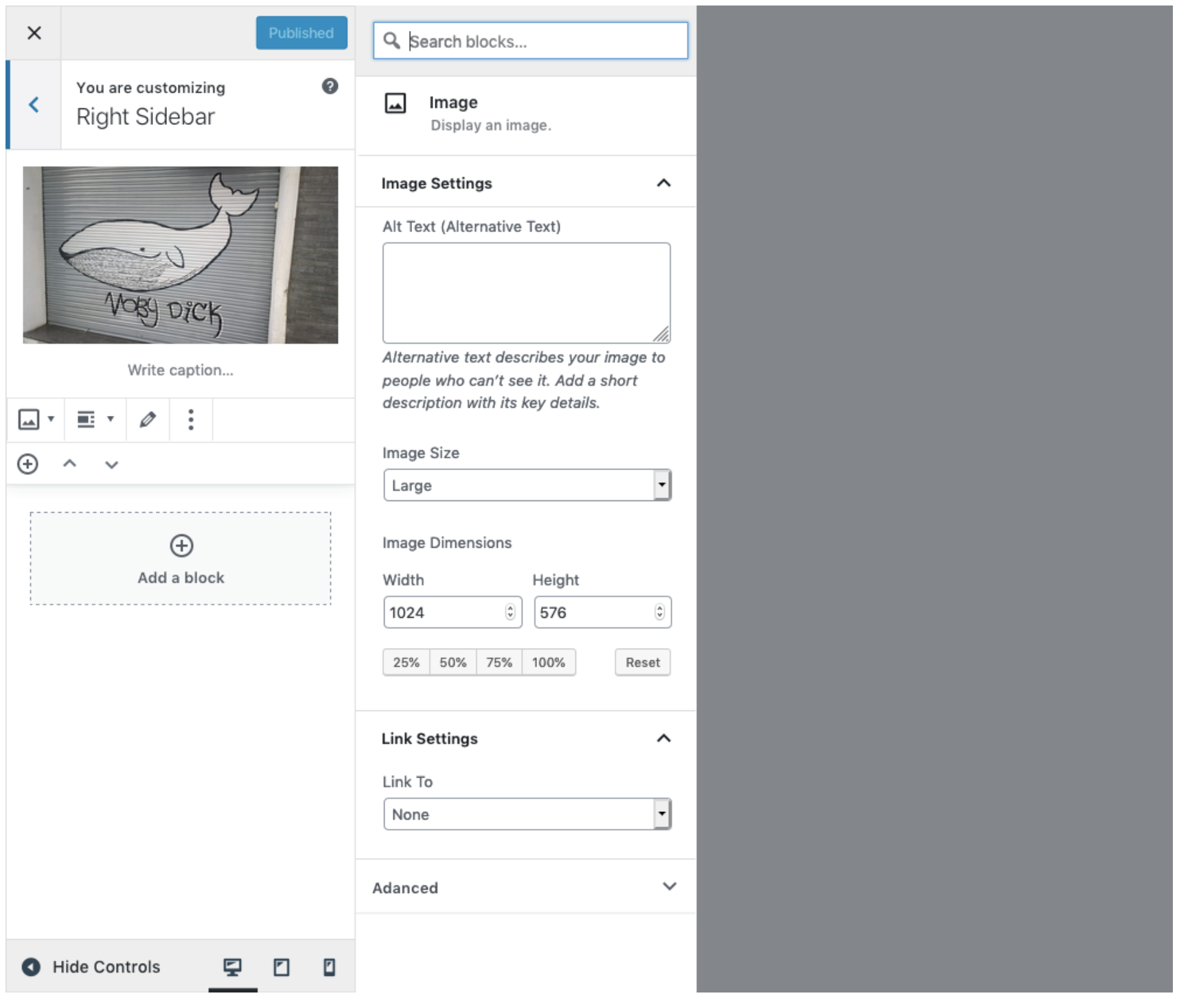
I took a first-pass at displaying widget-blocks (actually all blocks) in the Customizer. I kept this as simple as possible, following existing Customizer patterns for easiest implementation, but also included some new Gutenberg ones. This should help start the conversation around this and see where it can go from here.
The quick mockups can be viewed here: https://cloudup.com/cPcRd1OrC1V |

|
I'm not sure it's necessary to state "Widget-blocks" here, and probably best to just say "Blocks" instead. Any upvotes for stating just "Blocks"? |
|
I don't like this concept because it is was it was used before, we need something new, like to add an edit icon on every block/widget block and after you press that icon - on the right sidebar to show block settings... So it will be live editing, without left sidebar additional options. |
|
The same concept BUT with widget blocks instead of blocks. |

|
Some stream-of-consciousness feedback: I’m torn between just calling it widgets, or just calling it blocks. "Widgets" would work well in terms of transitioning people gently; the UI will change, but the name won't. We could still go for something like "add a block to your widget area" to smooth the transition? I think the fact that this is one unit needs to be more clear:
(I know this pattern is taken from mobile, but I also think it's a little confusing there, too.) I think we also need to see what more than one block in a widget area looks like. How would you re-open the sidebar? Click on the image/block? And how would you close it, click on the blank part of the sidebar? We'll need to think through those interactions. I also think we should always the block appender, instead of using ➕ in the toolbar. Otherwise, if you don't have a block selected, you wouldn't have a way of adding another block. The appender fits well within this space as well. This next screen: https://wp.invisionapp.com/share/BQRA7GFY2EN#/screens/355072536 feels like it needs some sort of placeholder on the left while you’re choosing a block so the sidebar doesn't appear blank. Maybe the appender, but highlighted? Good work on this — it's definitely a challenging (and daunting) task to tackle. |

|
Thanks, Mel! In regards to the naming of this, I'm going to rely heavily on how we handle this in the wp-admin widgets screen. Right now, I believe we're moving more toward dropping "widgets" and going full into "blocks". But I'm completely open to this.
I'm imagining this whole area being a mini-Gutenberg editor, so the blocks will appear and interact just like they do on a mobile device. If there's a larger problem here, maybe we can explore this mobile view in another PR? This way the Customizer view just adapts the mobile responsive layout of blocks.
Something like this:
Thanks for the push, I haven't thought that far ahead yet. I'm on it though!
Great point! The responsive view keeps the Inserter '+' icon in the top bar. We could try something like this or as your mentioned, have the larger appender always visible.
I'm wavering here honestly. Gutenberg does it well by providing a place to start typing immediately, but this isn't reallly a screen to just start typing; it's a widget area. That being said, if we have a persistent appender always visible, as you mentioned, that could be a good solution. |


|
@alexvornoffice Thanks for your feedback! Your points above are the direction we hope to get to in another Phase. It's basically a full site editing experience. Right now though, we need to take it slower and so we're just moving blocks into the Customizer while keeping a familiar experience. |
|
Here's a concept with the block appender always visible. It changes to a "Cancel" option when the block library is open.
|

|
I've since updated the prototype: https://wp.invisionapp.com/share/BQRA7GFY2EN |
|
@celloexpressions I didn't want to leave these great questions unanswered. Sorry for my late response.
I believe that's our ultimate goal – that everything can be edited in a full site editor experience. It's just not going to happen yet in Phase 2. I know this may not be the fastest path to an inline, full site editing experience, but I believe it’s the most considerate path forward. WordPress has just asked millions of users to learn a new thing, and I don’t want to push too quickly for them to learn another big thing. Phase 2, for me, is about working within the familiar patterns to bring this block paradigm into existing places where people interact with WordPress. (Except from my WPTavern comment) |
|
In Widgets to Blocks UX Flow Proposal I noticed a screenshot where a block in the widgets admin screen gets a sidebar: Should this not also be carried into the Customizer? In the Customizer, the the block sidebar be placed inside the Customizer pane and the block itself could be placed in the preview window. It seems ideal that the block being manipulated would be inline, instead of having the block appearing in two places largely identically. Also, if this were not done, where would the block's sidebar controls be located? |

I do think this is ideal (and is the end goal!), but technically at this point I don't think we're set up to live-edit blocks within the context of the front end preview like that.
In @mapk's comps today, the sidebar appears as a second panel on the right of the Customizer, while a scrim/overlay is placed over the site content.
|
|
Why not to make the block's sidebar controls to be located at the right of the window? |
If we're considering the existing mockups, putting the controls on the right would detach the sidebar controls from the content they refer to. It'd also introduce two sidebars, appearing at odds with each other, which is a little weird in itself. In Gutenberg (and in these mockups), the sidebar controls appear directly to the right of the content they're referring to, so I'm fairly sure that's why @mapk placed the controls where he did. If we wanted to retain a more similar interface layout between the block editor in the Customizer and the other implementations of Gutenberg, we could theoretically expand out the customizer's block content panel to be full width when editing a widget area:
This might be a little weird since no other customizer panel does this (that I've seen), and it'd also cut out the preview unfortunately. |

|
It should be noted that the current block inspector already has some accessibility design flaws in that it is visually detached from the block it is modifying. Moving the sidebar to the opposite side of the screen in the Customizer would only worsen this problem. |
|
Hey guys, I want to help on this matter! I think the existing mockup by @mapk with the sidebar as a second panel makes sense, however, if the behaviour will be the same as the menu options in the customizer (iFrame slides to the side), then the potential element one is customizing could slide out of view. Are the blocks supposed to update in real time? If yes, then this approach is problematic. The whole point of the customizer is to see how changes affect the site in real-time, something that wouldn't be possible in the newest mockup by @kjellr either. My suggestion to tackle this problem:
Display block settings of the current block in the sidebar. I am not sure if the border around the block is necessary, but it could help with locating the current block. Similar to the editor experience in the backend, there could be a focus mode:
This is my first contribution, if there is anything I can do better, please let me know. If this is something that is worth exploring, I could do some more high-quality mockups and show the interaction. |


As noted in the Phase 2 post:
Widget-blocks will be accessible in the Customizer.
We'll need to determine if these mockups are the right solution. Let's dig in!
The text was updated successfully, but these errors were encountered: